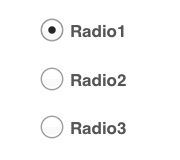
Radio buttons are an essential element of forms. They are used when there is a list of two or more options that are mutually exclusive and the user must select exactly one choice. In other words, clicking a non-selected radio button will deselect whatever other button was previously selected in the list.
Generic radio buttons control
Radio buttons are great when used correctly — they prevent users from entering erroneous data, since they only show legal choices and come with a lot of nice features, such as keyboard navigation and reliable rendering across platforms. In this article, we’ll overview practical guidelines for Radio Buttons that have been crafted from usability testing.
Radio buttons were named after the physical buttons used in old car radios to change the stations — when one of the buttons was pressed, other buttons would pop out, leaving the pressed button the only button in the “pushed in” position. The software radio button was modeled after these physical radio buttons.
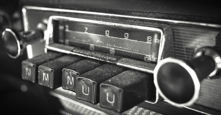
Only one button can be pressed at one time. Image credit: Tumblr
#Best Practices for Radio Buttons
##Use Radio Buttons Only For Settings
*Use radio buttons to change settings, not as action buttons to perform commands.* Also, the changed settings should not take effect until the user clicks the command button (labeled “Proceed” or “Save” for example). If the user clicks the Back or Cancel buttons, any changes made to radio buttons on the page should be discarded and the original settings reinstated.
If the radio buttons are used only to affect how a command is performed, it is often better to present the command variations instead. Doing so allows users to choose the right command with a single interaction.
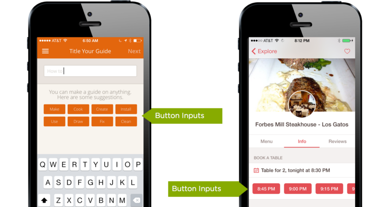
Button inputs make selecting them a single-tap action. Image credit: LukeW
##Logical Order For Options
You should list the options in a logical order, such as most likely to be selected to least, simplest operation to most complex, or least risk to most. Alphabetical ordering is not recommended because it is language dependent and therefore not localizable.
Options Should Be Comprehensive and Clearly Distinct
The biggest usability problems for radio buttons come from labels that are vague, misleading, or describe options that are impossible for average users to understand. Contextual help can alleviate the latter problem, but it’s still best to user test any important set of interaction controls.
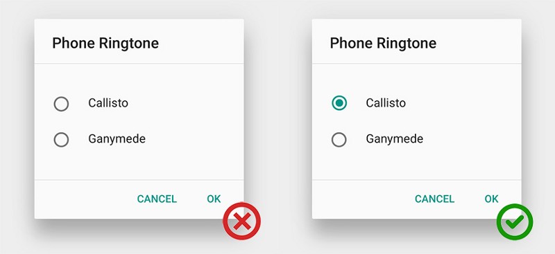
Always Offer a Default Selection
One of the 10 heuristics of UI design says that users should be able to undo (and redo) their actions. This means enabling people to set a UI control back to its original state. In case of radio buttons this means that radio buttons should always have exactly one option pre-selected. Select the safest (to prevent loss of data or system access) and most secure and private option. If safety and security aren’t factors, select the most likely or convenient option.
If users might need to refrain from making a selection, you should provide a radio button for this choice, such as one labeled “None.” Offering users an explicit, neutral option to click is much better than requiring the implicit act of not selecting from the list.
Try To Lay Out Your Lists Vertically
Horizontal radio buttons are sometimes difficult to scan and to localize. The horizontal arrangement of the radio buttons can also make it challenging to tell with which label the radio button corresponds: the one before the button or the one after. Vertical positioning of radio buttons is safer.
Try to lay out your lists vertically, with one choice per line. If you still need a horizontal layout with multiple options per line, make sure to space the buttons and labels so that it’s absolutely clear which choice goes with which label. For example, you should prevent a situation like this where it’s really difficult to see the correct radio button to click for option four.

Bad: Horizontal radio buttons
##Use Label Tags as Click Targets
Radio buttons are tiny in nature, and, thus, according to Fitts’ law, they can be hard to click or tap. To enlarge the target area, let users select an option by clicking or tapping not just that button, but also the label or associated words. Let users select an option by clicking on either the button itself or its label.
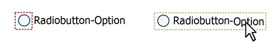
Left: Only limited area is available for click. Right: Large clickable area.
Good horizontal radio buttons can be found in Dualingo app: they’ve used a classic horizontal radio buttons, but made the targets visually distinguishable and large enough for touch-enabled devices.
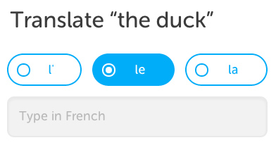
Good: Horizontal radio buttons
If possible, use radio buttons rather than drop-down menus. Radio buttons have lower cognitive load because they make all options visible so that users can easily compare them.
In case you have less than 7 options you should consider using radio buttons. Your users will be able immediately scan how many options they have and what each of those options are, without clicking (or typing) anything to reveal this information.
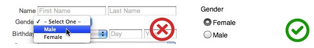
Left: Gender in drop-down menu. Right: Gender in radio buttons
##Avoid Nesting
*Avoid nesting radio buttons with other radio buttons or checkboxes.* You should keep all options at the same level to avoid confusion.
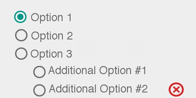
Using nested options adds unnecessary complexity
##Use Animation and Visual Feedback
Well-designed animations make the experience feel crafted. User interface elements like radio buttons should appear tangible, even though they are behind a layer of glass. Visual and motion cues acknowledge input immediately and add clarity through visual reactions to user input.
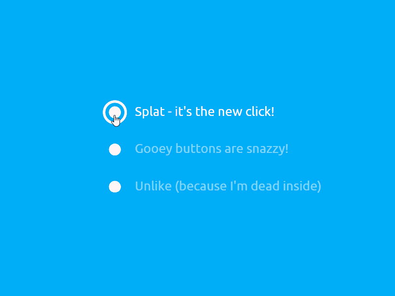
Image credit: Dribbble
#Would a Check Box be a Better Choice?
If there are only two options, you could use a single checkbox instead. However, checkboxes are suitable only for turning a single option on or off, whereas radio buttons can be used for completely different alternatives.

Checkbox control. Image credit: Material Design
You should remember following moments if both solutions are possible:
Alternatives. Use radio buttons if the meaning of the cleared checkbox isn’t completely obvious. In example below, the choices are opposites so radio buttons are the better choice for this option.
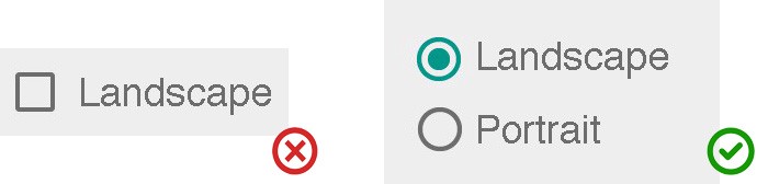
Select orientation for the document (Landscape or Portrait)
**Wizard.** You should use radio buttons on wizard pages to make the alternatives clear, even if a check box is otherwise acceptable. Designs with a radio button selected by default make a strong suggestion to the user. The default choice may lead the users into making the best decision, and may increase their confidence as they proceed.
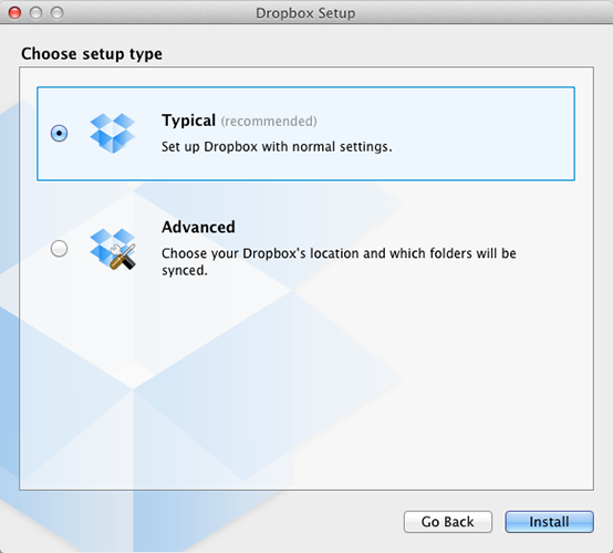
If an option is strongly recommended, add “(recommended)” to the label. Image credit: Dropbox
**Simple Yes or No answer.** Using a checkbox is correct when you have a single simple question and the user will answer either “yes” or “no”.
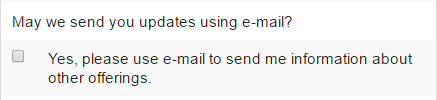
Simple question can be asked in a form of checkbox
#Conclusion
When designing radio buttons, most important to follow design standards, because this enhances users’ ability to predict what a control will do and how they’ll operate it. Conversely, violating the standards makes the user interface feel brittle — as if anything can happen without warning.
Design with care. Radio buttons are easy to test using paper prototyping, so you don’t need to implement anything to see if users understand the control and can use it correctly.
Thank you!