A picture is worth a thousand words. Since the beginning of time, people know that a complex idea can be conveyed with just a single still image.
A big part of our brain is devoted for visual processing. Some researchers even claim that over 90% of the information people process is visual.

Lascaux, France. A panel from the world-famous cave gallery painted 17,000 years ago. Image: subarcticmike
In this article, I want to talk about one specific type of visuals - illustrations. Similar to any other element of UI, illustration should be a functional element of the user interface - it should serve a specific purpose. That's why if you plan to use illustrations in your UI you need to clearly understand when and why you should use it.
Below are 3 typical examples of when illustrations can bring benefits to user experience:
to clearly understand when and why you should use it.
Below are 3 typical examples of when illustrations can bring benefits to user experience:
Describe concepts
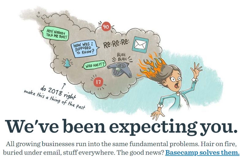
Sometimes it might be hard to describe a concept using only words (especially, if it's an abstract concept). Illustrations have a natural power for clarifying things and designers can use this property. For example, Basecamp uses illustrations to demonstrate the everyday problems of modern business. The message won't be so compelling with words only.

It's possible to tell a whole story with just one illustration. Image: Basecamp
Communicate the context of a text
When designers want to familiarize users with something, they can use text for that purpose. But text without visuals can look dull. It also worth remembering that when it comes to using digital products, users don't read text on a screen, they scan. If a screen is full of long and tedious sections of text users can quickly become overwhelmed.
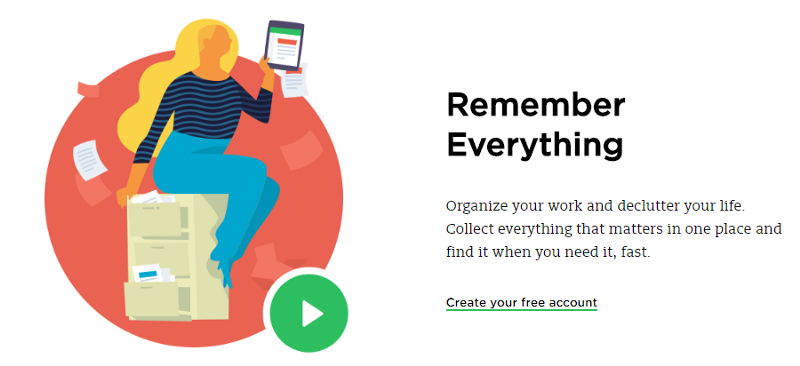
Using illustration designers can communicate the context more engagingly. For example, Evernote makes it clear what 'Remember Everything' really means in the context of using an app.

Illustrations help users understand the context of the associated text. Image: Evernote
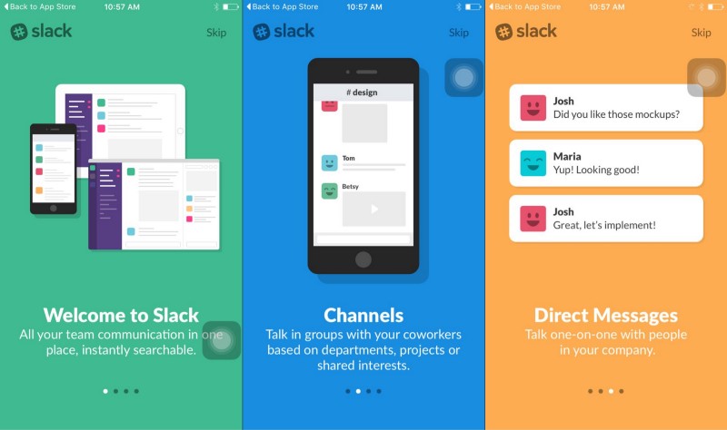
Illustrations can reveal their full potential for clarification during onboarding. Meaningful artworks not only allow for a quicker explanation of the product, they also make the user interface more live.

Like in real life, first impressions rely heavily on visuals. That's why illustration is so good for onboarding. Image: Slack
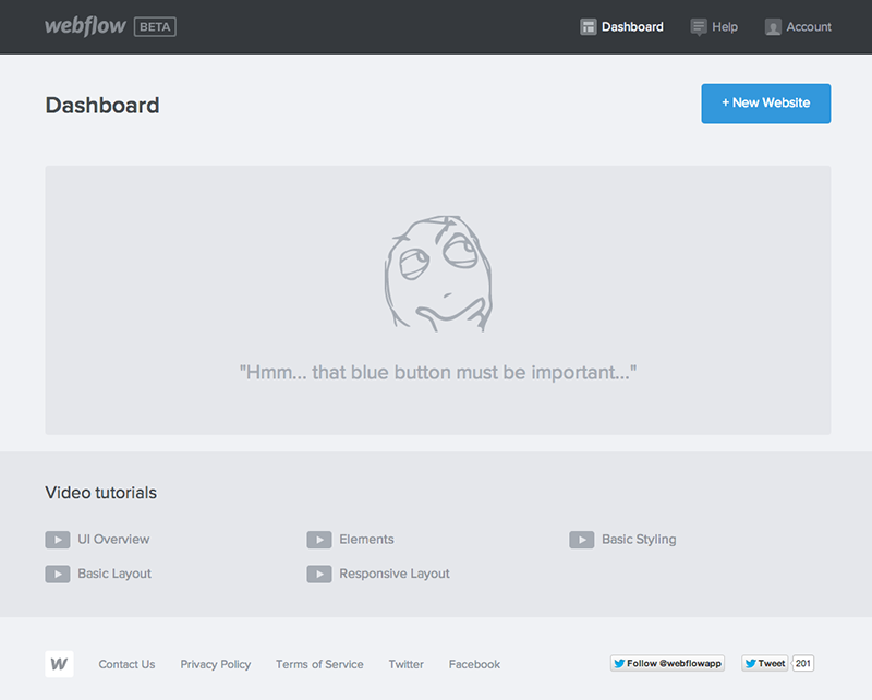
Illustrations are so powerful that they can even compel a user to take action.

Many users will be curious about the button. Image: Webflow
#2. Delight users
'Delightful' is a word we use to describe interactions that have a pleasurable effect on users. Users can interact with dozens of product on a daily basis, but they always remember products that make them feel great. When they find such products, there's a good chance they will stay loyal to them.
Good news for designers is that illustrations can be used to delight users.
##User reached a goal
Animated illustrations which appear on a screen at the time when users achieved a goal can evoke a feeling that users achieved something significant.

Make users feel a joy of inbox zero. Image: Google
##User is confused or frustrated by something
'Anxiety' is a term we use to describe the things that make users nervous. It's possible to mitigate anxiety through UX - using illustrations; it's possible to translate the moment of anxiety in a moment of delight. For example, when users see an empty state during the first-time product usage, the way an empty state is designed can make a significant difference.
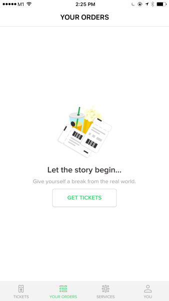
Illustration acts ass an anxiety reliever. This app uses illustration to help users get started using the app.
Or when a user reached a frustrating point in a journey (such as, when a user experiences error state).

Error messages which is shown in OfferUp when a service is down
#3. Communicate personality
It's possible to distinguish your product from the crowd with unique and custom-made illustrations.
##Illustrations as the identity of your brand
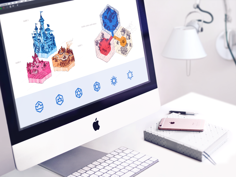
Illustrations can dictate the brand's identity. Illustrations created according to the brand visual language can build a strong brand recall. When users see such illustrations they immediately connect them to the brand.

Google uses its unique visual language for illustrations. Image: Google via Maya Stepien
##Mascots
A mascot is a specific illustrated object that people identify with a product or brand. A well-designed mascot can create an emotional connection between the user and the product.
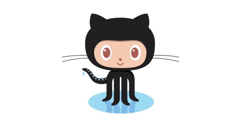
The mascot gives life and character to a product - it helps users connect to a product and creates a genuinely memorable user experience. Image: Github
One of the most known mascots in the tech industry is Freddie, the friendly chimp from MailChimp. It became the element of product's identity.

##Create mood
Using illustrations, it's possible to set the mood of the website or app. The power of visuals establishes an emotional appeal from the first seconds of interaction.
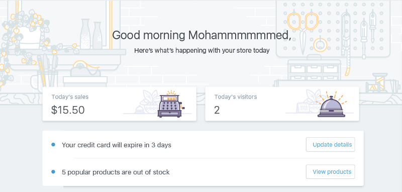
It's essential to make illustrations harmonic with the general stylistic concept of the interface. Illustrations should be accomplished in accordance with the general stylistic decision of the whole app or website.

Shopify creates a mood using illustrations. Image: Meg Robichaud
Conclusion
Illustrations are a powerful tool in designer's toolkit. Want to add beauty, emotion or describe a story in your UI? You can use illustrations to achieve those goals!
