Mobile UX Design: Sliders

Sliders has been around for a long time and has become the de facto standard for selecting and filtering in apps. However, sliders deserve special consideration from designers — precisely because they make it so easy for users to screw up their queries, leading to results that are either incorrect or of poor quality.
Why Should I Use Sliders?
Because sliders are intuitive. They translate well from the physical world to touchscreens, where they look good and don’t take a lot of space. Users like sliders when the metaphor of a slider is applicable. So when the user is thinking of the subject as a continuum, like a temperature slider is nice, because you tend to think of temperature in terms of “a little colder than now”, instead of numbers like “I want temp 23”.

Tip: Continuous range sliders aren’t always the best choice. Discrete stops are better for small sets of predefined values, such as product ratings.
Is an Exact Value Necessary?
Sliders are hard to adjust precisely — both in the physical world and on touch devices. Simply because adjusting a tiny peg in the middle of a large screen is difficult.
Thus, sliders work best when the specific value does not matter to the user, but an approximate value is good enough. Also allowing the selection of a very specific value is often not necessary to the user.
A slider with a histogram (as shown below) can be very helpful in preventing a zero response. A high bar represents a large numbers of items, and a proportionally short bar represents a smaller number of items.
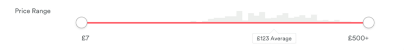
Tip: There is a possibility that users don’t get the histogram. In such case, they just ignored it and continued to use the app without any issues.
Think About the Thumb and Don’t Cover The Numbers
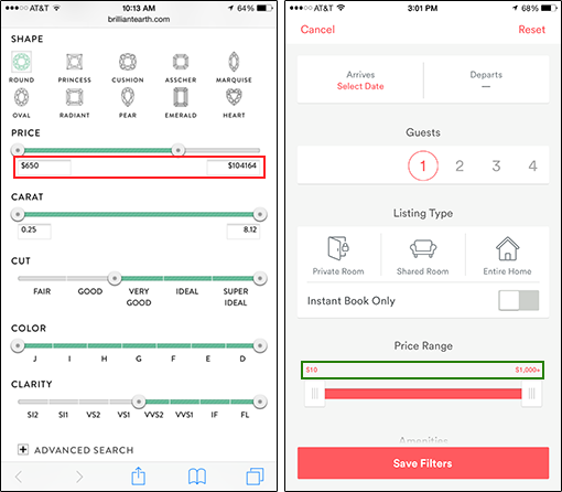
While labels placed directly below the slider may work on desktop designs, the same label placement does not work well for touchscreen because the labels may be obscured by the users’ finger while they are interacting with the control. In order to remain visible during use, the values should appear above the pins, where the user’s fingers would not cover them.
Provide a Visual Feedback
Visual feedback is extremely important in user interface design. In real life, buttons and controls respond to our interaction, and this is how people expect things to work. Upon an input event, the system should provide instant visual confirmation.
Tip: Visual feedback works because it appeal to the user’s natural desire for acknowledgement.
Conclusion
Sliders look great, but aren’t always the best tool. They are good when you want something that is relative, but not very good for exact values, unless you also have text boxes that users can type into. When designing a slider make sure that the users can select that range (or single value) correctly without having to struggle too much to hit a precise value.
Thank you!