Accessible Interface Design

Part 1: On Designing With Accessible Colors
A well-designed product is accessible to users of all abilities, including those with low vision, blindness, hearing impairments or motor impairments. Accessibility enables people with disabilities to perceive and interact with systems and applications.
While this series of articles primarily apply to mobile UI design, it could be useful for almost any other design project. And this article focuses on importance of accessibility and highlights practical aspects on designing with accessible colors.
People First
People are the first consideration, and application should be designed with the needs of everyone in the audience in mind. You should design for people who are young, old, power users, regular users, and those who need additional assistance. Improving your product’s accessibility enhances the usability for everyone who uses it.
Clear Purpose and Universal Usability
Help users navigate your app by designing clear layouts with distinct calls to action. Every additional UI element (button, image, even a line of text) makes the screen more complicated.

Design for clarity and simplify your app’s UI with:
- Clearly visible key elements.
- Sufficient contrast and appropriate size.
- A clear hierarchy of importance.
Solid Structure and Easy Interaction
People feel confident using the design if it is robust.

Design your app to accommodate a variety of users and your app should make it easy for each user to:
- Navigate. Give users confidence in knowing where they are in your app and what is important.
- Access your app. Use appropriate labels for buttons and other controls to accommodate users who experience a text-only version of your app.
- Understand important tasks. People should navigate an app following self-explanatory signposts. You can reinforce important information through visual and textual cues. Use color, shape, text, and animation to communicate what is happening.
Color and Contrast
Making sure that colors in your digital interface are accessible for your users is a really important aspect of a well executed visual design. You should use color and contrast to help users see and understand your app’s content, interact with the proper elements, and understand actions.
Accessible Color Palette and Contrast Ratios
Contrast ratios represent how different a color is from another color, commonly written as 1:1 or 21:1. The higher the difference between the two numbers in the ratio, the greater the difference in relative luminance between the colors.

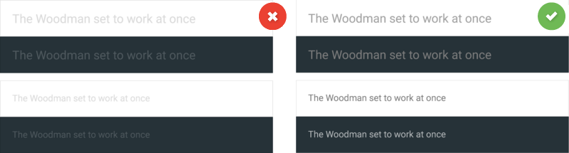
According to the W3C Web Content Accessibility Guidelines (WCAG), small text should have a contrast ratio of at least 4.5:1 against its background and large text (at 14 pt bold/18 pt regular and up) should have a contrast ratio of at least 3:1. This rule helps people with different types of color deficits see and read the text on your screen.
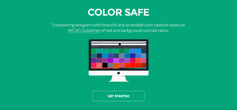
Online tools like Color Safe can help you find an accessible color palette for your designs. It aims to be your first step in the process of selecting accessible colors for apps and interfaces.
Don’t Rely on Color Alone
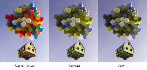
Colorblindness affects approximately 1 in 12 men (8%) and 1 in 200 women in the world. If color alone is used to convey information, people who cannot differentiate between certain colors and users with devices that have non-color or non-visual displays will not receive the information.
Colorblindness takes different forms (including red-green, blue-yellow, and monochromatic), so it’s important to use multiple visual cues to communicate important states.
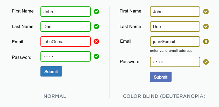
In the example below, the form field design relies only on color (red and green ) to indicate fields with and without an error. Imagine you submitted a data and receive a message “There was a problem with your submission. Please retry” and there’s nothing indicating the cause of the problem. This is a typical scenario that users with color blindness experience every day since they cannot differentiate the fields highlighted in red.
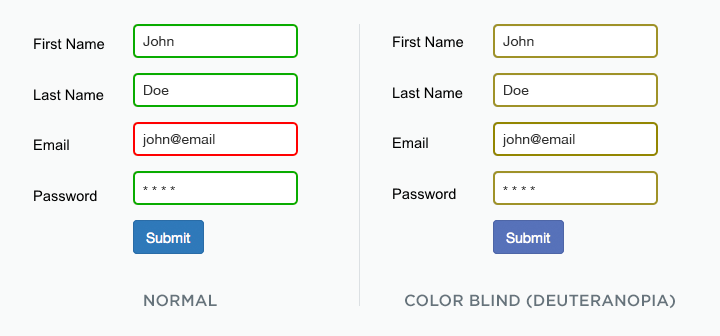
There are many acceptable ways to make this form visually accessible. One approach is to use both colors and labels where users’ attention is required. In following example, we notify user about the problem using visual cues and inline error messages which helps indicate fields with error.
A good example of this is Facebook’s form fields and the error messaging. It has the red circle icon in all of the error fields. It also use text to indicate and explain why a given field is in error by asking a direct and plan question.
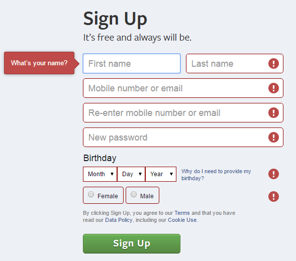
Facebook’s logo and blue color scheme was specifically chosen since Mark Zuckerberg is red-green color blind and sees blue the best.“Blue is the richest color for me. I can see all of blue.”
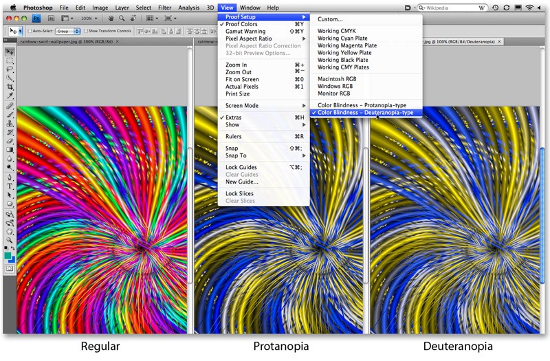
You can simulate color blindness to help aid in design. In Adobe Photoshop you should:
- Convert the image to RGB color scheme (this scheme provides the most accurate results for color blindness).
- Choose View > Proof Setup > Color Blindness, and then choose either Protanopia-type or Deuteranopia-type.
Conclusion
Think “accessibility first.” Remember that we aren’t designing for designers. We are designing for our users.
Feature reading:
Create Emotion With Color In UX Design