Notifications for Mobile Apps
Designing notifications to be useful and relevant for your users is extremely important. Good notifications give people information and functionality that’s important right now. Mobile apps can use notifications to let people know when interesting things happen, such as: a message has arrived, an event is about to occur, new data is available for download or the status of something has changed.
Also notifications can be powerful tools for businesses to communicate directly with users and deliver the right message at the right time and place in order to promote engagement.
What is Good Notification?
Good notifications are relevant, timely and contextual. The best advice for notification designers is to respect the user’s time and attention, to do more with less.
Relevant and Valuable
When users start using your app they don’t mind getting notifications as long as they carry enough “value-for-interruption,” meaning they are useful and interesting enough to them.
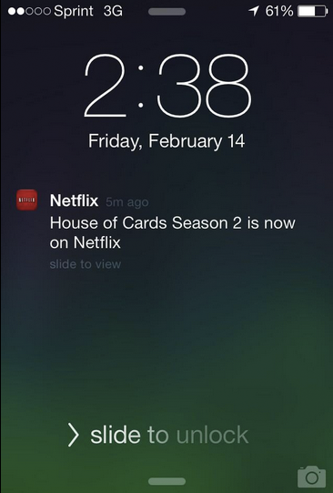
Netflix does a great job of personalizing their notifications. They use push notifications to let users know when their favorite shows are available.
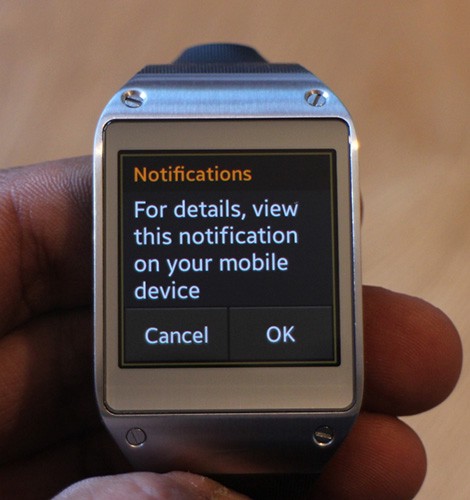
- Expire a notification when it is no longer relevant. For examples, a special online offer that ends at midnight shouldn’t be displayed after it has expired.
- Don’t use periodic updates for content that user’s expect to receive immediately (such as real-time updates), or content that’s generated at unpredictable times (such as incoming emails). Use push notifications to deliver more time-sensitive updates.
- If you’re going to keep users informed about real-time events, make it timely or else users might think that notifications aren’t quick enough.

Minimize Interruption
Notifications inform users about events in your app while the user is focused elsewhere. As they can be interruptive, use notifications judiciously. Annoying notifications is the #1 reason people uninstall mobile apps (71% of respondents).
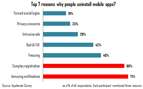
Don’t send out notifications just because you can. Increasing the frequency of notifications doesn’t necessarily increase the value of your app.
- Information that is currently on screen (such as an active chat conversation)
- Technical operations that don’t require user involvement (such as data syncing)
- Transient error states that can be resolved without user action
- As a sales channel (ads or spam)
Also you should respect your user’s battery life. Users can receive notifications at any time, even when their device is in a low power state. The more notifications that you send, the more resources it will require and the more frequently you will wake up the device. Keep this in mind when you determine the frequency of your notifications.
Takeaway: Mobile is all about making every message count. Choose the lowest frequency of notifications that still delivers a great user experience.
Things to Remember When Designing a Notification
Follow the KISS Principle
Keep the message clear and understandable. No matter what the content of the notification is, make sure it speaks the same language as your users, literally and figuratively.
Summarize Notifications
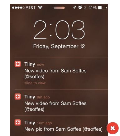
Don’t send multiple notifications for the same type of event. If you send multiple notifications for the same event, you fill up the notification list and users are likely to turn off notifications from your app.
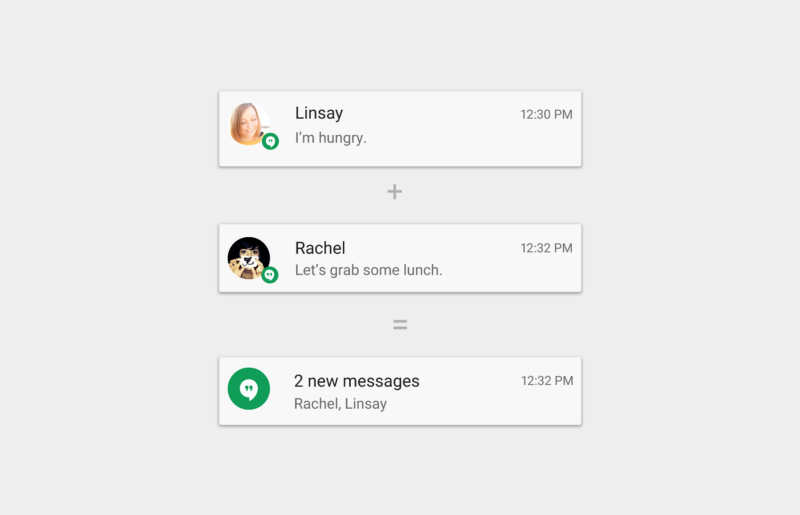
If multiple notifications of the same type are available, combine them into a single summary notification. A summary shows how many notifications of a particular kind are pending.
Navigate to The Right Place
When the user touches a notification, enable the user to take immediate action. This may open a detail view, such as a message, or a summary view for multiple notifications
Make Notifications Optional
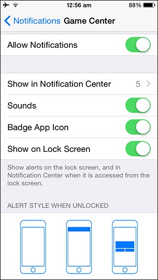
Users should always be in control of notifications. Allow users to disable or change notifications in your app’s settings.
Conclusion
We all experience the annoyances of poorly designed notifications. The worst offenders get their notifications turned off, their apps uninstalled, and worst of all, horrible reviews. But thoughtful, interesting, and actionable notifications that are closely coupled with users’ needs, can add real value to your application.
A great notification strategy must be backed by a great application. No notification strategy will take the user to your application if the application does not provide a valuable service to the user. So you may need to focus on many functional things before even thinking about adding notifications.
Thank you!