The Power of Defaults

The Power of Defaults

Defaults are the values or settings that come out of the box. They might not seem like much, but defaults (and their designers) hold immense power — they make decisions for users.

In this article, we’ll discuss how to use pre-populated input fields and default settings in apps for better user experience.

Default Values in Form Input Fields

Filling out a long form can sometimes be enough reason for the user to go somewhere else, where the process is easier. By providing good default values, you save the user from the hassle of selecting all the relevant choices.

Default should be what the majority of your users will want

Pre-populate fields with the value if you can determine it in advance, but be sure that a large portion of your user’s (e.g. 95%) will select that value. People scan forms quickly online so don’t assume they will take the time to parse through all the choices. They simply may blithely skip by something that already has a value.

Good defaults design can be found on travel sites. Skyscanner pre-populates cabin class and travellers fields to what most other users typically select.
##Use smart defaults Typing has high interaction cost; it is error-prone and time-consuming even with a full keyboard (and even more so on a touch screen). Try to minimise typing and prevent users from making errors — use smart defaults. Here are a few examples of how smart defaults can help users both reduce mistakes and increase productivity:
  • Pre-select the user’s country based on their geolocation data.
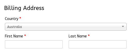
If you’re able to determine that user location is Melbourne, the country field should be pre-populated with value “Australia.”
  • Make the interface do as many calculations as possible. In the screenshot below the interface is calculating total in $ and then total cost to a client in Euro.
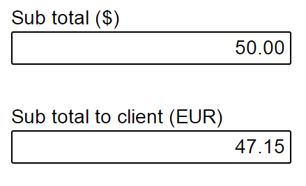
Try keeping the data entry to a minimum.
##Don’t use defaults for input fields that require user attention Do not use defaults for anything that requires user thought (e.g. signing up for newsletters or accepting terms of use). ![](/content/images/2017/04/new.png) ##Make it easy for the user to change default settings Even if you make a good well-researched default, there is always a possibility that users want something else. Thus, it should be possible to change the default relatively easily. ![](/content/images/2017/04/app-navigation-and-exploration-nugget-5.png)
As was mentioned above, auto-detection of location can save users time. However, there are times when users need to select a different location (e.g. find a store that’s not located nearby). Image credit: Google
#Default Settings in Apps You should strive to make you app work perfectly for the user out of the box. Use default settings when it is possible for the app to make qualified guesses regarding what the user might choose.  ##Helpful defaults Statistically speaking, users will rarely change the default settings in apps, even if customization options are available. Jared Spool in his article [Do users change their settings?](https://www.uie.com/brainsparks/2011/09/14/do-users-change-their-settings/) says that according to his observations:

Less than 5% of users change default settings

Another study Analyzing Facebook Privacy Settings: User Expectations vs. Reality found that Facebook users are confused about the privacy settings and usually assume they have more privacy by default than they really do. This means that:

Users assume you have their best interests in mind

Considering these two factors, you should make your app the most welcoming and useful with the default settings:

  • Conduct research to find out how people use your product. Don’t just ask users what they want, find out how to best fulfil their goals and build your defaults around that.
  • Set all critical settings to the safest (and helpful) for user values. For example, the features such as autosave for text editor should be turned on by default.
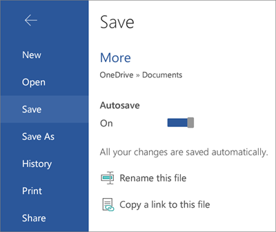
Settings can define preferred application behaviours

You can use the default settings to instigate the actions you want the user to follow. Slack provides a good example of how to make users aware of the default settings and how to update them.
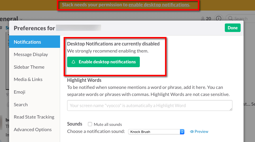
Slack advice users to enable desktop notifications
#Conclusion People tend to stick to the defaults. Defaults are incredibly powerful tools for guiding users, speeding up system usage, and influencing responses with the power of suggestion.

Thank you!

Subscribe to Nick Babich

Don’t miss out on the latest issues. Sign up now to get access to the library of members-only issues.
jamie@example.com
Subscribe