Wizard Design Pattern
Today I’d like to talk about the topic of wizards, and I don’t mean those guys with the hats and all the magical spells. I mean the step-by-step process that we use in apps or websites to guide someone through a process.
Should you use a wizard? Isn’t a wizard just a patch for a bad interface? In this article, you’ll find answers to these questions.
What is a Wizard?
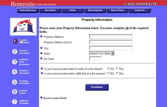
A wizard presents a series of steps or conditions that the user needs to complete in order to accomplish a goal (e.g. use a product). This pattern was firstly introduced in the physical world (a famous paper quick start guide that you definitely have together with all your appliances) and not so long ago was introduced in digital forms (e.g. a software installation wizard).
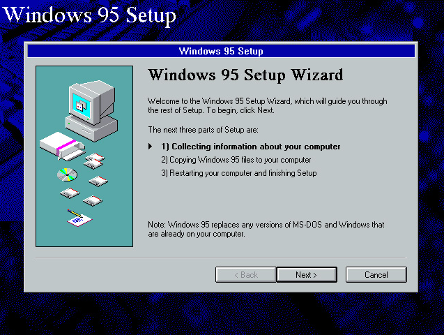
As was previously mentioned, one common example of such task is a software installation. Before installation wizards were common, users had to copy files themselves, edit configuration files, set up control directories, and check to see if the software was functioning. A setup wizard transformed this complex set of conditions into understandable steps. The payoff of using wizard was clear — reduced support and training costs.
Takes the burden of decision making off of the user
The wizard is especially good when users lack the necessary domain knowledge. Completing a task gets easier: the user can just follow a preplanned, step-by-step path to accomplish his goal: “Don’t make me think, just tell me what to do next.”
When to Consider a Wizard
Wizards can help in following situations:
Users want to accomplish a goal that has many steps
You are designing an UI for a task that is long or complicated and it cannot be simplified. Using wizard it’s possible to reduce the seeming complexity of a task and provide a sense of progress at the same time.
Users must complete steps in a specific sequence
In this case, a wizard support users performing a task by lowering the learning curve. When users are forced to follow the order of tasks, users are less likely to miss important things and will hence make fewer errors.
When a wizard may not help
Use this pattern very carefully. Breaking up a task into smaller steps does not always provide a better user experience:
When the task itself isn’t complex
The very need for a wizard indicates that a task may be too complicated. If you can simplify a task to the point where a short form or a few button clicks can do the trick instead, that’s a better solution.
When the audience is too advanced
Even when dealing with complexity, wizards are not the slam-dunk answer for creating an optimal UI design solution. Power users often find wizards frustratingly rigid and limiting (since wizards don’t show users what their actions really do, or what application state gets changed as choices are made). It’s quite common when wizards try to “help” with things users already know how to do. This is particularly true for software that supports creative processes such as art or coding.
Tip: Allows users to choose the way they want to complete the task.
When you want to teach
Don’t use a wizard to present a concept. The users don’t read supplementary text when they are using a wizard. They are very focused on getting their work done.
Best Practices for Wizards
When designing your next wizard, there are also several good things you can do to ensure its effectiveness:
Keep the number of steps at the minimum
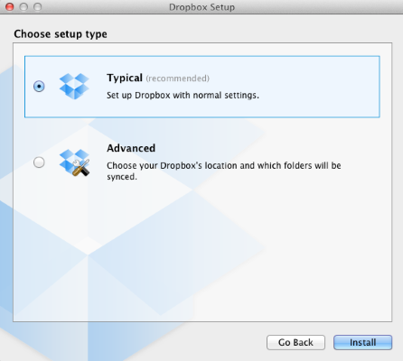
The hard part of designing this kind of UI is striking a balance between the sizes of the chunks and the number of them. It’s silly to have a 2-step wizard, and a 10-step wizard can seem overwhelming or tedious. Ideally, the process should have 3–5 steps. Putting your wizard through a usability test will help ensure the number of screens is acceptable.
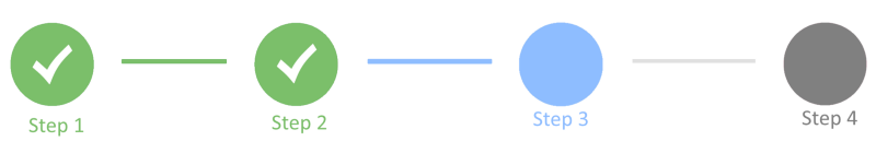
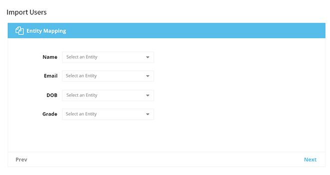
Keep the wizard’s purpose clear
At each step, users need to understand clearly what the wizard is asking. A wizard should provide enough information for users to make decisions and act on them. If it isn’t clear, users get stuck. There are two things that are essential to being clear about your wizard’s purpose:
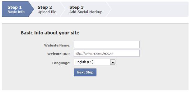
- A clear, concise wizard label on every screen
- A brief explanation of purpose on the first screen.
- Numbering the steps
- Show the direction of movement (as a rule it is from left to right or from top to bottom)
- Distinguish the current step, and how many steps there are left.
- Incorporate an indicator that shows successful completion of a step
- Greeting final message with results
Thank you!