Text Fields in Mobile App

Mobile devices have many challenges when it comes to UX design. One of the most obvious design challenges is dealing with the limited screen real estate during tap input. It is critical that product designers, developer and product managers understand the best ways to make this process really simple for users.
This article highlights three key factors that improve data input, which are speed up input, providing help and assistance for users and indicating problems directly related to the user’s input.
Input
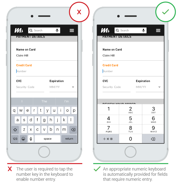
Match the Keyboard With the Required Text Inputs
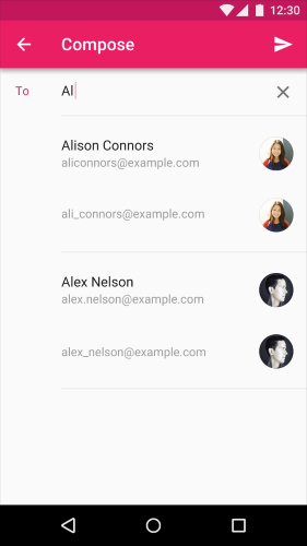
App users appreciate apps that provide an appropriate keyboard for text entry. Unlike physical keyboards, touch keyboards can be optimized for each form field the user has to fill out and the type of text field determines what kind of characters are allowed inside the field. Common input types for which you should optimize include:
- Number: phone number, credit card number, PIN
- Text: proper name, username
- Mixed format: email address, street address, search query
Ensure that this matching is implemented consistently throughout the app rather than only for certain tasks but not others.
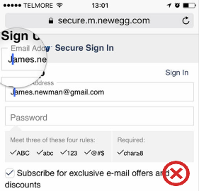
Configure Auto-Capitalization Appropriately
Configuring auto-capitalization settings appropriately is important to mobile form field usability. The first letter in each text field should be capitalized if required by the locale, as well as the first letter of each sentence. For example, this is especially relevant for input fields that:
- Ask to name something, such as a user‘s first or last name
- Contain sentence-like messages, such as text messages
However, you should disable auto-capitalization in email field, because when it’s turned on users might go back and delete the first capital letters as they fear e-mail delivery issues.
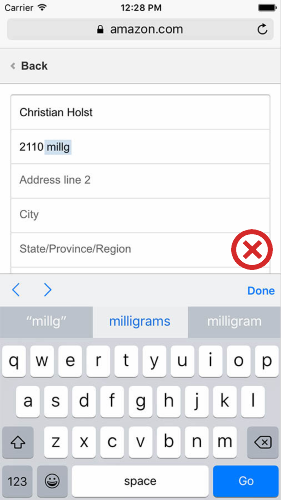
Disable Auto-Correct When the Dictionary is Weak
Poor auto-correction is frustrating when users notice it, and can be downright harmful when they don’t. Auto-correct often works very poorly for things like abbreviations, street names, emails, person names, and other words that aren’t in the dictionary.
Old version of the Amazon’s mobile app had auto-correct mode turned-on for the address field, which caused valid entries to be overwritten by auto-correct.
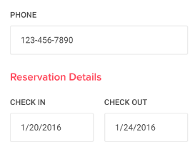
Fixed Input Format
Don’t use fixed input format. The most common reason for forcing a fixed format is validation script limitation (your back-end can’t determine the format it needs). In most cases it’s a problem of development, not user. Rather than forcing the format of something like a phone number during user input, you should make it possible to transform whatever the user entered into the format you want to display or store.
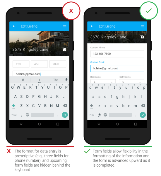
This solution can be paired with autocomplete functionality, which significantly speeds up the user’s actions. Autocomplete presents real-time suggestions or completions in dropdowns, so users can enter information more accurately and efficiently. It’s especially valuable for users with limited text literacy or who have difficulty with spelling, especially if they are using a non-native language.
You can also provide helpful information in context of the input field. Have relevant, in-context information ready to assist users to move through the process easily.
Limited Number of Words
Labels aren’t help texts. You should use succinct, short and descriptive labels (a word or two) so users can quickly scan your text fields.
- Once the user clicks on the text field, the label disappears and thus the user cannot double check that what he/she has written is indeed what was meant to be written.
- When users see something written inside a text box, they may assume that it has already been prefilled in and may hence ignore it.
Good solution for the placeholder text is a floating label — when the user engages with the text input field, the floating inline labels move to float above the field.
Label Color
The label’s color should reflect your app’s color palette, while also meeting appropriate contrast ratios (shouldn’t be too bright or too dark).
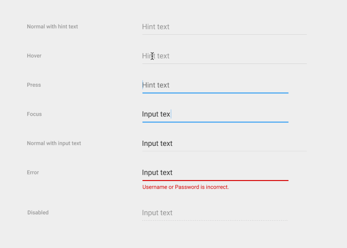
Real-time Validation
Users dislike when they go through the process of data input only to find out at submission, that they’ve made an error. The right time to inform about the success/failure of provided data is right after the user has submitted the information.
Real-time inline validation immediately informs users about the correctness of provided data. This approach allows users to correct the errors they make faster without having to wait until they press the submit button to see the errors. Use a contrasting color for error states, such as a warmer hue like red or orange.
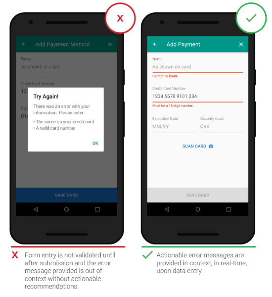
- What went wrong and possibly why.
- What’s the next step the user should take to fix the error.
Again, it should avoid using technical jargon. The rules are simple, but somehow they are very easy to ignore.
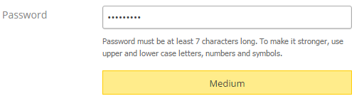
Right Color
Color is one of the best tools to use when designing validation. It works on an instinctual level, adding red to error messages, yellow to warning messages, and green to success messages is incredibly powerful. Below is a good example of validation for the password text field:
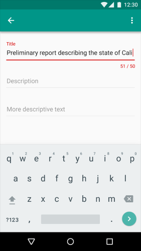
Another good example with using color is a character restriction for the input text field. Character counter with a red line showing that the restriction has been exceeded.
But make sure that colors in your digital interface are accessible for your users, it’s a really important aspect of a well executed visual design.
Conclusion
You should make the process of data enter as easy as it possible. Even minor changes such as auto-capitalization or indicating what information goes in each field can significantly increase input field usability together with overall UX. Think deeply about how the user is actually using your mobile app when they’re able to give inputs and make sure you’re not missing something obvious when designing your app.
Thank you!