Using Red and Green in UI Design

Color has a significant impact on our perceptions and emotions. Used correctly, color can evoke a specific reaction in your users. For this article, I want to focus on two particular colors - red and gree. There's a reason why I want to do it:
Both red and green are extremely important for UI design because they are actionable
Let's explore common ways of using red and green as an accent color in user interfaces.
Red
- Importance. It's a highly visible color that is able to focus attention quickly and get people to make quick decisions.
- Red is a very hot color. It's an intense color that is packed with emotion ranging from passion to anger.
- Warning or danger. Flashing red lights often mean danger or emergency.
Error state
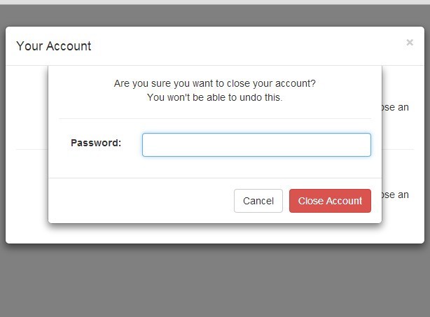
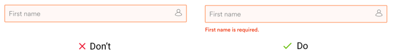
Red is often associated with either a warning or something which is crucial to see. That's why red is the first color that comes to mind when we think about error states. Paired with a cross icon, red delivers the message that something went wrong in a glance.
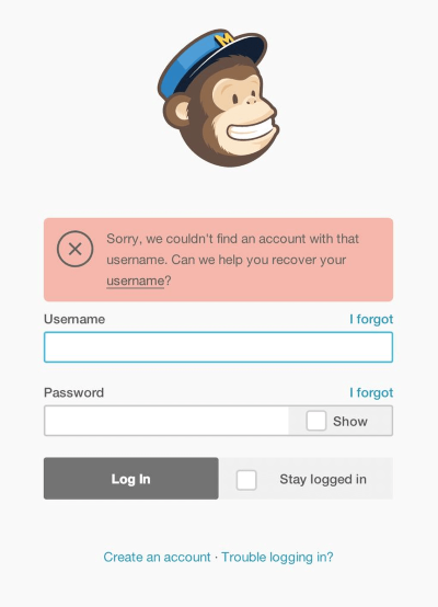
Both deletion of a file or closing an account are good examples of using red in design. When users see such dialogs the red color encourage them to think twice before making the final decision.
Green
- Green has many of the same calming attributes that blue has. It's one of the most restful and relaxing colors for the human eye.
- A symbol of growth. Green can represent new beginnings and growth.
- The green color is often used to indicate safety or success.
Success state
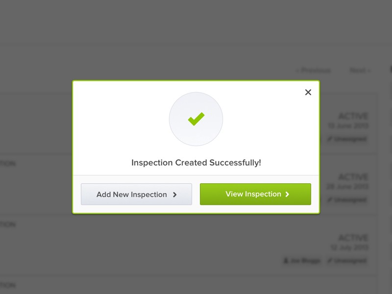
Typically, green is associated with a positive outcome -an action which is complete, a file which has been saved or an online order which was placed. That's why the message that users see when the operation is completed successfully is colored in green.
Checkmark icon paired with green color reassures the user that the user operation was successfully completed
Which Color Converts Better?
The 'red vs green' debate has been a long-running battle on the web. There are plenty of case studies to be found online. One of the most famous is the study by Joshua Porter for Hubspot (The Button Color A/B Test: Red Beats Green). In this study, red button outperformed the green button by 21 %.

But it's important to understand that we can't generalize the results of this and any other similar studies. What works for one particular page, not necessarily work for another.
At the same time, we should take two things into account when selecting a color for CTAs:
- CTA on your landing page should be eye-catching, and this happens only when the button has a significant contrast from surrounding objects and background.
- Both the colors you choose and the context in which you show them are crucial to consider.
What will happen when we change the color of the CTA for Stripe's landing page from green to red? The button is definitely is more eye-catching now, at the same time red doesn't work for this design because it contradicts with aesthetics of this page.

There are many types of color blindness, but the large percentage of color blind people are people who suffer from deuteranomaly and protanomaly. They generally have difficulty distinguishing between reds, greens, browns, and oranges.
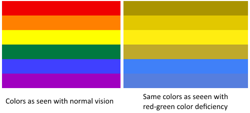
Why? Because the interfaces that use color alone (red and green) pose the risk of confusing color blind users. Always provide additional information such as an icon or text message for error and success states to create better user experience for color blind people.
Helpful resources for color schemes
I want to share a collection of resources that will simplify the task of choosing the right colors for your UI. Enjoy!
Colors - UX Pro