Checklist for Using Icons In UI

Icons are one of the most frequently used elements in graphical user interfaces. What makes a good icon?
In this article, I want to share a simple checklist that you can use to ensure that the icons you use work for your users.
1. Easy to recognize
Clarity is the most important characteristic of a great interface. Unfortunately, icons are often broken clarity.
Icons must first and foremost communicate meaning. When it's not clear what the icon represents, it immediately loses its meaning and becomes nothing more than visual noise.
What makes an icon great is the fact that its meaning can be understood without reading a label
A few simple rules will help you avoid using icons that don't convey the meaning.
Try to use icons that are familiar to your users
User's understanding of an icon is based on previous experience. That's why it's better to use familiar icons rather than unique.
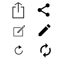
- Rely on universal icons. Icons like home, print, play, and search are so common that they don't require any explanation.

- Conducting research. Check the icons used by your competitors.
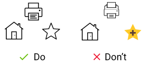
Don't use icons with conflicting meaning
Icons that could represent multiple things should be avoided. For example, the 'Heart' and the 'Star' icons can both mean liking or putting an item to the favorites. When used together they can confuse users.

5-second rule is an effective way to test your icon. Ask people what they expect the icons to stand for.
If it takes more than 5 seconds to think of an appropriate icon for something, it is unlikely that an icon can effectively communicate a meaning
Test scalability
Test if your icons can still be recognized at small sizes such as 15 x 15 px.

Even a slight difference in meaning hinders the ability for a user to understand an icon.
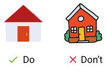
For a long time, Google Docs used icons that look almost like a hamburger. The majority of interfaces uses a similar icon to represent the main navigation menu. But Google redefined its meaning and used it as 'Back' action. When users click on this icon, they were redirected to the Google Docs home page.
KISS principle works for all elements of UI including icons. Keep icons as simple as possible, and avoid unnecessary complexity by following two rules:
- Limit the number of colors used. Use no more than 3 or 4 colors to keep the design clean.
- Reduce the amount of graphic details by focusing on the basic characteristics of the object. Try to keep the design schematic because schematic design translates well on different screens and resolutions.
Create delight by adding an animation effect
Animation can both have a clear functional purpose and delight users. For cases like state changes, it's possible to use animation to create a more dynamic experience.
Both usability and learnability improve when similar elements have consistent look and function in a similar way.
Internal consistency
Icon sets should have visual unification. The icons you decide to use for your product should have the same style. Ideally, they all should look like they were designed by the same person. Here are some of the rules you need to follow to create a sense of unity:
- Use the same color or color scheme for all your icons.
- Use the same shape and other styling attributes (such as the size of borders) for all your icons.
Consistency with a platform
Make sure the style of icon is consistent with the platforms that you target. They will be most recognizable to your users.
Consistency with product family
If you have a product family, make sure that the same (or at least similar) icon style is used in all products.
Bonus
Usually, it's really hard to find the right icon for your project. That's why I want to share a list of resources that will make this task much easier. I'll update the list of a regular basis, so you'll find more helpful resources there.