Storyboarding in UX Design
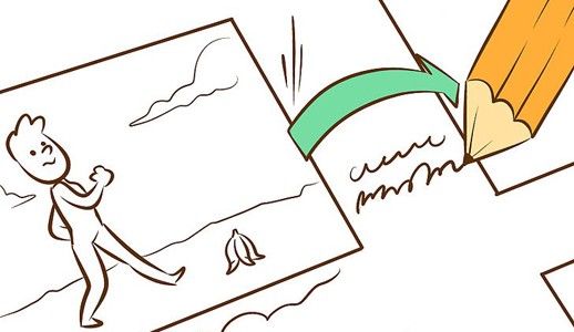
In user experience design we’re familiar with user research techniques like workshops and interviews. We synthesise our research into user stories and process flows. We communicate our thinking and solutions to our teams with artefacts like personas and wireframes. But somewhere in all of this lies the real people for whom we’re designing. In order to make our product better, we must understand what’s going on in their worlds and how our product can make their lives better. And that’s where storyboards come in.
In this article I’ll focus on storyboards as a medium to help explore solutions to UX issues, as well as communicating these issues and solutions to others.
What is a Storyboard?
Storyboards are illustrations that represent shots that ultimately represent a story. Basically, it’s a sequential art, where images are arrayed together to visualise the story. This method came from the motion picture production. The Walt Disney studio is credited with popularising storyboards, using sketches of frames since the 1920s. Storyboards allow them to build the world of the film before they actually build it.
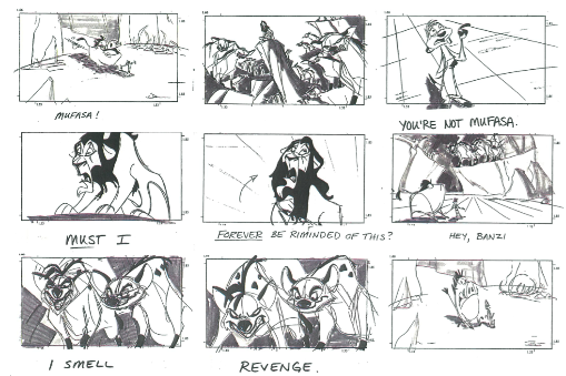
Stories are the most powerful delivery tool for information:
- Visualization. Pictures are worth a thousand words. Illustrating things works best for understanding of any concept or idea. The images can speak more powerfully than just words by adding extra layers of meaning.
- Memorability. Stories are 22 times more memorable than plain facts.
- Empathy. It’s possible to tell a story that everyone could see and relate to. We often empathize with characters who have real-life challenges similar to our own.
- Engagement. Stories capture attention. People are hardwired to respond to stories: our innate sense of curiosity draws us in and we engage more when we can sense a meaningful achievement about to be had.
What is a storyboarding in context of UX design?
Storyboarding in UX is tool which help you visually predict and explore a user’s experience with a product. It’s a very much as thinking about your product as if it was a movie in term of how people would use it. It would help you to understand how people would flow through the interaction with it over time, giving you a clear sense of how to create a strong narrative.
Why does storytelling matter in UX?
Stories are an effective and inexpensive way to capture, relate, and explore experiences in the design process. In relation to UX design process this technique has following benefits:
- Human-centered design approach. Stories put a human face on analytic data. Storyboards bring our solutions to life, so that designers can walk in the shoes of their users, and see solutions as they see them. Storyboarding helps designers to understand existing scenarios, a well as test hypotheses for potential scenarios.
- ‘Pitch and critique’ technique. Storyboarding is a team-based activity and everyone can contribute (not just designers). Same as for movie industry, each scene should be presented and critiqued by all team players. Approaching UX with storytelling inspires design concepts and brings teams closer together around a clearer picture of what’s being designed.
- Iterative approach. Storyboarding relies heavily on an iterative approach. The action of sketching out role-play tests for design concepts, lets designers experiment at little or no cost. Nobody gets too attached to the ideas that are generated because they’re so quick and rough.
Creating your own storyboard
When thinking about storyboarding, most people focus on their ability (or inability) to draw. The good news is that you don’t need to be good at drawing before you start drawing scenario storyboards.
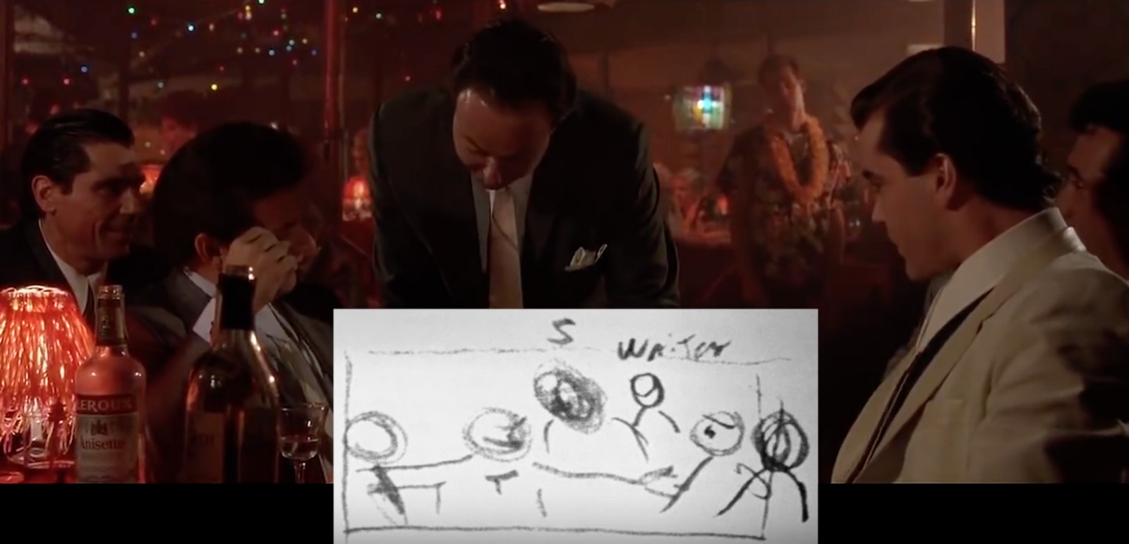
How to work out a story structure?
If you are going to create a visual representation of stories to communicate user issues to others, there’s some preparation to be done to make them logical, understandable and convincing in their arguments. By understanding the fundamentals of the story and deconstructing it to the building blocks, we can present it in a more powerful and convincing way. Each story should have following essential elements:
- Character. The specific persona involved in your story. Their behaviours, appearance, and expectations, as well as any decisions they make along the way, are very important. Revealing what is going on in your character’s mind is essential to a successful illustration of their experience in the storyboard.
- Scene. It’s an environment that the character finds herself in (a real-world contexts that involve place and people).
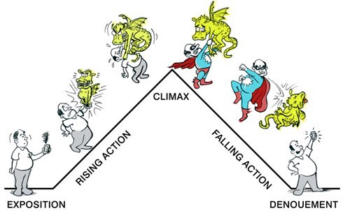
- Plot. All too often you designers jump straight into explaining the details of their design without first explaining the back story. Don’t be one of them — your story must be created with a structure in mind, there should be an obvious beginning, middle, and end. The narrative that unfolds in your storyboard should focus on a goal for the character. Plot should start with a specific trigger and end with either the benefit of the solution, or a problem that the character is left with. Try using Freytag’s Pyramid in structuring your plot.
- Authenticity. The main thing is to make the character, their goal, and what happens in their experience as clear as possible. If you’re writing something that doesn’t resonate with your product, your users will be able to tell. Thus, keep the focus on real humans in real contexts, and your audience will empathise with them.
- Simplicity. Cut out any unnecessary extras. No matter how good a sentence, picture, or page may be, if it doesn’t add value to the overall message, you should remove it.
- Emotion. It’s essential to communicate the emotional state of your character throughout their experience.
Using storyboard to illustrate experiences
Starting the storyboard can be a little daunting, especially if you’re not confident in your drawing skills. But don’t worry, the guideline mentioned below will help you turn out a better scenario storyboard:
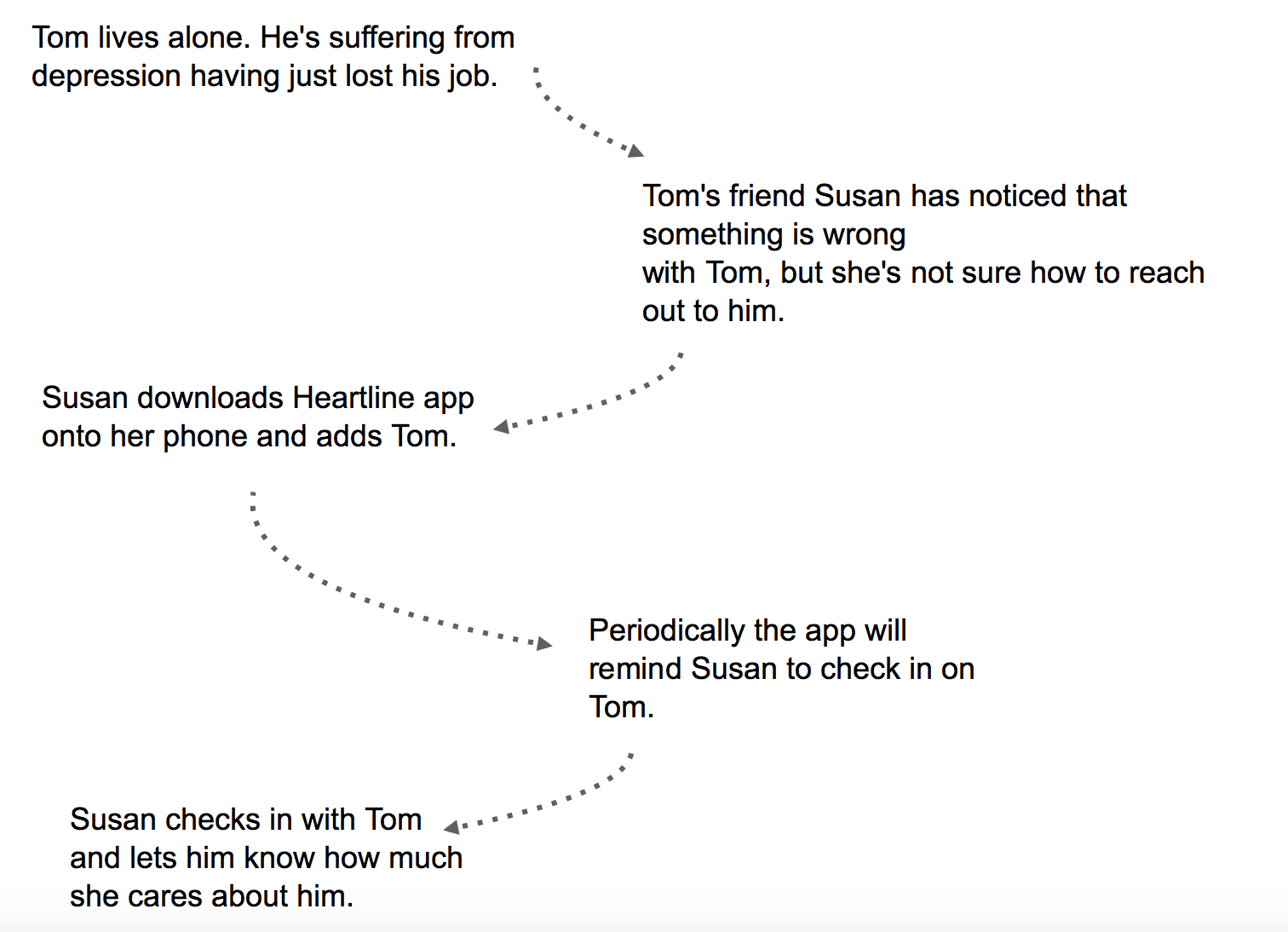
- Start with a plain text and arrows. The main thing is to break the story up into the moments (context, trigger, the decisions a character makes along the way, and ends up with the benefit or the problem).
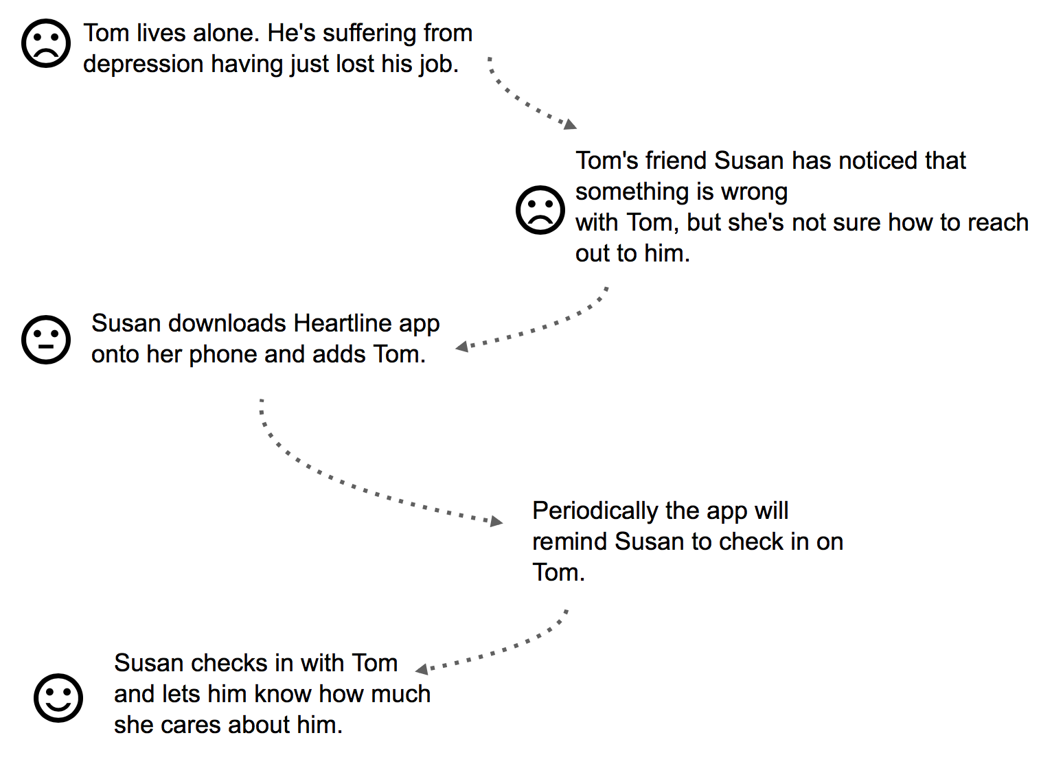
- Add emotions to your story. Add emoticons to each step, to help others get a feel for what’s going on inside the character’s head. Remember to illustrate any reactions to success/ pain points along the way (what is the character expecting to happen, and how does the result affect him/her?) Try drawing in each emotional state as a simple expression.
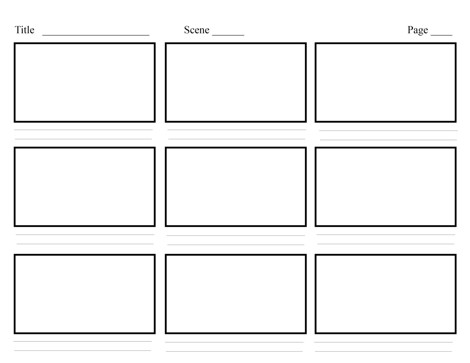
- Translate each step into a storyboard frame. Emphasize each moment, and think how your character is feeling about it.
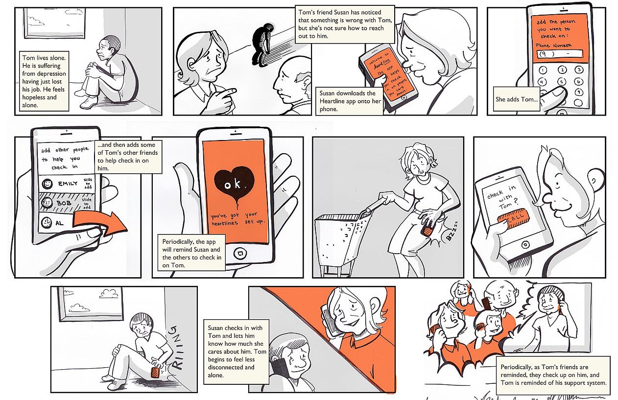
- Design clear outcome. Make sure your storyboard leaves your audience with no doubt about the outcome of the story: if you’re describing an unfavorable situation — end with the full weight of the problem, if you’re presenting a solution — end with the benefits of that solution to your character.
Thank you!