Wireframing: 8 Pro Tips for Designers
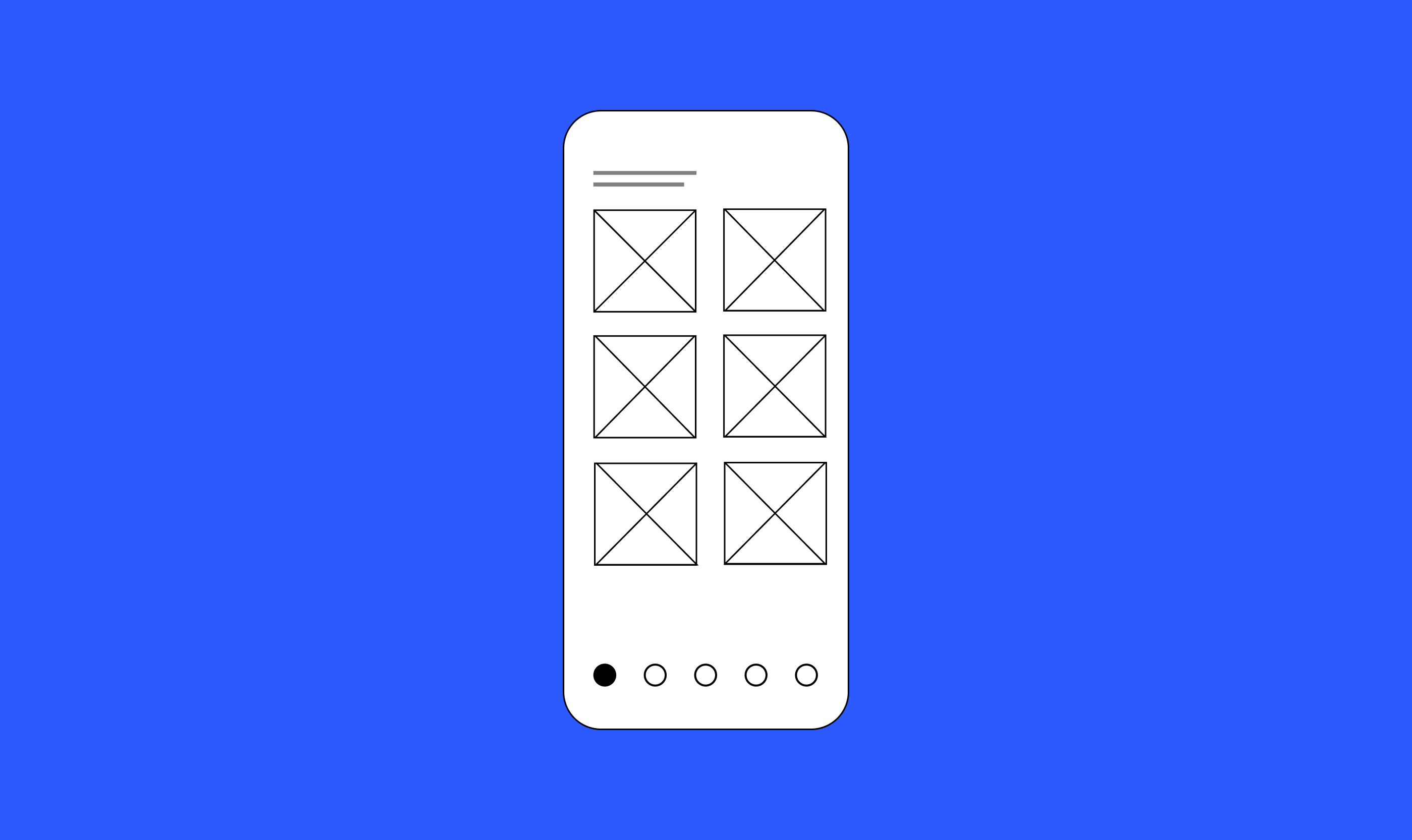
Wireframes are low-fidelity visualizations of a future interface created on a piece of paper or in a digital tool. The purpose of a wireframe is to help designers to understand how content and functional elements should be laid on the screen.
In this article, I want to share 8 tips that will help you make the most of wireframing.
1. Map out a target user flow before starting wireframing
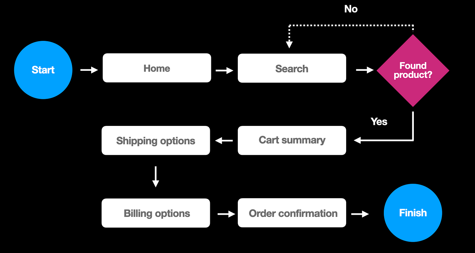
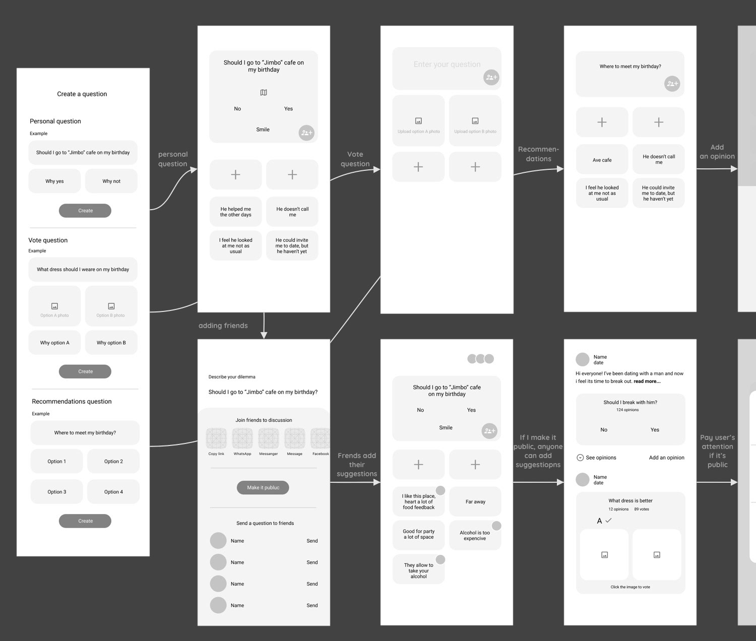
Before starting wireframing, you need a clear idea of how many screens you’ll need to design and how users will interact with them. It’s much easier to form this understanding when you have a user flow that you can use as a reference. It’s possible to visualize the flow using simple objects such as boxes and arrows. For example, below, you can see a simple user flow for the checkout experience.
If you’re interested in learning more about user flows, check this video:
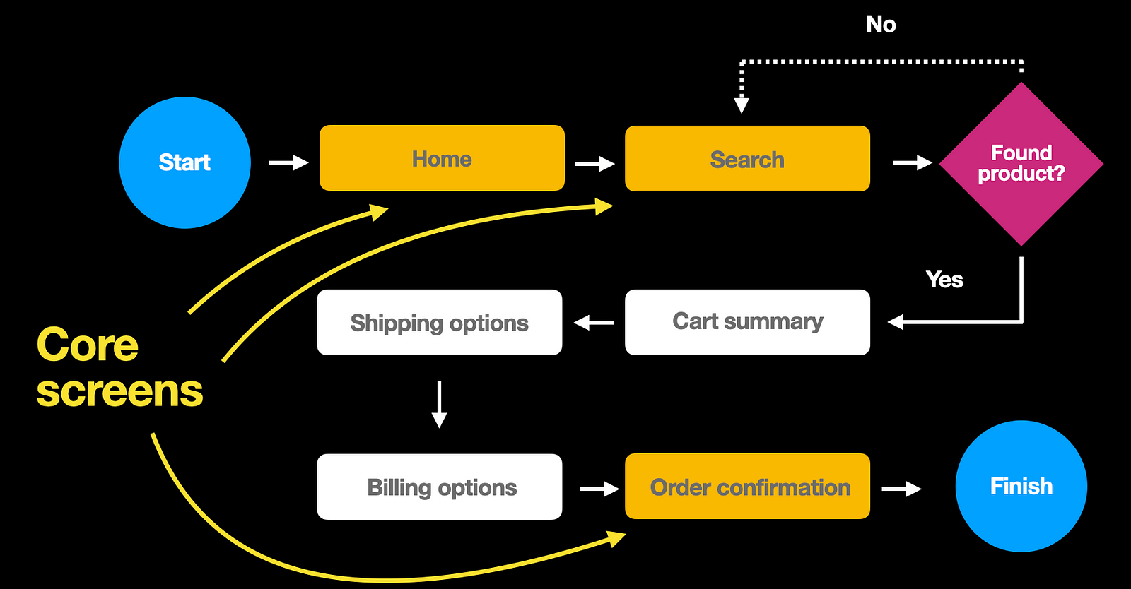
2. Create wireframes for the core screens first
Choose the screens that are the most important for the user flow. It will make it easier to iterate your design.
3. Choose the right level of fidelity
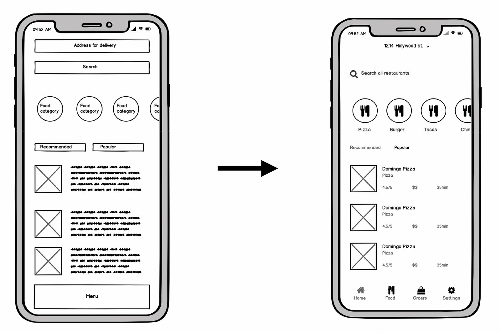
Fidelity is a level of realism that your visual assets have. Wireframes are typically created in low and medium fidelity. Low-fidelity wireframes contain bare minimum design details
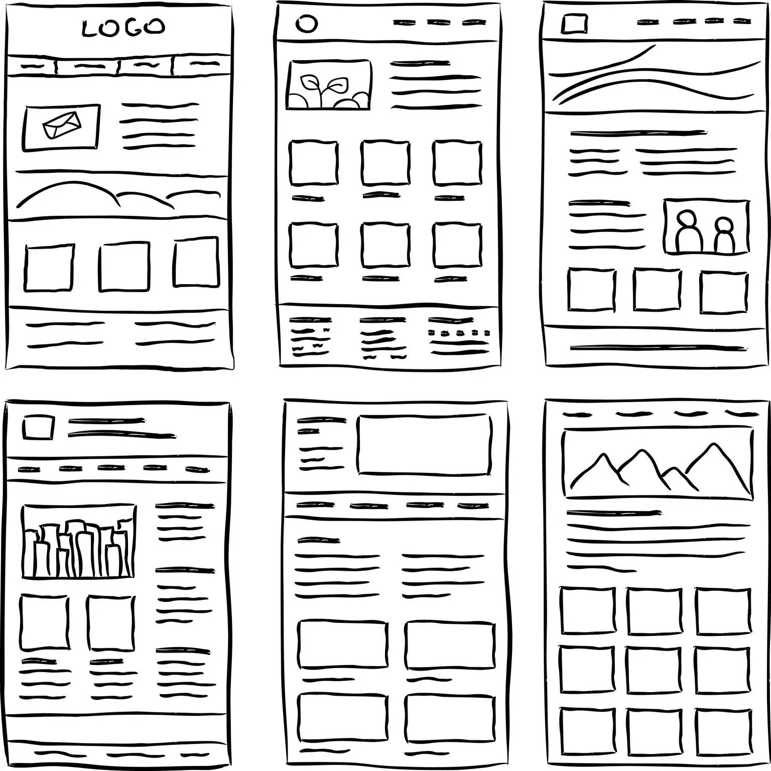
while medium-fidelity wireframes look more like mockups.
Low-fidelity wireframes can be good during the early phase of the design process — when you explore different design directions and want to visualize as many ideas as possible.
The medium-fidelity wireframe should be created when you want to dig deep into a particular solution. Medium-fidelity wireframes are also very useful during discussions with other designers and developers.
4. Use color to draw attention
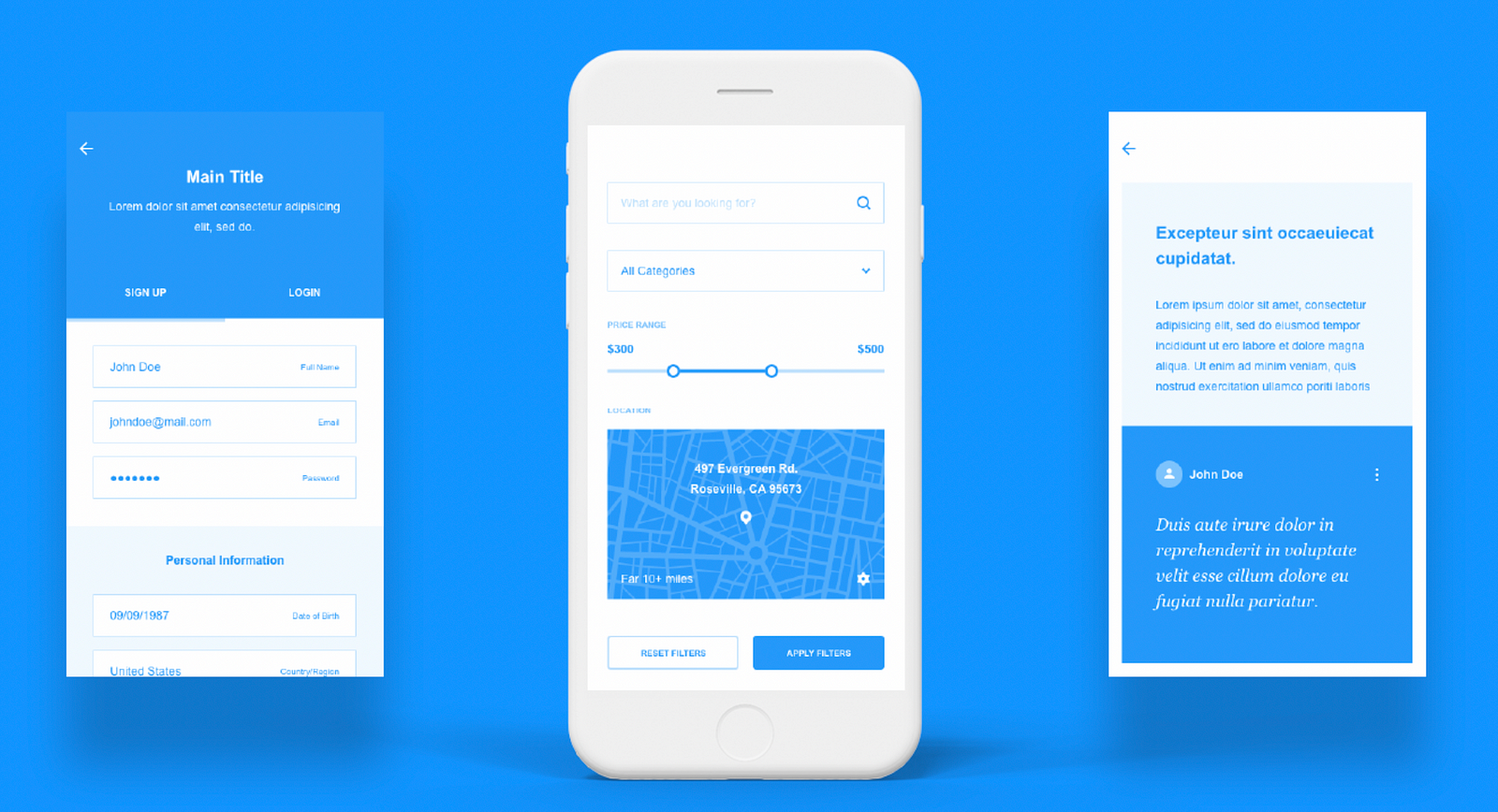
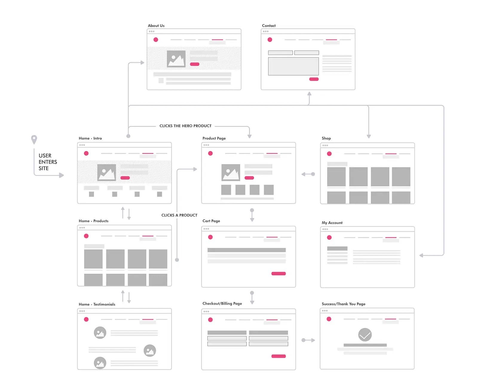
Wireframes are traditionally created in black & white or grayscale, but it’s possible to use one or two contrasting colors to create visual accents and direct the viewer’s attention to a particular object (such as the call to action button). The following example uses contrasting colors to highlight interactive elements.
5. Try to avoid dummy text in mid-fidelity wireframes
In the early stages of the design process, your goal is to create a clear visual hierarchy — layout with a clear structure. You don’t focus on the content at this stage; you must think about how it’s presented. But after you create a decent visual hierarchy, you should start replacing placeholder text with actual copy that you will use in your product.
There is a reason why we should avoid dummy text at this stage — Lorem Ipsum doesn’t say much to people who will review your design. As a result, when they will review wireframes, they can easily misunderstand your design.
6. Create clickable wireframes
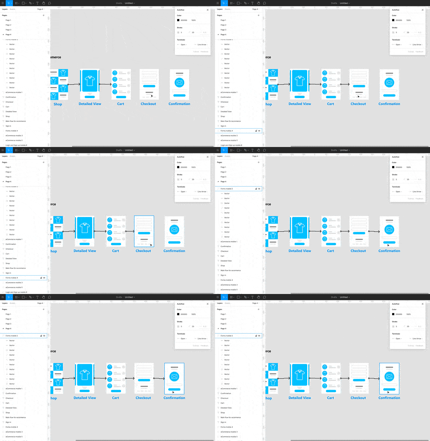
Wireframes are static design artifacts. While it’s possible to ship your design as a collection of individual screens, it’s much better to create a flow out of them or even create a clickable version of wireframes. Clickable wireframes make it easy for the team to understand the details of scenarios — they make you think about the product functionality holistically. For example, when going through the flow, you can notice that you need to introduce an in-between state between some screens to create a smooth journey.
7. Annotate wireframes
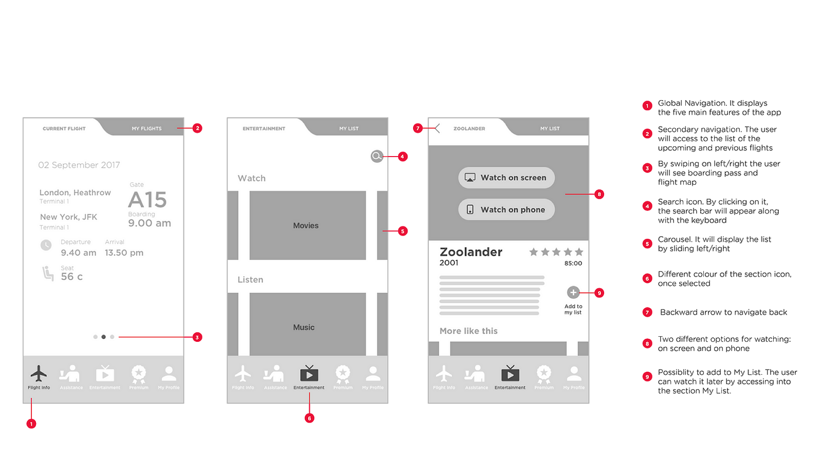
As product designers, we need to provide context and communicate design decisions to team members and stakeholders. If you plan to present a wireframe to the team, it’s always better to include annotations. Annotations help create context and quickly deliver key ideas. Just make sure you use short-to-point annotations. If you need to discuss the concept in more detail (say, you need to write a paragraph of text), it’s better to do it in design documentation, not on wireframes.
8. Use wireframe kits
Don’t create mid-fidelity wireframe from scratch. Use special wireframe kits to speed up the process. Here are two kits that you should try:
- Figma wireframe kit. Free UI kit with essential elements that will help you design your wireframes.
- Platforma. Platforma is paid UI kit that includes 300+ screens. This kit is available for Sketch, Figma, and Adobe XD.
- Wires. Wires are two free wireframe UX kits for mobile and web. You will have 170 mobile templates, 90 web templates, and 240 components inside. The kits are avaible for Adobe XD.
