Z-Shaped Pattern For Reading Web Content

It is easy to imagine every user excitedly reading every letter you write. Get over it, because users don’t do that. They scan.
Users don’t read web pages, they scan.
Scanning means they only stop to read when something catches their eye.
As a designer, you have a lot of control over where people look when they’re viewing a web page you’ve designed. To create the right path the visitor’s eyes are going to follow, you need to understand how our eyes process information. In this article, I’ll explain the theory and practice of creating visual hierarchies in web design using Z-pattern.
What Is Z-Pattern, How It Works and Why It Works
As you would expect the z-pattern layout follows the shape of the letter Z. A z-pattern design traces the route the human eye travels when they scan the page— left to right, top to bottom:
- First, people scan from the top left to the top right, forming a horizontal line
- Next, down and to the left side of the page, creating a diagonal line
- Last, back across to the right again, forming a second horizontal line
When viewers’ eyes move in this pattern, it forms an imaginary “Z” shape:
- When visitor lands on a page what information do you want them to notice?
- In what order do you want them to see the information?
What do you want them to do?
The premise of the Z-layout is actually pretty simple: impose the letter Z on the page. Ideally, you want people to see your most important information first and your next most important information second. Thus, important elements should be placed along the scanning path and visitors should be presented with the right information at the right time.
It’s essential to create a flow
Flow is about leading the eye from one part of a page to another in the direction you want it to move. You create flow through a combination of visual weight and visual direction. Here are a few best practices to keep in mind when creating a flow:
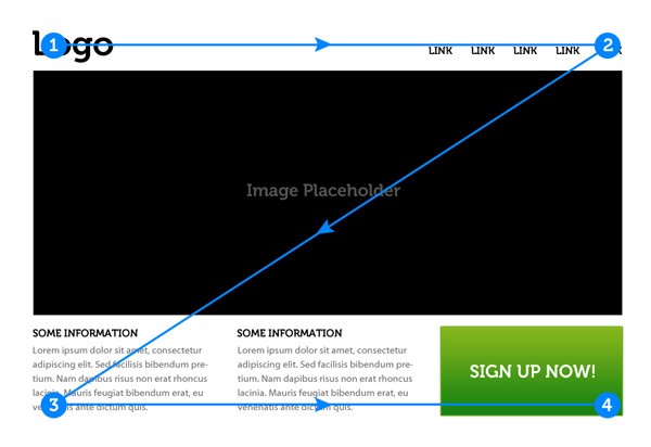
- Point #1. Point #1 is a starting point of viewer’s journey. It’s a prime location for your logo.
- Point #2. Place the items that you want the reader to see first along the top of the Z. The eye will naturally follow the path of the Z, so the goal is to place your secondary “call to action” at the end. Put more visual weight into Point #2 element — make the button (or another key element) bright and colourful to get users attention and guide users along the Z-pattern.
- Center area of the page. The trick to this area is fill it with content that interests the user, while still urging their sight downward to the next line. For example, you can place a hero image in the center of the page to separate the top and bottom sections and guide the eyes along the Z path.
- Point #3. The purpose of Point #3 is to guide the users to the final call to action at Point #4. For example, if your page promotes some product that you want to sell, you want potential customers to see the copy that will convince them to buy before they see the “Buy Now” button. Thus, you can use Point #3 to provide benefits or other helpful information for them.
- Point #4. Point #4 is the finish line, the row between it and Point 3 should contain content that pushes the user’s sight to the corner. Point #4 itself is an ideal place for your primary Call to Action.
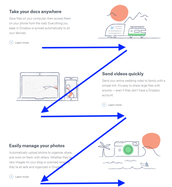
As you can see in the example below, this is exactly what Dropbox does by guiding users through a few key product features and finishing their repeated Z-pattern with “Sign Up For Free” call-to-action button. In this layout “Learn More” buttons play a role of secondary call-to-action buttons that help readers go to the next relevant page without needing to read a full copy.
Conclusion
Z-layout has some great things to offer, and this is the reason it has been adopted by numerous websites. You can take advantage of z-pattern and place important information where the eye would naturally fall to increase its visual prominence. Just remember to prioritise the information you’re communicating.
Check out the “F” shaped pattern post!
Thank you!