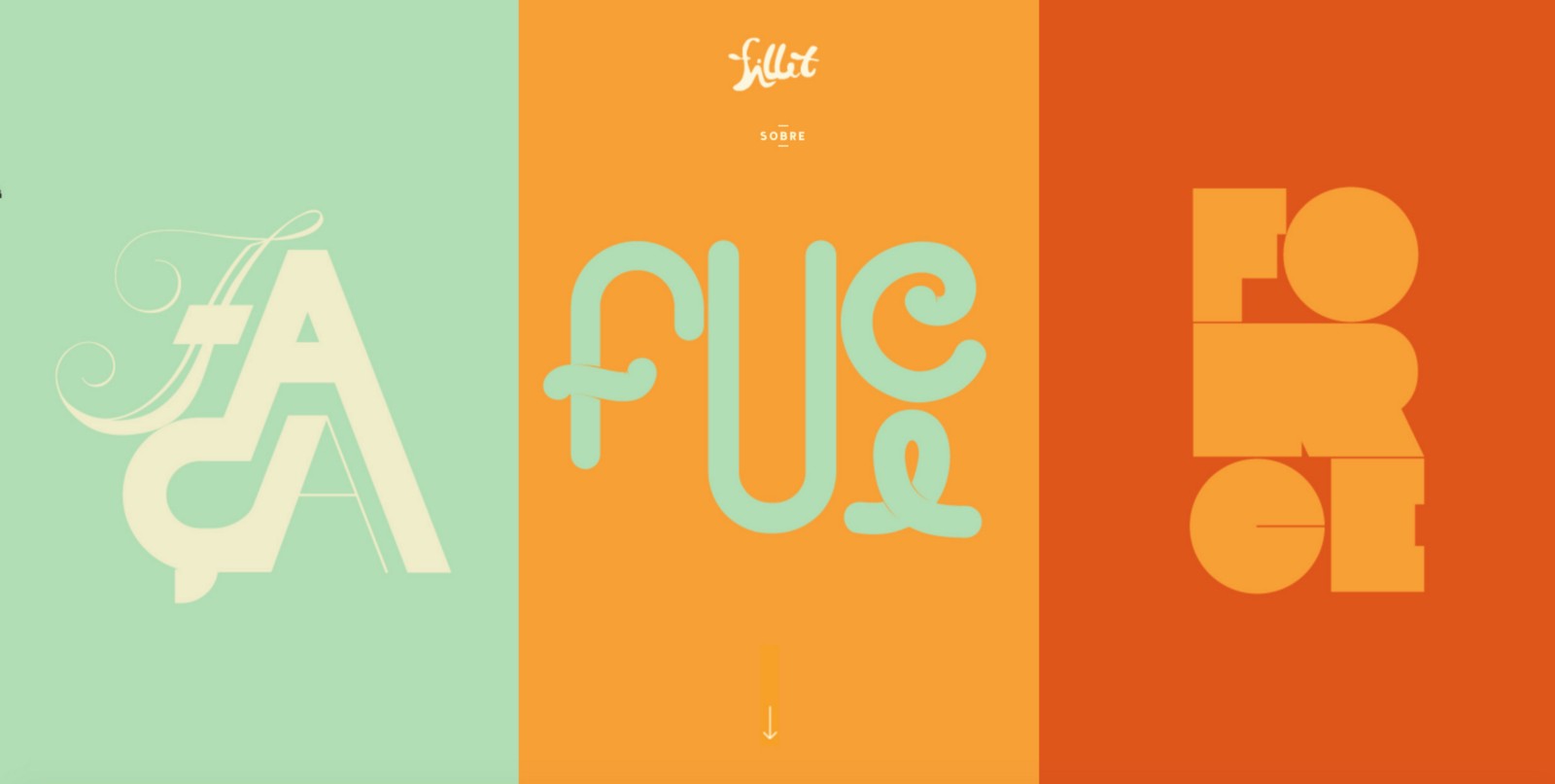
Best Practices for Long Scrolling

The days of “above the fold” are over. Long scrolling and infinitely scrolling sites are becoming more and more common lately, and it’s no mere trend or coincidence. The technique that allows user to scroll the chunks of content without any interruption or additional interaction (information simply appear as the user scrolls down the page) has following benefits:
- It simplifies navigation.
- Has more storytelling potential to engage users.
- Translates well to mobile devices.
The increased use of mobile screens has definitely played a key role in the widespread acceptance of this technique:
The smaller the screen, the longer the scroll
Furthermore, the gesture controls of mobile devices make scrolling intuitive and fun. However, long scrolling isn’t without its drawbacks. Here are a few best practices to follow to make sure that your long scrolling meets user expectations.
Use Visual Cues
Inform users that most of the content is below the fold
Suggest scrolling with design elements so that every user can quickly see how the site works. A subtle visual cue, such as an arrow pointing off-screen or a copy “scroll down”, can inform users that most of the content is available below the fold.
One of the biggest risks of long scrolling is disorientation — users may get lost along the way. This inability to determine current location and other navigation options causes annoyance and confusion to the users, and hurts the overall user experience.
When creating longer-scrolling sites, keep in mind that users still require a sense of orientation (their current location) and navigation (other possible navigation options). The obvious solution for this problem is a sticky navigation menu which shows current location and remains on the screen in the same position at all times.
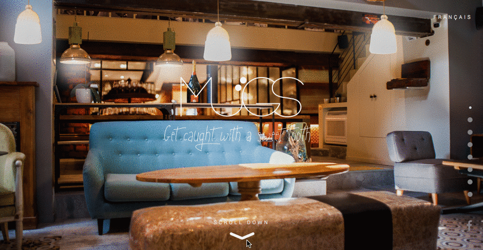
A site wants to tell a story in a smooth, linear fashion. You need to keep the site organized and help the users understand it by designing each screen in a fold as a page. For example, each section in Le Mugs site includes its own piece of information that is wonderfully bolstered by activated animation.
Incorporate Functional Animation
Use animation to establish a connection with users
Interaction design is the foundation of long scrolling site design and animations is essential part of the design. Animations bring their own touches and appeal to the site by providing users with a more smooth and comfortable exploration. Long scrolling enables creative elements like parallax scrolling and scroll-activated animations. They turn scrolling into something more fun and makes the user wonder “what will happen next?”

Conclusion
Long scrolling can create a completely immersive browsing experience. If users like the UI and find it intuitive, then they won’t really mind the length of the scroll. Thus, focus on your user goals and make things more convenient for your users.
P.S. In article Five Rules For Good Infinite Scroll you can find best practices for infinite scrolling.
Thank you!