Best Practices for Search Results

Search is like a conversation between the user and system: the user expresses their information need as a query, and the system expresses its response as a set of results. The results page is a crucial piece of the search experience: it presents an opportunity to engage a dialogue that guides users’ information needs.
In this article I would like to share 10 practices that will help you improve the search results UX.
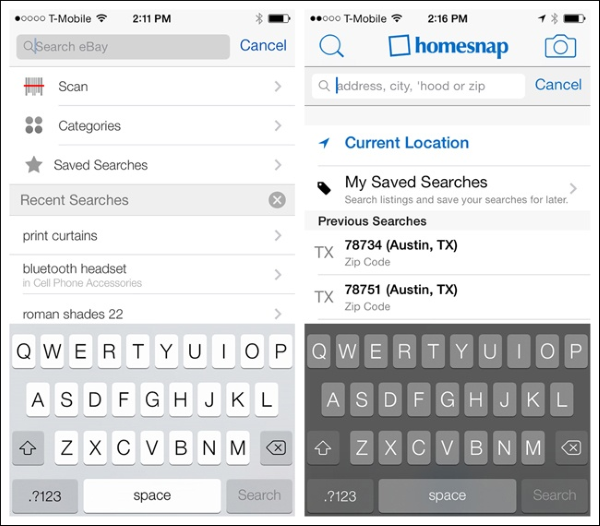
1. Don’t erase users’ query after they hit Search button
Keep the original text. Query reformulation is a critical step in many information journeys. If users don’t find what they’re looking for then they might want to search again using a slightly modified query. To make it easier for them, leave the initial search term in the search box so they don’t have to re-type the entire query again.
2. Provide accurate and relevant results
First results page is golden. The search results page is the prime focus of the search experience, and can make or break a site’s conversion rates. Users typically make very quick judgments about a website’s value based on the quality of one or two sets of search results.
It’s clearly important to return accurate results to users, otherwise they won’t trust the search tool. It is thus essential that your search prioritize results in a useful way and that all the most important hits appear on the first page.
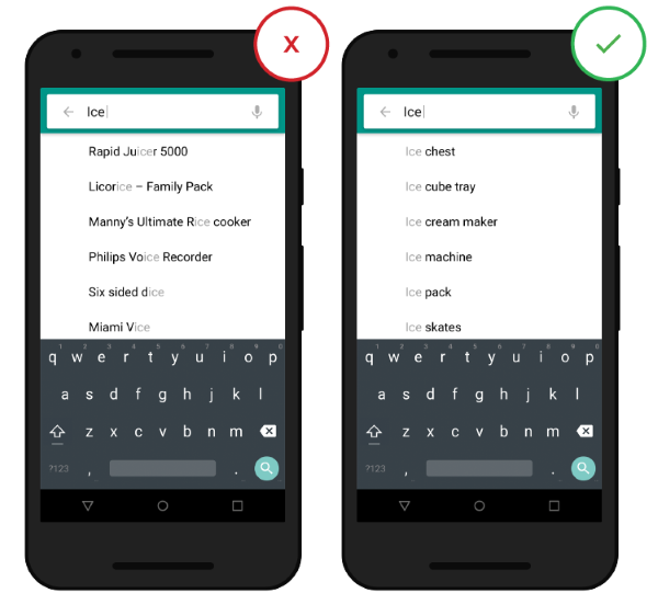
3. Use effective autosuggest
Ineffective autosuggestions deliver a poor search experience. Ensure that autosuggest is useful. Some helpful functions include recognition of root words, predictive text and suggestions while the user enters text. They help speed up the search process and keep users on-task toward conversion.
4. Correct typos
Typing is error prone. If a user mistypes a search term and you’re able to detect this, you could show them results for the guessed and ‘corrected’ search term instead. This avoids the frustration that could be caused by returning no results and forcing the user to enter the search term again.
You site should store all recent searches, in order to provide this data to the user the next time they conduct a search.
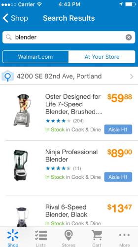
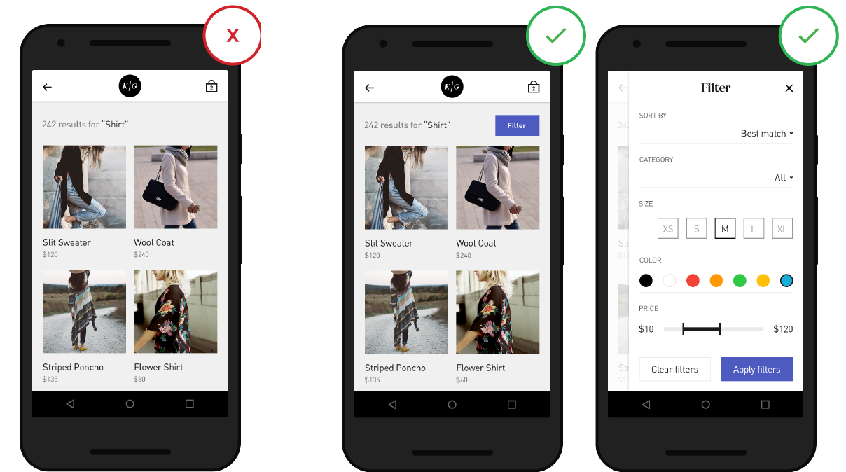
7. Choose proper page layout
One of the challenges of displaying search results is that different types of content require different layouts. Two basic layouts for content presentation are list view and grid view. A rule of thumb:
Details in lists, pictures in grids
Let’s examine this rule in cotext of product page. Product’s specifics is very important moment. For products like appliances where details like model numbers, ratings and dimensions are major factors in the selection process — the list view makes most sense.
- Allow users to choose ‘list-view’ or ‘grid-view’ for search results. This gives your users the ability to choose how they view their results in a way preferable to them.
- When designing grid layout, pick the right size of images so that they are large enough to be recognizable, yet small enough to allow more products to be seen at a time.
8. Show search progress
Ideally search results should be displayed immediately, but if it’s not possible — a progress indicator should be used as system feedback for user. You should give your users a clear indication of how long they need to wait.

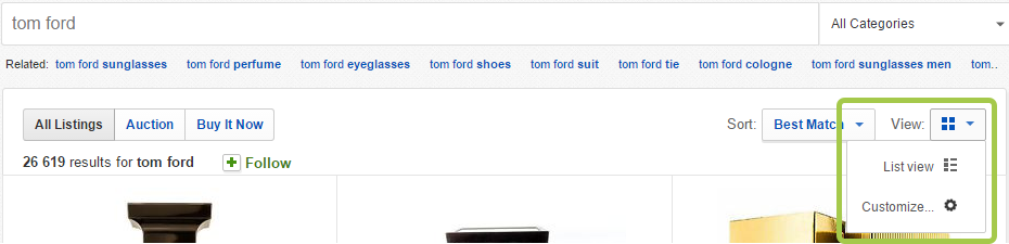
9. Provide sort and filter options
Users become overwhelmed when their search terms result in seemingly irrelevant and/or too many results. You should provide the user with filtering options that are relevant for their search, and enable them to select multiple options each time they apply to filter results.
- It’s important not to overwhelm users with too many options. If your search requires a lot of filters, then collapse some by default.
- Do not hide the sort feature within the filtering feature — they are distinct tasks.
- When the user chooses a narrow search scope, explicitly state the scope at the top of the results page.

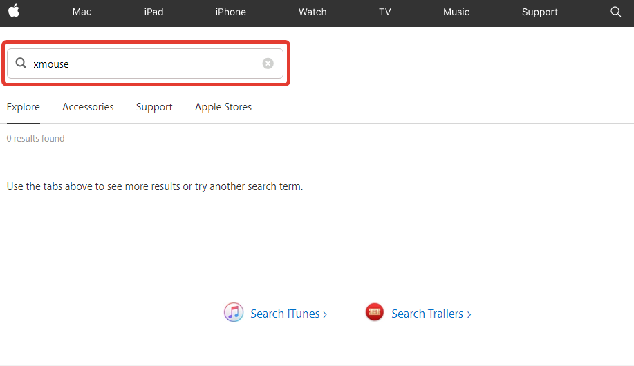
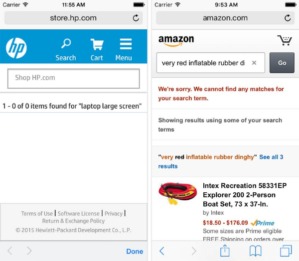
10. Don’t return ‘no results’
Dropping someone on a page with no results can be frustrating. Especially if they have tried the search a couple of times. You should avoid giving users dead-ends in their experience when their search produces no matching results. Provide valuable for user alternatives when there are no matching search results (e.g. online shop can suggest alternative products from the similar category).
Conclusion
Search is a critical element of building a profitable site. Users expect smooth experiences when finding and learning about things and they typically make very quick judgments about site’s value based on the quality of one or two sets of search results. An excellent search facility should help users find what they want quickly and easily.
Thank you!