One screen divided in two. More and more websites are using design patterns that include two vertical panels placed side by side. Split-screen design follows a simple rule:
One screen. Two messages.
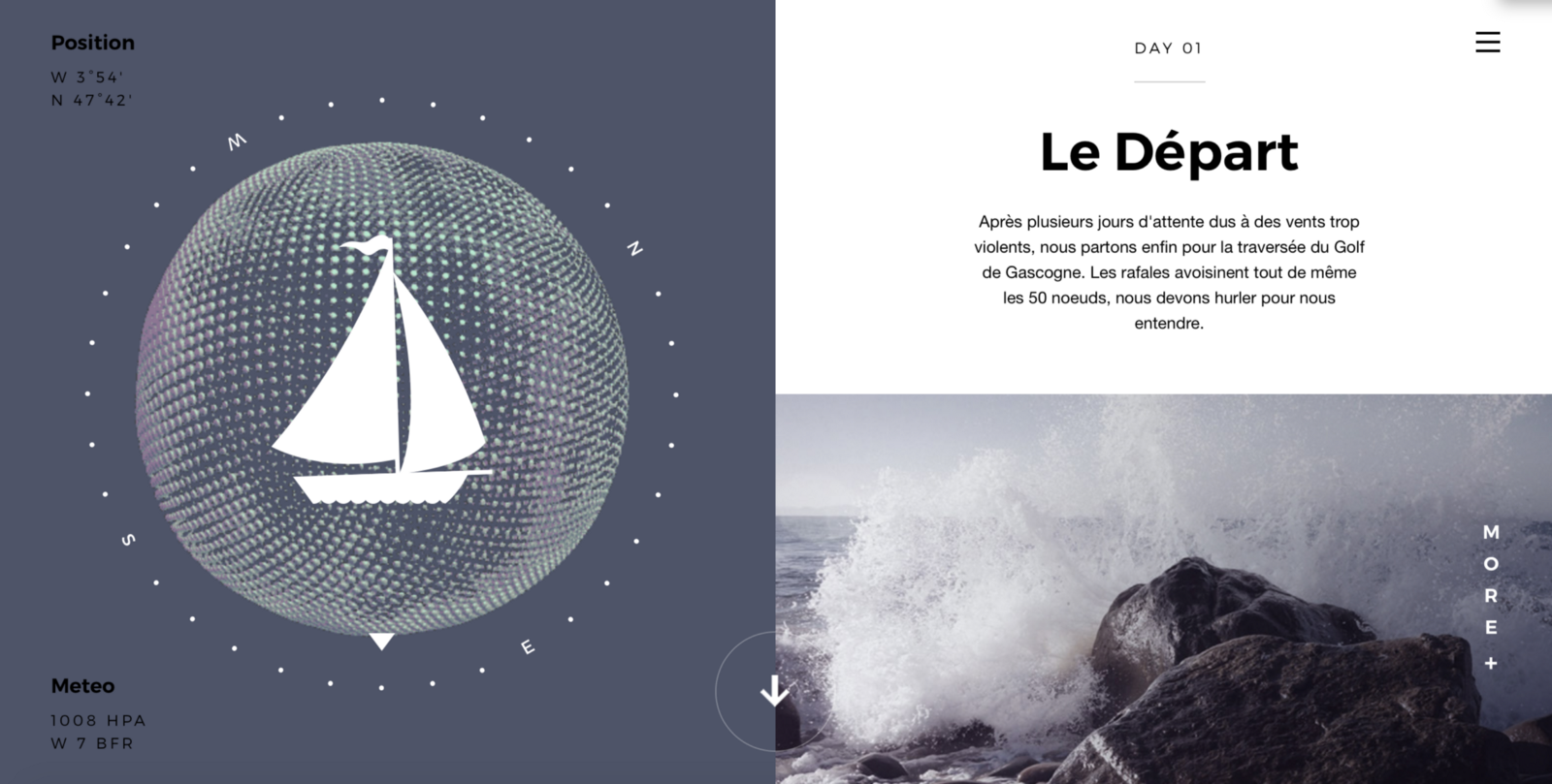
Each side features a separate contained element, such as a photo, text block, or illustration.
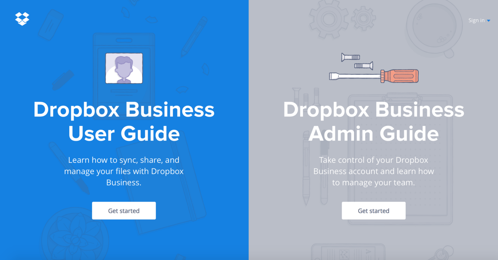
Split-screen is especially good when you have two things to promote. This approach allows you to give prominence to them both and allow the user to rapidly select between them.
Much more than a simple graphic trend, splitting the screen into two distinct parts provides an original way to guide the user into your site. Looking at it a little closer, you can find following advantages:
- Draws the user’s attention to a specific part.
- Plays on contrasts.
- Offers an unconventional format.
It’s also a good choice for responsive frameworks. This type of layout is particularly well suited to navigation on large screen or on tablet, but it can be also good for mobile devices: when it comes to smaller screens, the panels can be stacked.
And what’s great about split screens is that an almost unlimited numbers of design combinations are possible. In this article you’ll find out how you can make the most of this design trend.
Best Options for Split Screen Design
When using a split screen layout for your design, you are be able to give equal importance to both elements while, at the same time, allowing the user to choose between them quickly. This means that you are able to easily convey dual importance. It’s important to understand that users will make a visual connection between paired items, so you should see it as an almost yin and yang concept.
Pair Vibrant Color and Dramatic Typography
Thanks to an increased focus from flat and material design, color and typography are big trend drivers now. Vibrant colors are visually stimulating and dramatic typography enhances the text content. Combine the two and you end up with a visually interesting design.
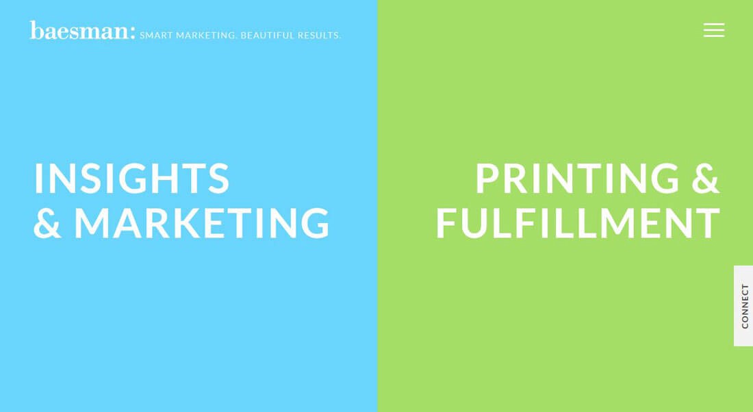
Bright colors and interesting typography pairs can add interest. Image credits: Baesman
A powerful combination of colorful image and content located side-by-side.
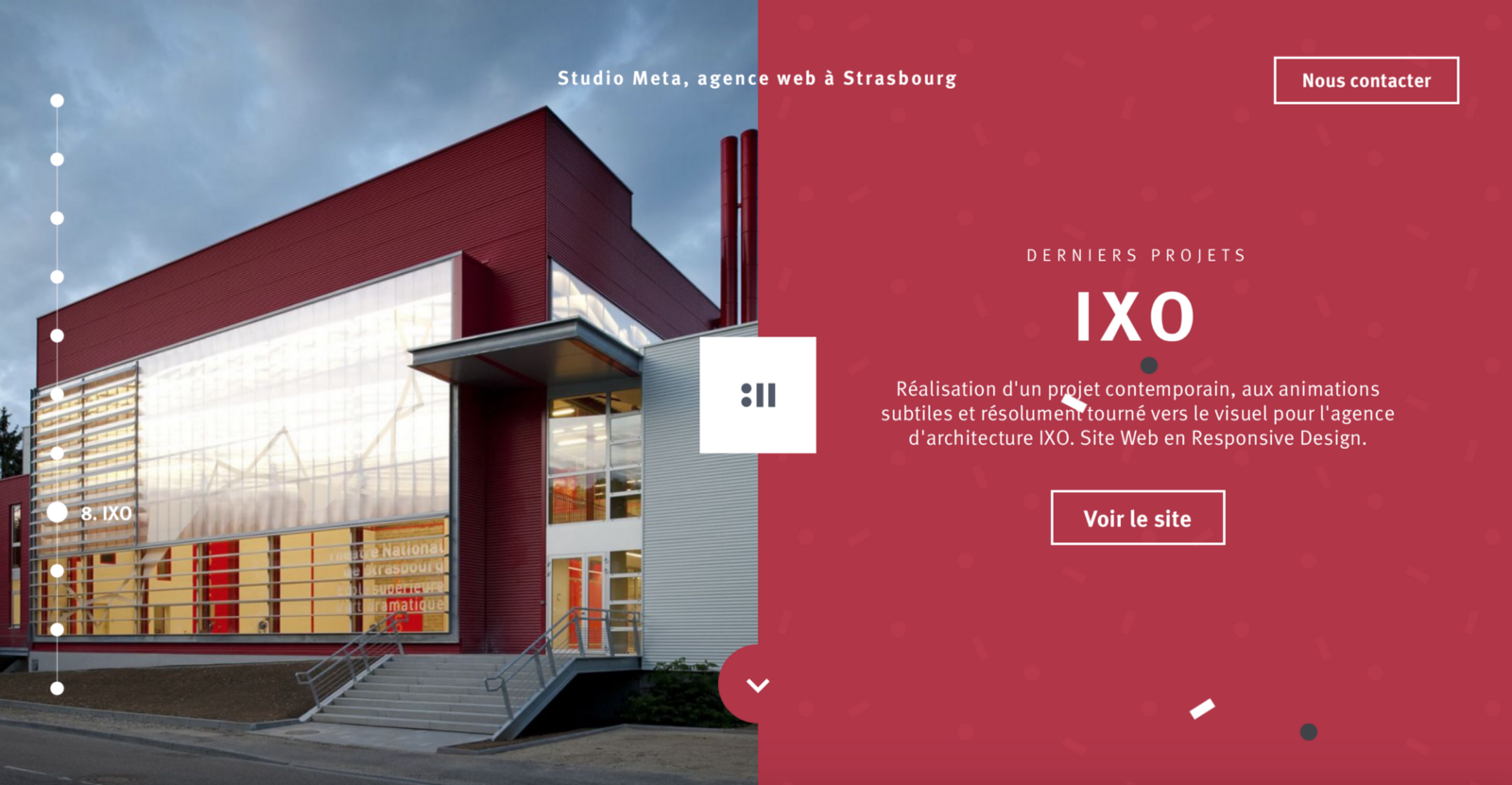
##Draw user attention to the call to action button
A split screen is a great option to design a visual theme that can create a bigger focal point for calls to action. Negative space combined with the bold vertical divide adds a supreme amount of focus on the important areas or key elements.
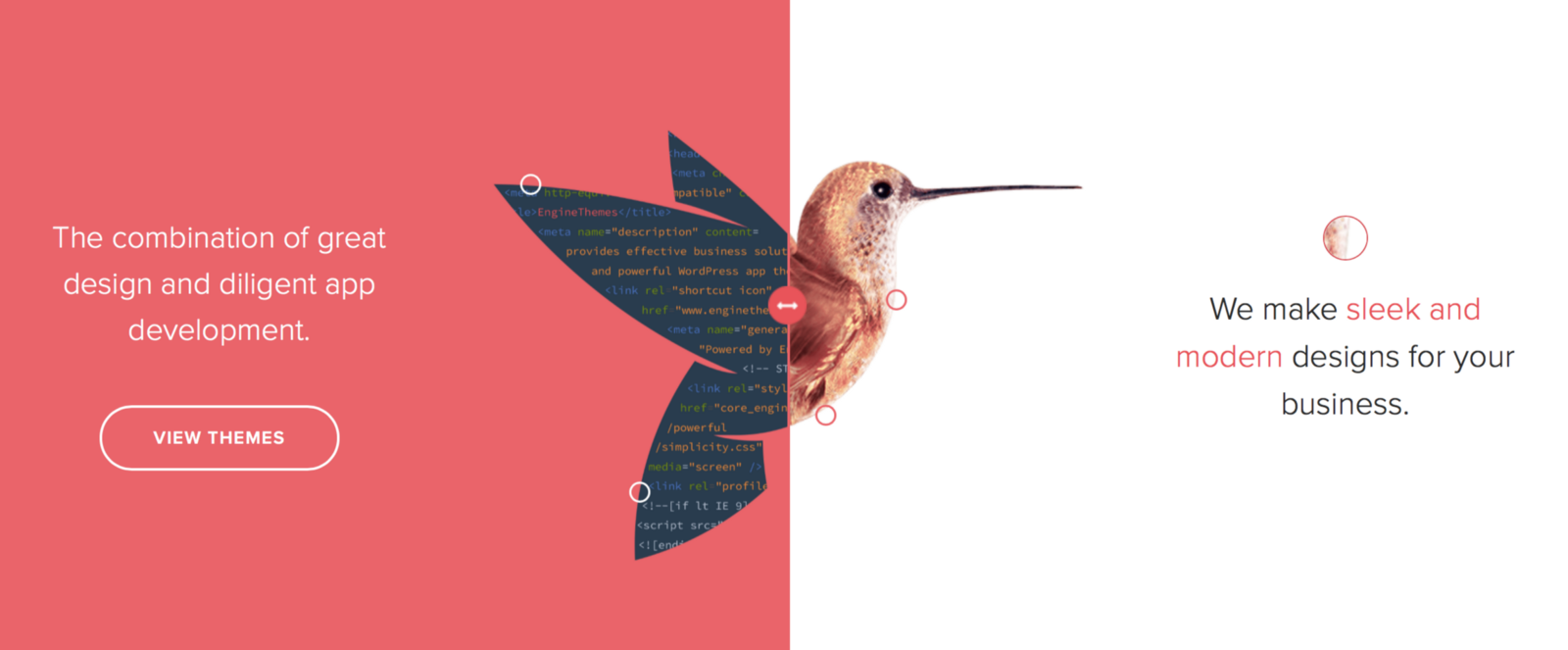
Design helps draw users to the call to action on the left size of the screen.
##Think of Screen as a Card
Split screen design is a pattern derived from the popularity of cards. Websites that follow this trend share a [card-based concept](http://babich.biz/best-practices-for-cards/): screens are essentially just oversized cards, and each screen is a container that contains one message and one action for users.
The left panel in Si Le Solei design is one “card,” while the right panels contains a card pair.
Stacking patterns may vary pieces. For example, Stikwood’s design in example below features a side divided into smaller pieces. This provides more user entry points.
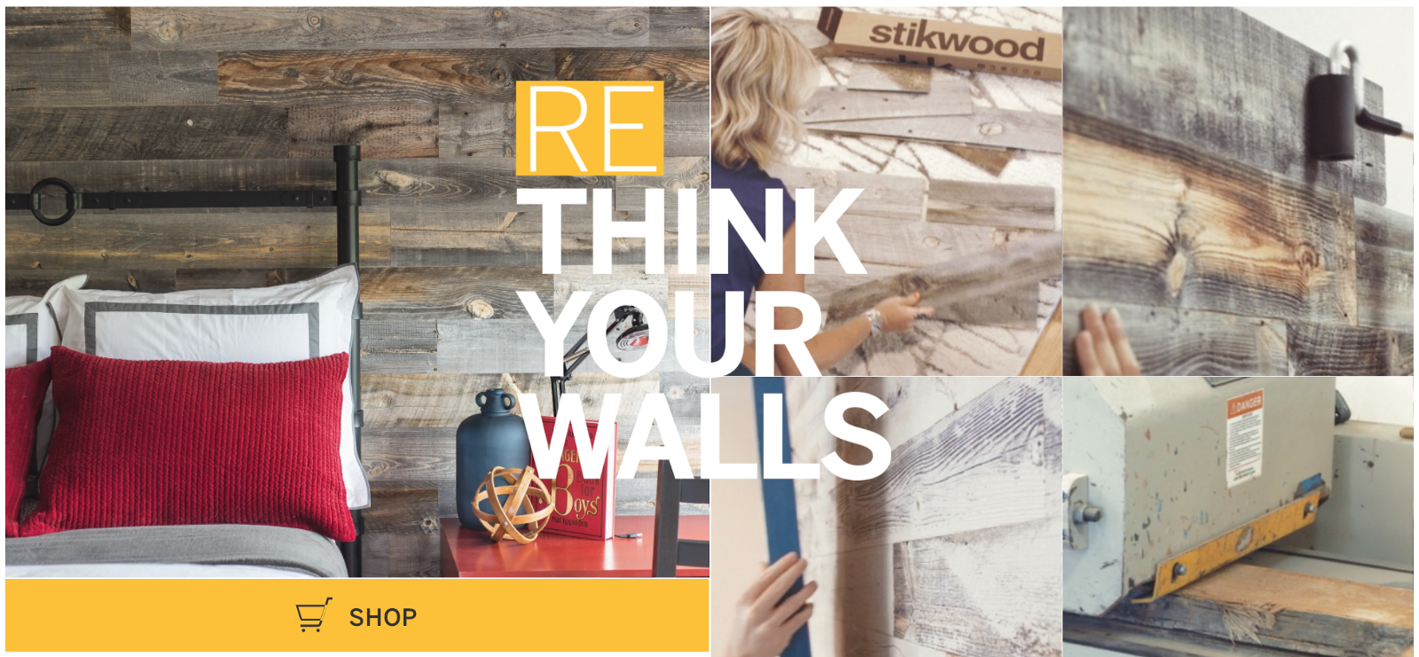
Consider stacking elements using mosaic or masonry patterns.
**Tip:** Keep your screens simple, because complex split screens make the UI look cluttered.
##Create Visual Flow Between “Screens”
While split-screen design patterns can leave you with distinctly different elements, there must be a connection between content containers. One possible way to establish a connection is using a color. Duplicate a distinct color to establish visual flow from one “screen” to the other. This works particularly well with a brand color or hue with a lot of contrast:
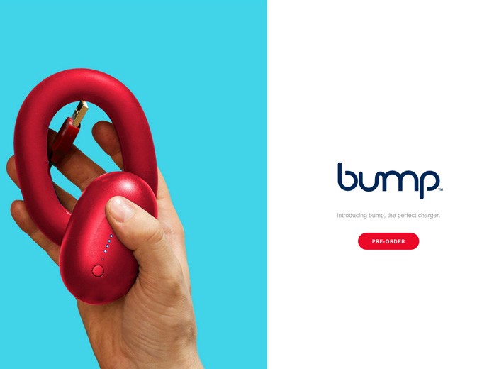
Bump duplicated a brand color to establish a visual flow from product screen to the pre-order screen.
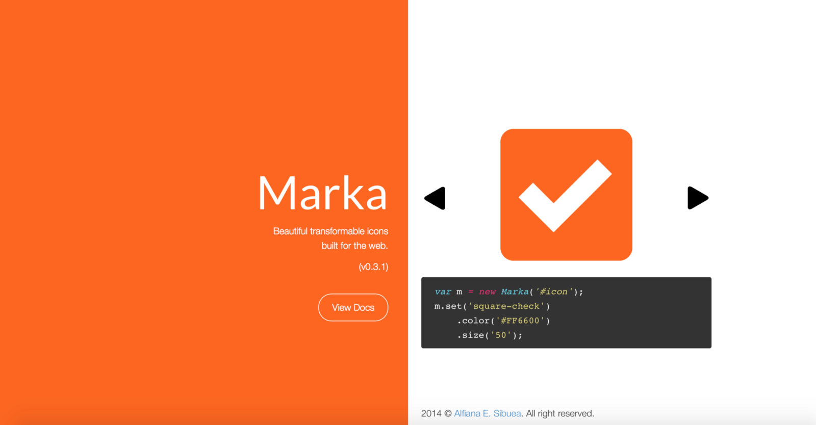
Marka duplicates a high-contrast color to establish a visual flow from one screen to another.
Another technique is layering a single element (e.g. text copy) across screens. This element can provide an additional level of cohesion:
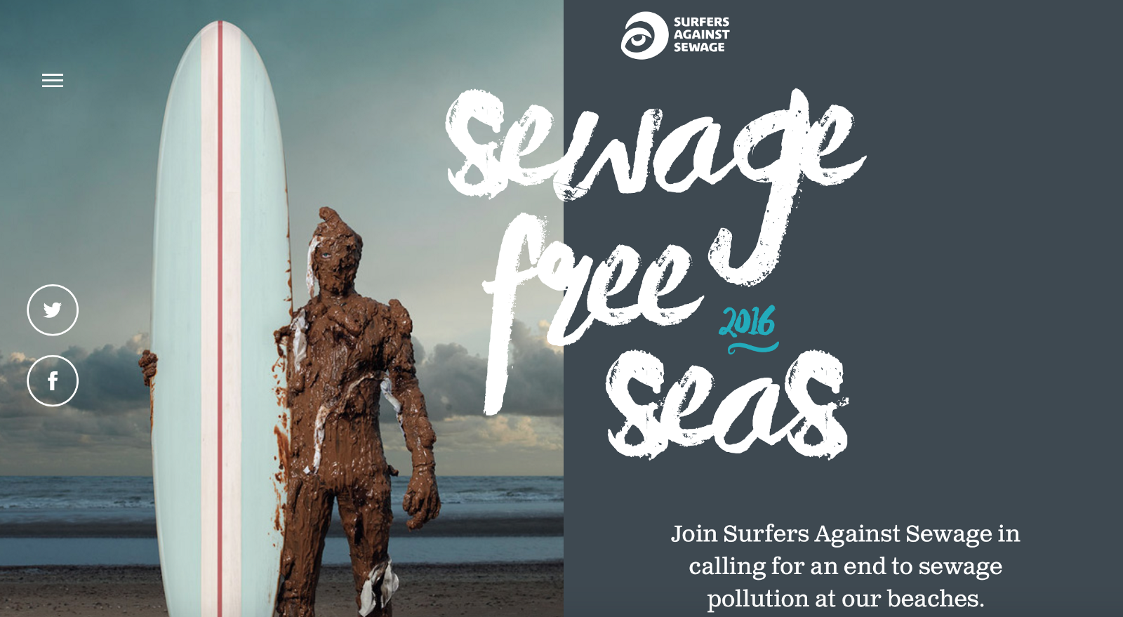
Split screen elements can overlap. Image credits: Sewage Free Seas
Last but not least you can use a colored overlay:
Right screen is designed as a continuation of the left screen on Nathan Riley website.
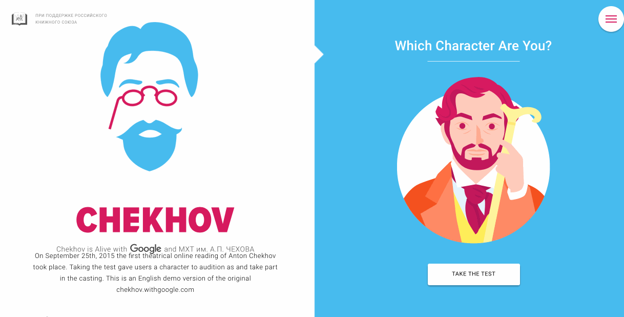
##Use animation to encourage users to act
Fine animation and interactive effects encourage users to click. Look at the design used for the “Chekhow is Alive” site below. The design begs you to click to find your character.
#Conclusion
Split-screen designs are a fun, functional, and responsive way to create an engaging design. However, when it comes to content, split layout can be tough. If you’re considering a split-screen technique for your website, I advise you to ask yourself a few questions:
- Is it suitable for your content? Will there be enough negative space to make the layout work?
- Are your users appreciate the layout or it will confuse them?
- Will it be OK to split your user’s attention in half?
Keep in mind that content is king and split-screen should be a simple way to deliver your message to people.
Thank you!