When creating forms, interaction designers are often faced with having to select an UI element that dictates the interaction of option selection. Of course, we all have rules of thumb that we follow. Nonetheless there are some considerations to keep in mind when you choose the element you would like to use as selection control.
Option selection can be represented by checkboxes, toggles, radio buttons and drop-downs controls. Each of them can be great when used correctly. In this article we’ll focus on checkboxes and toggles.
Checkboxes
Checkboxes are used when there is a list of options and the user may select any number of choices, including zero, one, or several. In other words, each checkbox is independent of all other checkboxes in the list, and checking one box doesn’t uncheck the others.
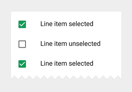
Checkboxes come with labels
##Toggles
The toggle switch represents a physical switch that allows users to turn things on or off.

Switches support two simple, diametrically opposed choices
The toggle switch general use is to represent an action (e.g. start or stop something). It has the analogy of a light switch:
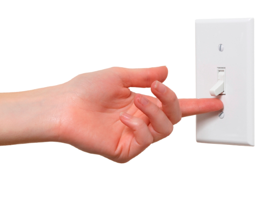
Toggles are commonly used as the light switches
#Best Practices for Checkboxes and Toggles
##Use Standard Visual Representations
A checkbox should be a small square that has a checkmark or an X when selected.
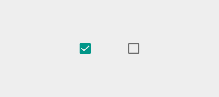
Checkbox control in selected and unselected states. Image credit: Material Design
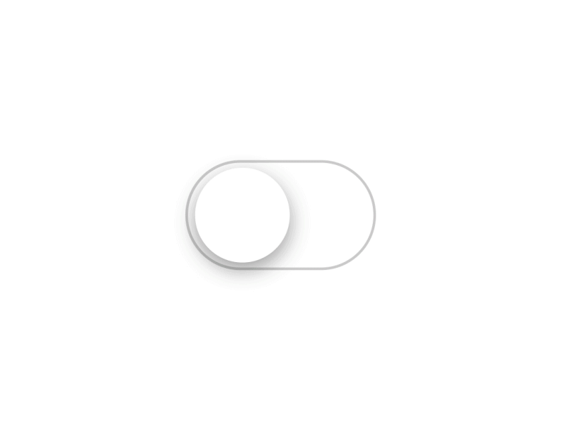
A toggle should look like a on/off switch.

Toggle control in selected and unselected states. Image credit: Material Design
You should provide a clear visual feedback for user interaction with control. Subtle animation makes the experience feel crafted — it’s especially important for mobile apps which UI controls should appear tangible, even though they are behind a layer of glass.
iOS7/8 Toggle button. Source: Dribbble
##Lay Out Your Lists Vertically
Try to present your lists vertically, with one choice per line. This rule works both for toggles and checkboxes. If you must use a horizontal layout with multiple options per line, make sure to space the buttons and labels so that it’s abundantly clear which choice goes with which label. Below is an example of set with elements located too close to each other:

It’s difficult to see the correct radio button to click for option four
##Current State for Toggle Should be Outside the Control
When design toggles you should *avoid state-action ambiguity.* We take the iOS 6 switch design as an example and focus on the state that’s blue and says ON.
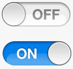
It is unclear whether the label (‘ON’ for example) is the current state, or the action
Can you tell if the switch is ON currently, or if it will go on if you move/click/tap the slider? Is “ON” here a state(adjective) or action(verb)? Unclear.
You shouldn’t confuse users and it’s important to have a distinction between an action and a state. In fact, the design could be further enhanced for user friendliness by highlighting the current state:
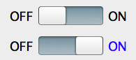
The color of the text indicates the current state (lit up = ON)
##Use Positive Wording For Checkbox Label
Use positive and active wording for checkbox labels, so that it’s clear what will happen if the user turns on the checkbox. Avoid negations such as “Don’t send me more email,” which would mean that the user would have to check the box in order for something not to happen.
Checkboxes should always be used with positive commands, not negative like “do not ..”
##Use Label Tags as Click Targets for Checkbox
All checkboxes have labels, but not all use label tags. Checkboxes are tiny in nature, and, thus, according to [Fitts’ law](https://en.wikipedia.org/wiki/Fitts%27s_law), they can be hard to click or tap. To enlarge the target area, let users select an option by clicking or tapping not just that small square, but also the label or associated words.
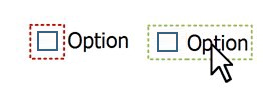
Let users select an option by clicking on either the checkbox itself or its label
##Use Checkboxes Only To Change Settings, Not as Action Buttons
For a binary choice, the main difference between a check box and a toggle switch is that the *check box is for status* and *the toggle switch is for action*. If a physical switch would work for the action, a toggle switch is probably the best control to use.
In the example below, it’s clear with the toggle switch that the wireless is set to “On.” But with the checkbox, the user needs to think about whether the wireless is on now or whether they need to check the box to turn wireless on.
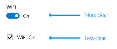
Use a toggle switch to turn services or hardware components on or off, such as WiFi
Commit Interaction For Checkbox and Toggle
You can delay committing a checkbox interaction (as part of a form submit, for example), while you should immediately commit a toggle switch interaction.
It is a good UX to immediately change the affected setting by the switch and not only after pressing “save” or returning to the previous screen. We have this expectation for a switch in real life (for example, we know light immediately turns on).
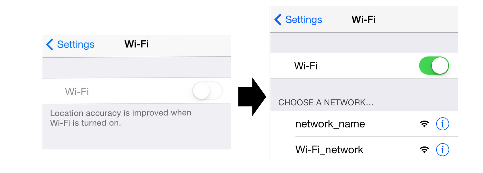
Turn ON Wi-Fi in iOS
And use a checkbox when the user has to perform extra steps for changes to be effective.
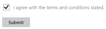
Use a check box when the user must click a “Submit” or “Next” button to apply changes
#Conclusion
When designing your interface, try to be consistent and predictable in your choice of interface elements. By following design standards you enhance users’ ability to predict what a control will do and how they’ll operate it. Conversely, violating the standards makes the user interface feel brittle — as if anything can happen without warning.
##References
* [Selection controls (Material Design)](https://material.io/guidelines/components/selection-controls.html)
* [Checkboxes vs. Radio Buttons (Jakob Nielsen)](https://www.nngroup.com/articles/checkboxes-vs-radio-buttons/)
Thank you!