Empty states: 5 practical tips for designers
Content is what provides value for most apps. Along with features, content is a primary reason why people start using products. This is why it’s critical to consider how we design empty states, those moments in a user’s journey when an app might not have content for a user yet.
In this article, we will learn 5 tips on how to design an ideal empty state.
Why is an empty state important?
A useful empty state lets the user know:
- what’s happening,
- why it’s happening,
- and what the user can do about it.
Here are a few situations when users can encounter empty states within an application:
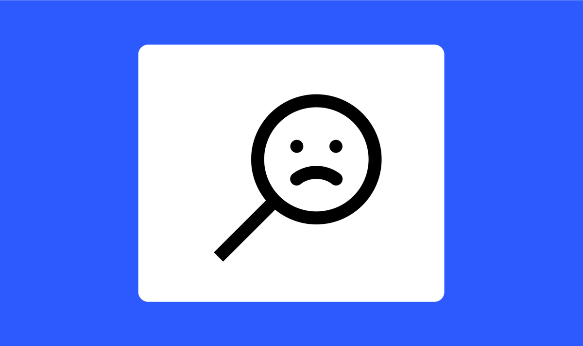
- Error state, such as getting a no internet connection.
- No content in a particular category of items. Such as no incoming emails, albums, or connections.
- User action is required. The app cannot show the data because the user didn’t do something. For example, the user didn’t connect a payment method in the app. This type of empty state is especially common during the onboarding and initial use stages when the user didn’t fully configure the app.

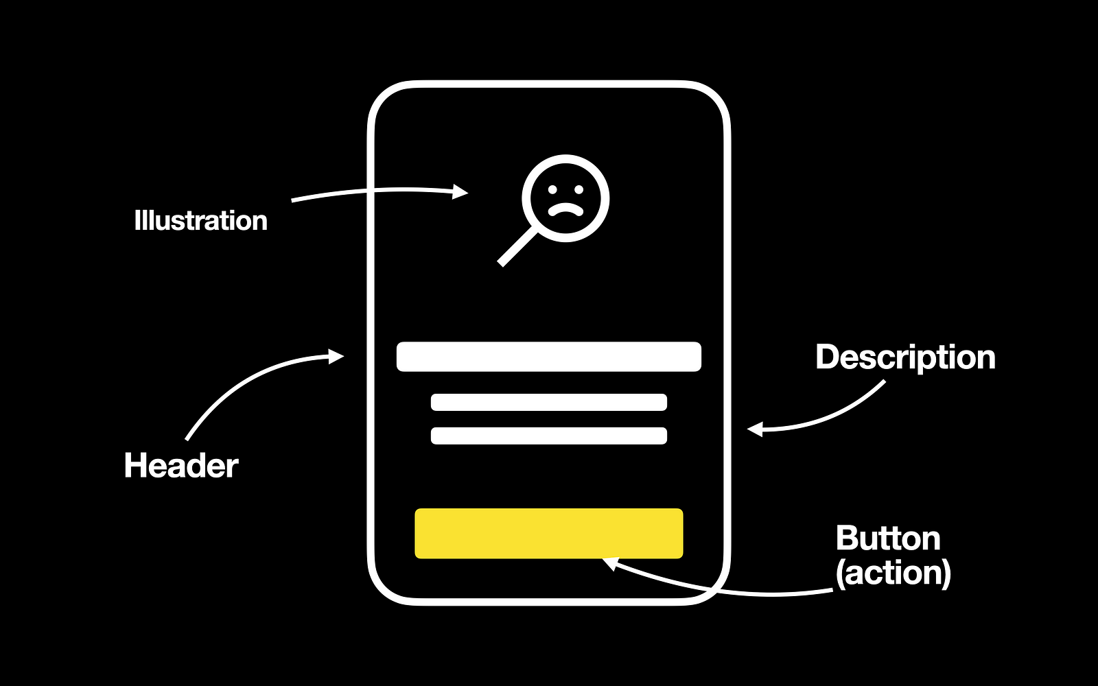
Anatomy of empty state
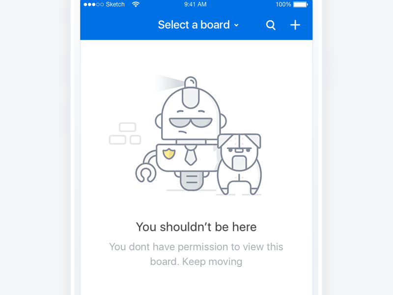
- Header and description. First and foremost, the empty state should communicate the system status. It should create a context for users on what’s happening. It is important to provide a summary of a system state in the header and description. The header and description should tell users why they see the empty state.
- Call to action button. Effective empty states allow users to act. When users read the text description and see the action, they understand what they should do next.
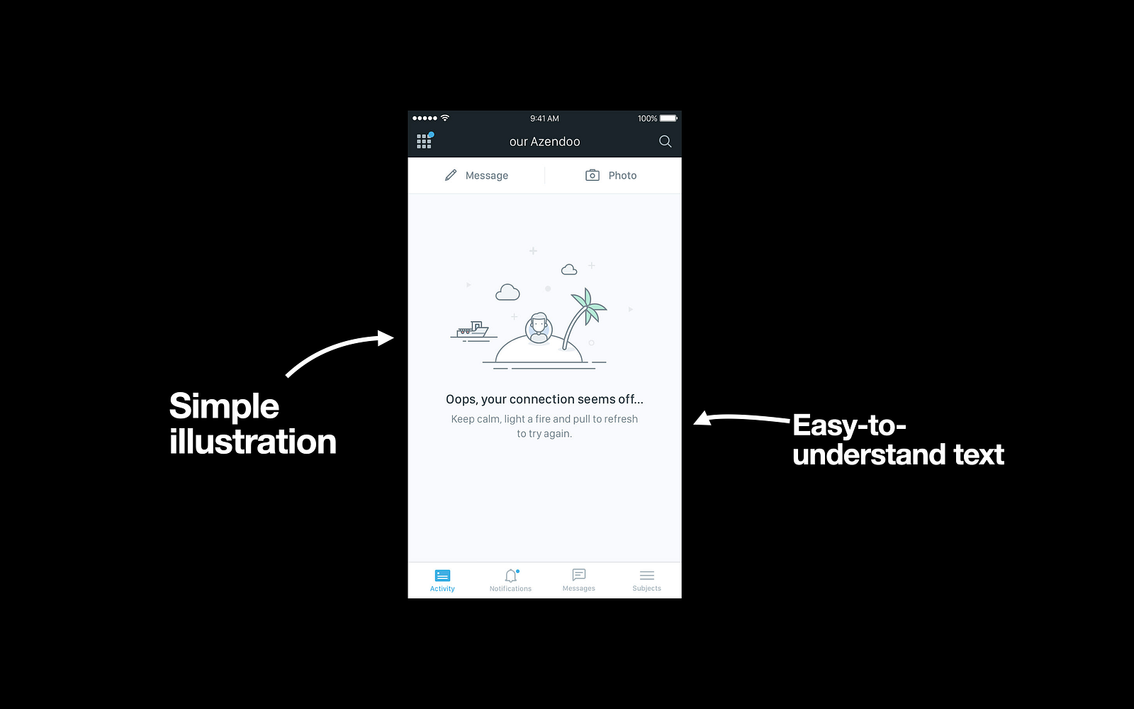
- Imagery. While your app should be functional and usable, it should also be pleasurable. Empty states are an excellent opportunity to make a human connection with your users. Well-crafted illustrations at the top of the screen can help create a more memorable experience for your users.
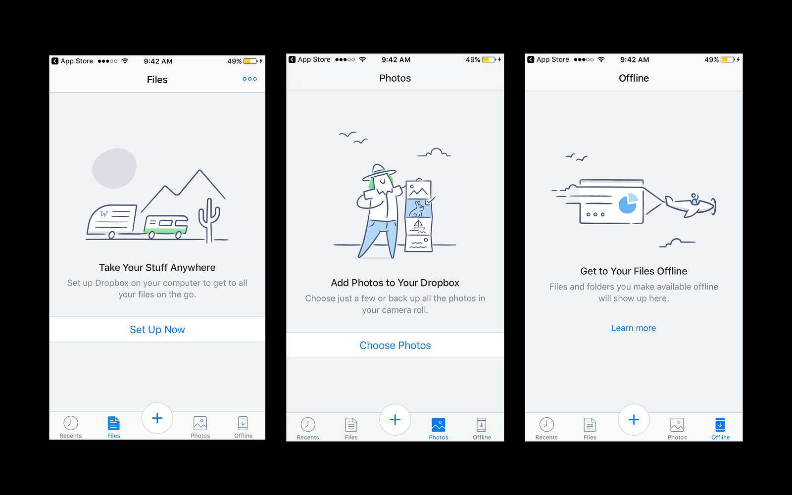
Here is an example of a well-designed empty state from the Dropbox mobile app. Notice the image. The image should have a neutral or humorous tone, and it should be consistent with your brand
5 Tips on how to design empty states
Now let’s discuss a few tips on how to design an ideal empty state. Empty states are often overlooked in UI design. When we design a product, we normally design for a populated interface where everything in the layout looks well arranged. However, it’s equally important to design pages on which the content is pending user action.
1. Analyze user flow
And the first thing that we need to do is to find places where users can face empty states. How to find such places? We need to analyze user flow.
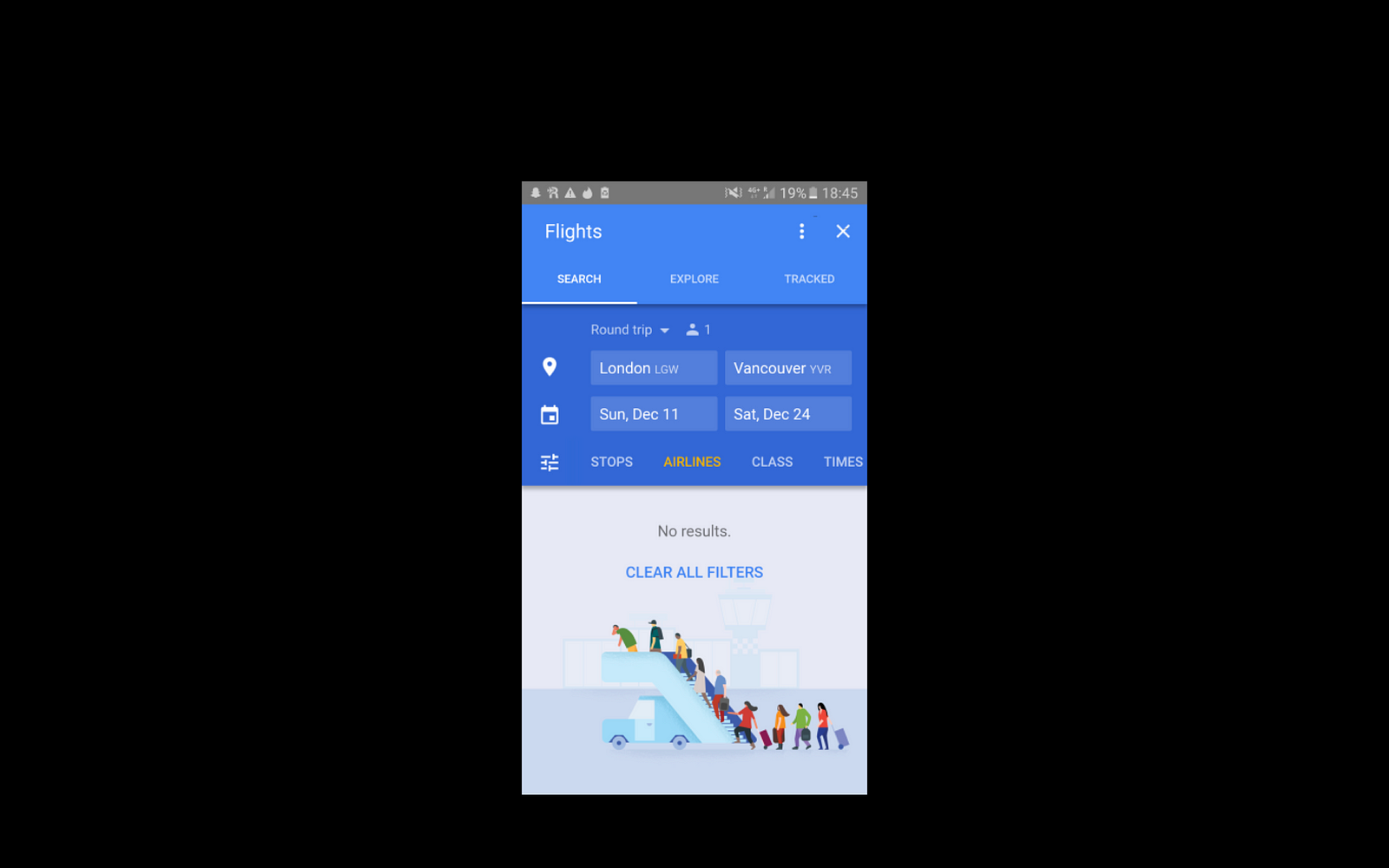
For example, when we design an eCommerce app, “No search results” is an excellent place for an empty state.
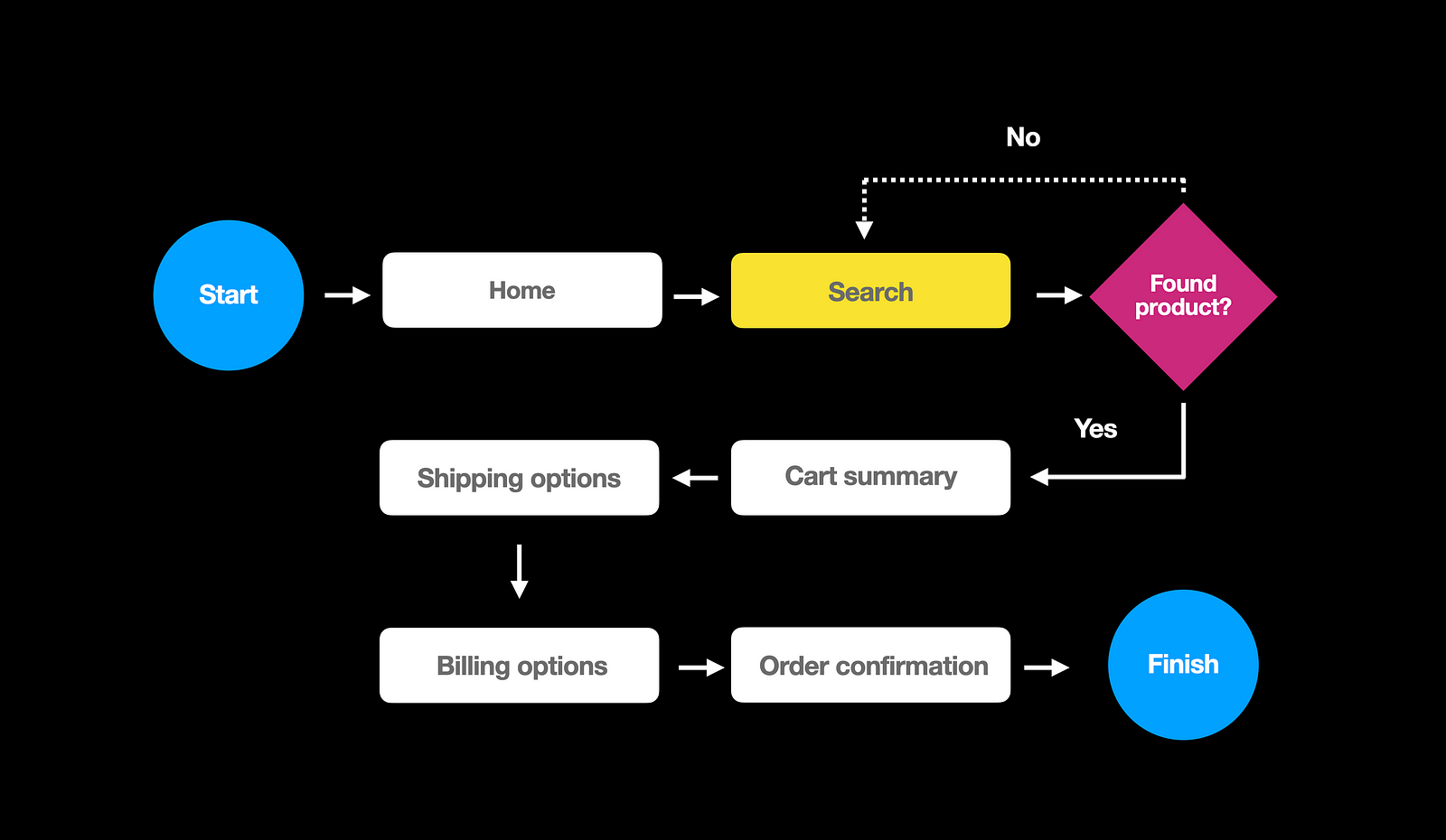
An empty state can show a quick update, “No results found,” along with a call to action, “Clear all filters.”
2. Avoid creating dead-end pages
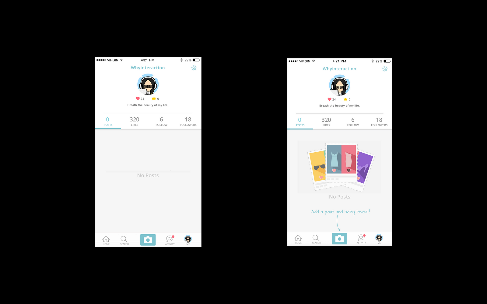
Next, we need to avoid creating dead-end pages. The absolute worst thing we can do with an empty state is to drop our users into a dead-end. Dead-ends page don’t provide a next step, they confuse uesrs and make them leave a product.
Here are two examples of empty states. The first one is an ineffective empty state that provides no guidance — only a dead end. The second example reduces friction by helping the user start the task. It gives a direct pathway to the action that the user needs to complete.
3. Keep empty state visually simple
The beauty of a great empty state design is its simplicity. You should use a minimalist design approach to bring the most critical content to the forefront and minimize distractions. Try to include well-written and easily scannable copy and wrap it together with good visuals.
4. Bake emotions into the UI
Empty states can help you show the human side of your product. The positive emotional response from using a product can improve user engagement.
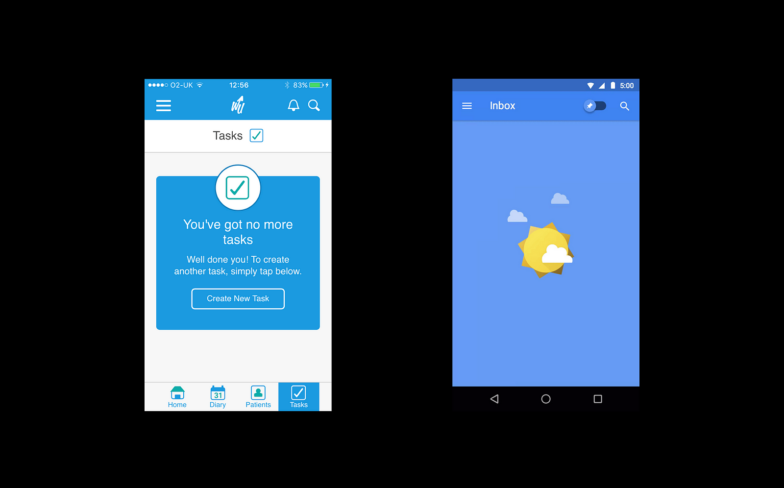
5. Introduce success states
Last but not least, we need to think about success states. The moment a user completes their first milestone in an app is an excellent opportunity for you to create a positive emotional connection between them and your product. You can congratulate users on a job well done and prompt them toward new interactions. To the left, you see the resulting screen after the user completes all tasks in a to-do list, and to the right is inbox zero animation.