When Friction In Design Is Good For UX
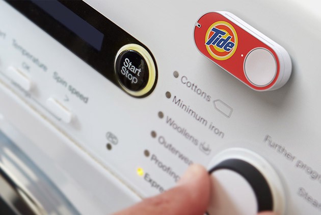
Friction raises negative thoughts in most designer’s minds. When you ask designers about friction, most of them will tell you that friction damages a UX because it slows down interactions, reduces conversions, and impedes progress. Today frictionless design is the new business goal. Designers seem to be obsessed with the idea of going from A to B in the fastest, smoothest and most efficient way. A good example is the popular Amazon physical dash button, that allows users to order a refill of a specific product in just one click.
In fact, friction can improve UX in some cases. Here are 5 ways friction can improve UX of your product:
1. Friction Can Prevent Users From Making Bad Decisions
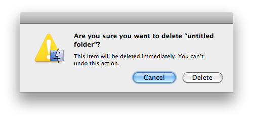
Confirmation dialog for important actions
Introducing frictions in a product or service can create an important opportunity for the user to think about what they are doing. Frictions allow for thinking and reduce the risk of mistakes: because of the effort necessary to overcome the friction, the decision-making process has to pause for a while, allowing people to stop and analyze.
Friction makes user get out of auto-pilot mode by promoting reflection and critical thinking.
Friction allows the user to reflect on the action he/she is about to perform. A strong example of frictions increasing safety comes with a system dialog where the user must confirm a delete action. When a user sees such dialog they might “Was this really what I wanted to do?” Notice that the most prominent button here is “Cancel.”
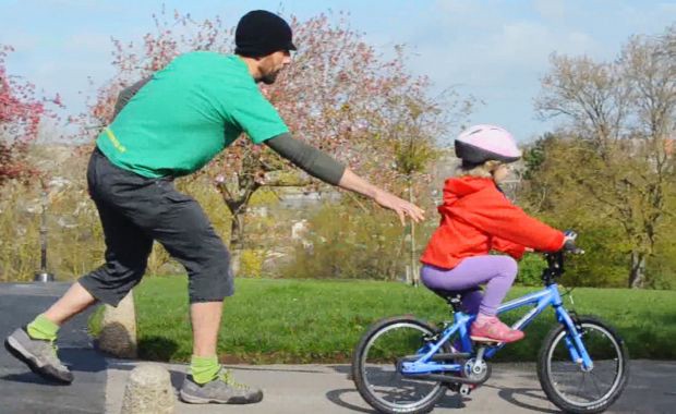
Friction can create confusion and increase cognitive load. That’s generally a bad thing if your design makes a user think. But for educational products, friction can actually improve the outcome. We saw that friction can usefully prevent mistakes when it comes to safety but it is important to note that not all mistakes are bad for users. Most of us remember a time when we learn to ride a bicycle. It was a time of trials and errors. But I’m sure that most of us overcome this and become great riders.
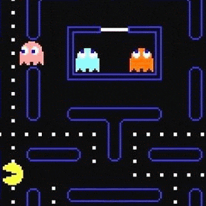
Games are good examples. In games, frictions are used to foster learning. Games allow us to go from beginner to expert while actually having fun. And no one likes games without friction because there would be absolutely no fun (and actually no point) in a frictionless game.
In game design, friction can turn from the pain points to exciting challenges.
3. Friction Can Make Users Feel Good
Feelings of accomplishment (IKEA Effect)
In 2011, business researchers from Harvard, Yale, and Duke conducted a series of experiments that demonstrated that people value things they create or build more than those created by someone else. They call it the IKEA Effect:
The more effort you put into something, the more you come to value it.
It’s true for an IKEA cupboard, and it can be true for the app or website as well.
In essence: labor leads to love. Labor occupies in our well being. Once you have put time and effort into something, you’re less likely to pull out of it.
People like to feel a sense of accomplishment. It helps us feel competent and in control.
At the same time, it’s important to remember that:
- Labor leads to love only if the user was able to finish the task successfully.
- The reward should be superior to the amount of the effort required. The difficult part here is that each user has their own idea of what is a good enough reward.
4. Friction Can Improve Quality
When you’re thinking about acquiring users, it’s easy to assume that friction is the worst enemy of traction. That’s why many products make the sign-up process so effortless. But that only really works when your user’s satisfaction doesn’t depend on other users. However, friction can be helpful for sites where users generate the content.
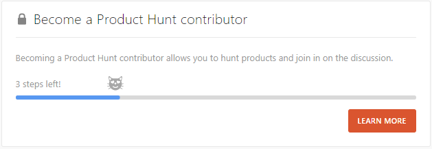
Friction can be helpful when the quality of users and their interactions define a good experience.
Think about Product Hunt. If anyone could post a product, spammers would turn the experience into a nightmare for Product Hunt support team. That’s why the team carefully curating the content by first curating the people who can post.