Functional animation is subtle animation that has a clear, logical purpose. It reduces cognitive load, prevents change blindness and establish a better recall in spatial relationships. But there is one more thing. Animation brings user interface to life.
Motion can make surfaces feel alive by multiplying and dividing them, and changing their shape and size. You should use functional animation to smoothly transport users between navigational contexts, explain changes in the arrangement of elements on a screen, and reinforce element hierarchy.
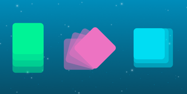
Successful motion design possesses the following six characteristics:
1. Responsive
Visual feedback is extremely important in UI design. It works because it appeal to the user’s natural desire for acknowledgement. In real life, buttons, controls and objects respond to our interaction, and this is how people expect things to work.
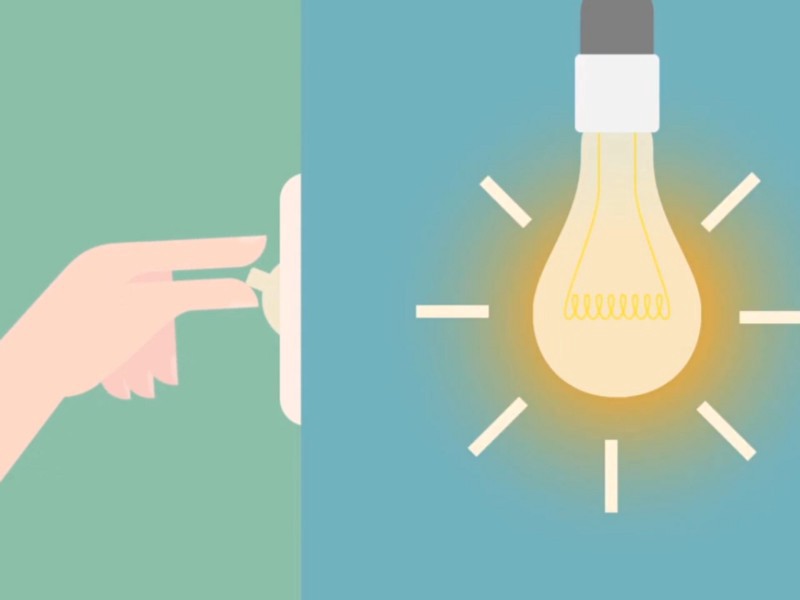
Image credit: Smart Design
User interface should quickly respond to user input *precisely where the user triggers it* and show the connection between new surfaces and the element or action that creates them. It feels great to click through the app and always feel like you know what’s happening.
Objects respond appropriately to user intent. Image credit: Material Design
#2. Associative
Associate newly created surfaces to the element or action that creates them. The logic behind associative connection is to help the user *comprehend the change* that has just happened in the view’s layout and *what has triggered the change*.
Below you can see two examples of menu transition. In first example menu appears far away from the touch point that triggered it, which breaks its relationship with the input method.

Don’t. Image credit: Material Design
In second example menu appears right from the touch point. This tying the element to the point of touch.

Do. Image credit: Material Design
Another example is an action button whose functionality changes under certain conditions. “Play” and ”Stop” buttons are probably the most common example of switchable buttons. Transforming the play button to a pause button signifies that the two actions are linked, and that pressing one makes the other one visible. You should animate the transition between states so that it looks smooth, not discontinuous.

Smoothly transition to a playback control both informs the user of the button’s function while adding an element of wonder to the interaction. Image credit: Material Design
#3. Natural
*Avoid a surprising transition.* Every movement should be inspired by forces in the real world. In the real world, an object’s ability to speed up or slow down quickly is affected by weight and surface friction. In a similar way, starts and stops do not occur instantaneously in good user interface design.
Below you can see a good example where the user selects an item in a list to zoom into its detailed view. During expansion, the small card moves in an arc towards its destination as it expands into a larger card.
Do. Elements moving upward on the screen should similarly depict effort during acceleration through an upward movement. Image credit: Material Design
#4. Intentional
Guide focus to the right spot at the right time. Motion, by its nature, has the highest level of *prominence* in a user interface. Neither text paragraphs nor static images can compete with motion. A good transition helps guide the user to the next step of an interaction.
The first-time user cannot really predict an interaction that is about to happen, but proper animation helps the user stay oriented and not feel that content has suddenly changed.
Mac OS uses a functional animation when minimizing a window. This animation connects the first state with the second state.
Mac OS minimize windows animation
Another good example is a parent-to-child transition where user selects an item in a list item or card element and zoom into its detailed view. This interaction allows the user to maintain context.
Animation of parent-to-child transition. Image credit: Material Design
#5. Quick
When elements move between positions or states, the movement should be fast enough that it doesn’t cause waiting, but slow enough that the transition can be understood.
Don’t animate slowly as it creates unnecessary lag and can lengthen the duration.
Don’t. Image credit: Material Design
Staggering and slowing the movement of many elements can lengthen the duration.
Don’t. Image credit: Material Design
Animate quickly so that the user doesn’t have to wait for the animation to finish.

Do. Image credit: Material Design
Keep transitions short as users will see them frequently. Keep animation duration at or under 300ms.

Do. Image credit: Material Design
#6. Clear
Transitions should avoid doing too much at once, because they can get confusing when multiple items need to move in different directions or cross paths.

Don’t. Image credit: Material Design
Transitions should be clear, simple, and coherent. Remember, less is more with regard to animation. So we should focus only on practical things the animation does for the user.

Do. Image credit: Material Design
#Conclusion
Above all, motion isn’t random. There’s purpose behind each action. Motion guides it and focuses on what’s important so you don’t lost. Whether your app is fun and playful or serious and straight forward, using a motion principles can help you provide a clear and quick cohesive experience.
Design with care. Attention to each and every detail is key to your success making human-computer interaction easy to use.
Thank you!