Mobile UX Design: Key Principles
The most important thing to keep in mind when designing a mobile app is to make sure it is both useful and intuitive. If the app is not useful, it has no practical value for user and no one has any reason to use it. If app is useful but requires a lot of time and effort, people won’t bother learning how to use it.
Good UI design addresses both of these design problems:
- In order to be useful, mobile apps should be user-centric. Users install your app because they need to solve a pressing problem. Thus, the app has a sharply defined “sense of purpose.” Think about what it is your users will be trying to accomplish and focus on their key goals/remove all obstacles from their way.
- You should bring clarity into your UI. To be effective using an interface you’ve designed, people must be able to recognize what it’s for and how to use it. There is simply no room for confusion.
Here are 9 UX design principles that I think are key for creating really great mobile user experiences.
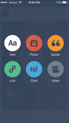
1. Cut Out The Clutter
User attention is a precious resource, and should be allocated accordingly. Cluttering your interface overloads your user with too much information: every added button, image, and line of text make the screen more complicated.
A simple rule of thumb: one primary action per screen. Every screen you design for the app should support a single action of real value to the person using it. This makes it easier to learn, easier to use, and easier to add to or build on when necessary. One hundred clear screens is preferable to a single cluttered one.
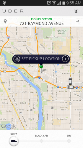
Take Uber, for instance. Uber knows that the goal of the user who uses the app is to take a cab. App does not overwhelm the user with too much of information: it automatically detects users location based on GEO data and the only thing users have to do is to select a pickup location.
- Mobile navigation must be coherent. You should use the proper signifiers (correct visual metaphors) so that the navigation doesn’t require any explanation and make sure that each navigation element (such as icon) lead to the proper destination.

- Mobile navigation must be consistent for the app. Don’t move the navigation controls to a new location or hide them on different pages. This will just disorient the user.
- Mobile navigation should communicate the current location. Failing to indicate the current location is probably the single most common mistake to see on apps menus. “Where am I?” is one of the fundamental questions users need to answer to successfully navigate.
3. Create a Seamless Experience
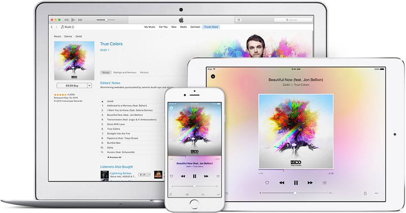
You shouldn’t think of a mobile design in isolation. Creating a seamless experience across mobile, desktop and tablet is very important for your users.
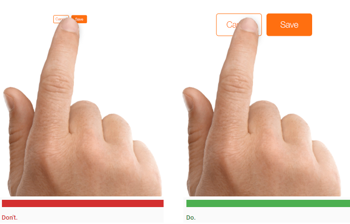
4. Design Finger-friendly Tap-targets
Smaller touch targets are harder for users to hit than larger ones. When you’re designing mobile interfaces, it’s best to make your targets big enough so that they’re easy for users to tap.
Create controls that measure have a size 7–10 mm so they can be accurately tapped with a finger. Such target allows the user’s finger to fit snugly inside the target. The edges of the target are visible when the user taps it. This provides them with clear visual feedback that they’re hitting the target accurately.
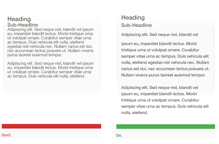
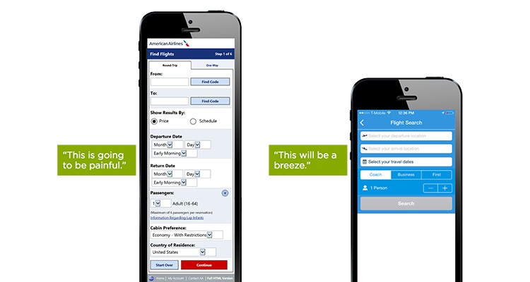
5. Text Content Should Be Legible
When compared with desktops, smartphones have relatively small screens, which means that one of the challenges of mobile design is to fit a lot of information on a small UI. You might have a temptation to squish everything down for a mobile design in attempt to provide as much information as possible. But you should resist the temptation.
A rule of thumb for mobile: text should be at least 11 points so it’s legible at a typical viewing distance without zooming.
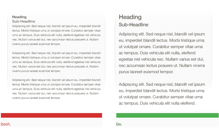
Improve legibility by increasing line height or letter spacing. Good, generous whitespace can make some of the messiest interfaces look inviting and simple.
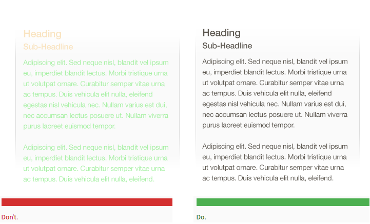
Make sure there is ample contrast between the font color and the background so text are legible. The W3C recommends the following contrast ratios for body text and image text:
- Small text should have a contrast ratio of at least 4.5:1 against its background.
- Large text (at 14 pt bold/18 pt regular and up) should have a contrast ratio of at least 3:1 against its background.
- It’s important to place top-level menu, frequently-used controls and common actions to the green zone of the screen, because they are comfortably reached with one-thumb interactions.
- Place negative actions (such as delete or erase) in the hard to reach red zone, because you don’t want users to accidentally tap them.
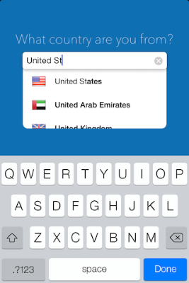
8. Minimize Need For Typing
Typing on a mobile is a slow and error-prone process. It’s therefore best to always try to minimize the amount of typing required to use a mobile app:
- Keep forms as short and simple as possible by removing any unnecessary fields.
- Use auto-complete and personalized data where appropriate so that users only have to enter the bare minimum of information.
9. Test Your Design
All too often a mobile design looks great when viewed on a large desktop screen but doesn’t work nearly half as well when taken for a test on an actual mobile. Even the most painstakingly-considered UX will ultimately contain some unseen flaw when put into the real world. That’s why it’s so important to test your app with real users on a variety of mobile devices. You should ask real users to proceed regular tasks only after that you’ll see how well the design really performs. Treat your app as a continuously evolving entity, using data from analytics and user feedback to constantly improve the experience.
Conclusion
Just like with any other design elements, tips specified above are just a place to get started. Make sure to mix and match these ideas with your own for the best results. Just remember that design isn’t just for designers — it’s for users.