Mobile UX Design: User Errors

Mobile UX Design: User Errors

‘Errors’ happens. They happen in our apps and they happen in our life. Sometimes they happen because we made mistakes. Sometimes because a system failed. Whatever the cause, these errors — and how they are handled — can have a huge impact on the way user experiences your app. Often overlooked, a lazy error handling and ill-constructed error messages can fill users with frustration, and make them stop using your app. A well-crafted error handling, on the other hand, can turn a moment of failure into a moment of delight.

In this article we’ll examine how the design of apps can be optimized to prevent excessive user errors and how to create good error messages.

What is Error?

Errors (or error condition) occur when an app fails to complete an expected action, such as:

  • The app does not understand user input
  • The app fails
  • A user intends to run incompatible operations concurrently

Every error, regardless of who is to blame, becomes a point of friction for your users. Luckily, a well-designed error handling can help reduce that friction.

Preventing User Errors

If you design app, you should be familiar with constraints. For example, it’s hard to fill out a certain form or it’s impossible to properly sync a data if device has poor network connection. You should take these constraints into account in order to minimize errors by designing app that make it easy for users to use it. In other words, it’s better to prevent users from making errors in the first place by offering suggestions, utilizing constraints, and being flexible.

Twitter famously has a strict character limit for Tweets, and warns users before they exceed that limit with a remaining character count.
##Make Error Message Informative and Consistent One of the [10 Usability Heuristics](http://babich.biz/golden-rules-of-user-interface-design/) advises that it’s important to communicate errors to users gracefully and clearly. An effective error message provides following information:
  • Clearly communicate what is happening
  • Describe how a user can resolve it
  • Preserve as much user-entered input as possible

User Input Errors

User input validations are meant to have conversations with users and guide them through the difficult times of errors and uncertainty. The output of this process is emotional rather than technical.

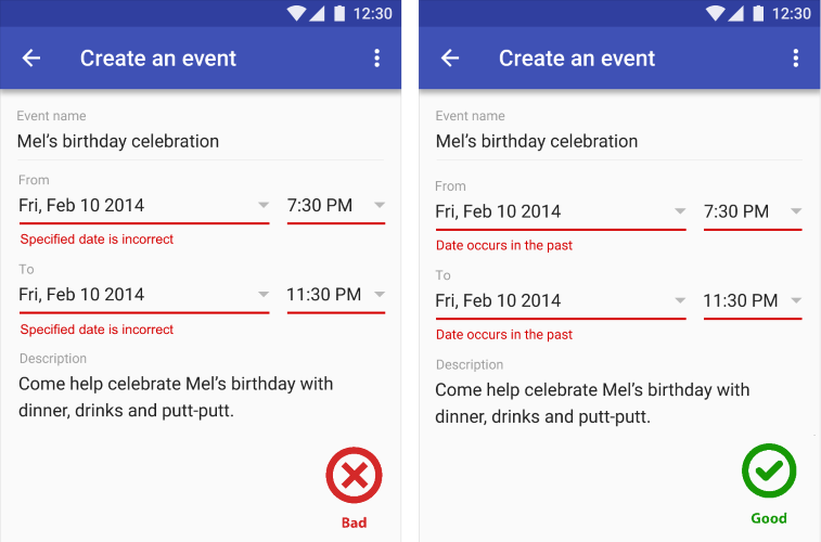
The primary principle of input validation is this: “Talk to the users! Tell when them what is wrong!” Generally speaking, there are three important elements that good form validation consists of:

  • Right time and place for informing about errors
  • Right color for the message
  • Clear language for your message

And all these moments have one major goal — avoid confusion.

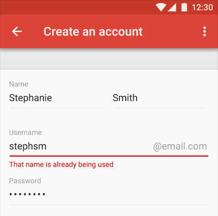
Right Time and Place (Inline Validation)

Users dislike when they go through the process of filling out a form only to find out at submission, that they’ve made an error. The right time to inform about the success/failure of provided data is right after the user has submitted the information. And it’s a time when real-time validation comes into play.

Real-time inline validation immediately informs users about the correctness of provided data. If you are performing inline form validation, and the field with the error is clearly marked, the submit button may be disabled until the error is corrected. It allows users to correct the errors they make faster without having to wait until they press the submit button to see the errors.
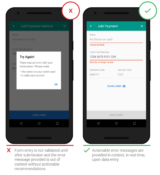
Image credit: Google
Below are a few examples of inline validation:
  • Incompatible values
Example of errors detected before form submission. Image credit: Material Design
* **Over/under character or word count** ![](https://babich.biz/content/images/2016/06/1-cJpnSCjTu075jizlqVVRCQ.png)
Example of an input field with character counter and error text. Image credit: Material Design
##Right Color (Intuitive Design) *Color is one of the best tools to use when designing validation.* Because it works on an instinctual level, adding red to error messages and yellow to warning messages is incredibly powerful. Error text should be legible, with noticeable contrast against its background color. But make sure that colors in your digital interface are [accessible for your users](http://babich.biz/accessible-interface-design/), it’s a really important aspect of a well executed visual design. ![](/content/images/2016/06/1-owGg_C9TWciu1XUFw1CG2g.png)
Make people notice the message. Image credit: Material Design
##Clear Message (What Happened) Make sure your error messages sound like they’ve been written for humans. In order to achieve this you should speak the same language as your users, avoid using technical jargon, express everything in the user’s vocabulary. Your validation message should clearly state:
  • What went wrong and possibly why.
  • What’s the next step the user should take to fix the error.
A typical error might state that “the data is invalid” without telling the user why it’s invalid (Is it a typo? Is it occupied?). Make sure the message is clear. Image credit: Material Design
#App Errors App errors occur *independent* of user input. It is an example of a situation where the user is getting something other than their desired state. When showing errors, explain why user cannot see anything, and how to solve this.

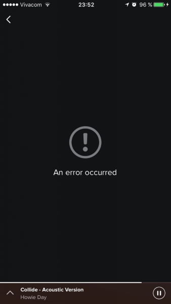
Sync Error/Failure To Load

When sync or connectivity is down or content has failed to load, the user should know that. Tell them upfront. Since you don’t have a data, you can use empty states to fill this gap. Sad fact that most empty states often look… empty. In example below, error screen only states “An error occurred” and doesn’t provide any helpful information.

Dead-end empty state. Image credit: Spotify
Think of your error message as a *conversation with your user.* Use friendly and helpful empty states in a moment of failure. Assist users by providing the basic required information, and encourage users to solve the problem. ![](/content/images/2016/06/1-ydkY2tT5WIKUUH6KE6Te3w.png)
Feel lost and unconnected, like you are on a deserted island? Follow the advice, keep calm, light a fire, and keep refreshing. Image credit: Azendoo
If appropriate, present a link (or button) to help a user accomplish their task. But you should only offer options that you can actually support. For example, don’t offer an option like “Try again” in cases where you can detect that the operation will fail. ##Never Show The Raw Error Message Messages like the example below are cryptic and scary. ![](/content/images/2016/06/1-tU5KLghqq1IyHwTnz6NU4g.png)
This error message was written by a developer for a developer.
Don’t assume people know about the context of a message or they are tech-savvy, tell people what’s wrong in simple words. How would you explain the error to them, in human speak? Write those words down. That’s your error message.

Incompatible State Errors

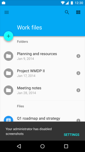
Incompatible state errors occur when users attempt to run operations that conflict, such as making a call while in airplane mode or trying to play online video while being offline. You should help prevent users from putting themselves into these situations by clearly communicating the states they are selecting. Simply, don’t let people start something they can’t finish.

Clarify the reason for and origination of the error. Image credit: Material Design
#Conclusion *The best error message is the one that never shows up.* It is always best to prevent errors from happening in the first place by guiding users in the right direction ahead of time. But when errors do arise, a well-designed error handling not only help teach users how to use the app as you intended, but they also prevent users from feeling ignorant.

Thank you!

Subscribe to Nick Babich

Don’t miss out on the latest issues. Sign up now to get access to the library of members-only issues.
jamie@example.com
Subscribe