Motion in UX Design

Motion in the world of design is used to describe spatial relationships, functionality, and intention with beauty and fluidity. Motion might sound like a big concept, but when used effectively it is subtle and natural. Thoughtful motion in design can enhance the user’s experience over traditional design elements.
So let’s talk about the fundamentals of motion design, why and when you’d want to use it in your UI, and how it can help you make your UX better.
Motion-based Design
Motion tells stories — it shows how an app is organized and what it can do. Motion drives the entire UI — it redefines navigation and creates a more natural experience by adding a new level of depth to the interaction design. For every button clicked and screen transition, there is a story that follows and good motion-based design helps you to tell it.
Why Does Motion Matter?
When users interact with your product, they might ask following questions:
- “What’s most important here?”
- “How do I know what to do next?”
- “How to know whether or not I have completed my task?”
Questions like that might reveal opportunities to use motion to enhance the experience. Motion optimize perceived UX:
- It drives user’s attention and hints at what will happen if a user makes a tap.
- It helps you orient users within the interface and provides guided focus between views.
- It provides a visual feedback.
Besides that, the motion-based design brings another important thing into UX: delight. We all appreciate the value of humane, delightful products over cold and purely rational robotic products. That’s why designers should experiment and find solutions that feel more natural and evoke an emotional connection.
Motion Language
Motion is allowing us to communicate better the interaction, making it easier for the user to understand them. Motion-based design elements can be seen in a variety of forms, including transitions, spatial relationships, animations and even mimic 3D depth. Here are a few places for integrating motion-design in the UX workflow:
Driving Users’ Attention
Motions can draw user’s attention to a specific area. Good motion design makes UI more predictable and easier to navigate - it puts emphasis on the right elements depending on what the objective is and helps the eye see where a new object comes from or where a hidden object goes.
Motion design also gives the viewer a clue as to what’s about to happen. There may be multiple layers of elements working together to support that action.
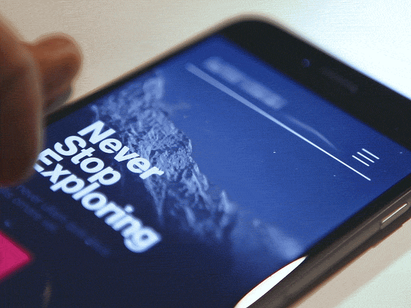
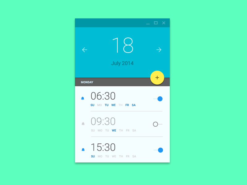
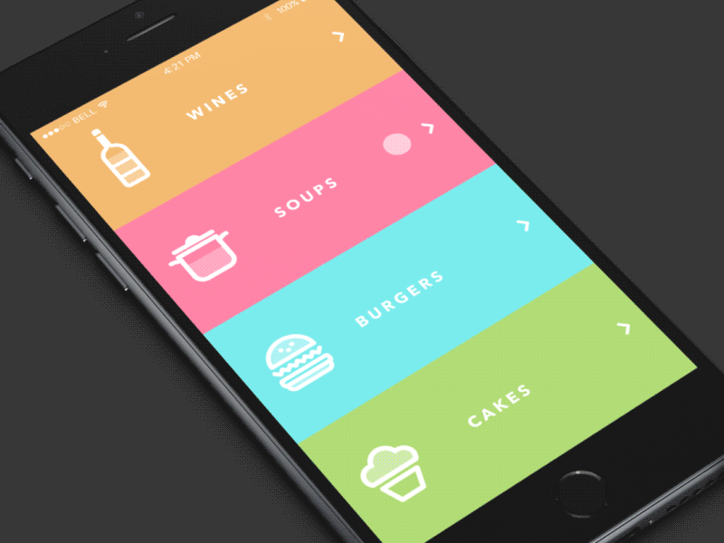
Motion design fills the comprehension gap by defining the spatial relationships between screens and elements. It helps people orient themselves within the interface and establish visual relationships. In examples below, during the transition, the user is guided to the next view and the surface transforms to communicate hierarchy:
Brings Delight
Motion can make your user experience truly delightful and memorable. By injecting subtle motion into a design, you can make users feel like they are interacting with something that’s has a personality. A simple attention to detail is often what signals to the people that people responsible for the design are care about their users.
Conclusion
Motion is the next level of tech. It’s a natural way of interacting with things and it’s absolutely critical to the design of the future. We need to say goodbye to static user interfaces and create interfaces which much more human and alive.
Thank you!