Progress Indicators in Mobile UX Design

Visibility of system status is one of the most important rules of UI design. The goal behind this rule is pretty obvious— to minimize user tension you should provide feedback for the user about what is happening with the app within a reasonable amount of time. Don’t keep the users guessing — tell the user what’s happening. And one of the most common forms of such feedback is a progress indicator.
In this article, we’ll overview the main types of progress indicators and use cases for them.
Good Interaction Design Provides Feedback
While instant app’s response is the best, there are simply times when your app won’t be able to comply with the guidelines for speed. Delays are usually caused by slow loading times and latency issues. For such cases, you must reassure the users that the app is working on their request and that actual progress is being made.
Essentially, feedback answers questions across three categories:
- Current Status: What’s happening?
- Outcomes: What just happened?
- Future Status: What will happen next?
What is Good Progress Indicator?
Good progress indicators always give some type of immediate feedback. They notify users that the app needs more time to process the user action, and tell (approximately) how much time it will take. They have two main advantages:
- Reduce user’s uncertainty (app reassures the user that it’s working).
- Offer a reason to wait and reduce users’ perception of time (app gives the user something to look at while waiting. Thus, makes users pay less attention to the wait itself).
A user’s wait time begins the moment when she taps the screen (initiates an action). Immediately, the system should give some visual feedback to communicate that it has received the request.
Use a progress indicator for any action that takes longer than about one second. For anything that takes less than 1 second to load, it is distracting to use an animation.
Types of Indicators
Progress indicators could be determinate or indeterminate:
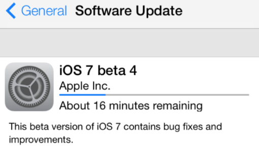
- When indicators are determinate they indicate how long an operation will take when the percentage complete is detectable.

- When indicators are indeterminate they request that the user wait while something finishes when it’s not necessary to indicate how long it will take.

As a general rule you should use looped animation only for fast actions (2–10 seconds). Making the user to stare at a spinning wheel longer can increase bounce rates.

It can also be helpful to add additional clarity for the user by including text that explains why the user is waiting (e.g. “Loading comments…”).
Users Expectations
Default loading icons (like the iOS spinner of gray lines radiating from a central point) tend to have negative connotations. They serve a variety of operating system functions, indicating the status of everything from device boot to problems connecting to network or loading a data. Because of that, people dont’ like to see only a loading spinner with no indication of progress or time.
The thought process here is to confirm that the submission was complete not necessarily the progress. That is shown through the completion of the circle.
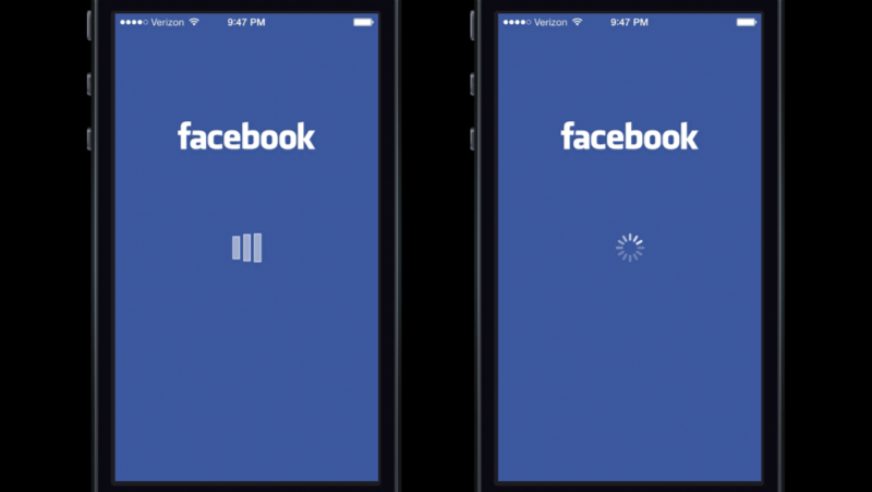
System or Custom Looped Animation
Facebook app has very interesting experience with looped animation. Rusty Mitchell highlighted this moment when he talked about a Facebook loading indicator: “When the users were presented with a custom loading animation in the Facebook iOS app (left) they blamed the app for the delay. But when users were shown the iOS system spinner (right), they were more likely to blame the system itself.”
Linear Animation
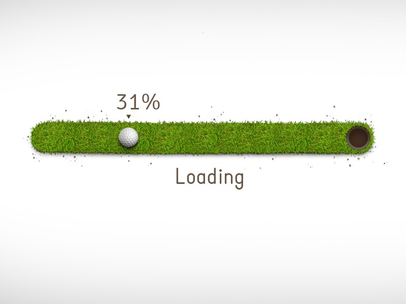
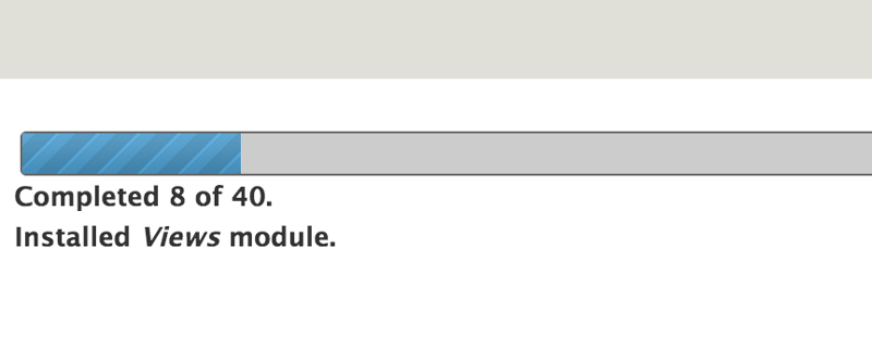
A determinate linear progress indicator should always fill from 0% to 100% and never decrease in value. For multiple operations happening in sequence, you should use the indicator to represent the progress as a whole, and not each individual operation.
As a general rule you should use percent-done animation for actions that take 10 seconds or more.
Provide a General Time
Estimate Don’t try to be exact, a simple, “This might take a minute” can be enough to inform the user and encourage them to wait it out.
Progressive Animation
Progress bars tell users how long an action is taking, but they’re not always correct. You can disguise small delays in your progress bar by starting the progressive animation slower and allow it to move faster as it approaches the end. The progress bar should never stop, otherwise users will think the app froze.
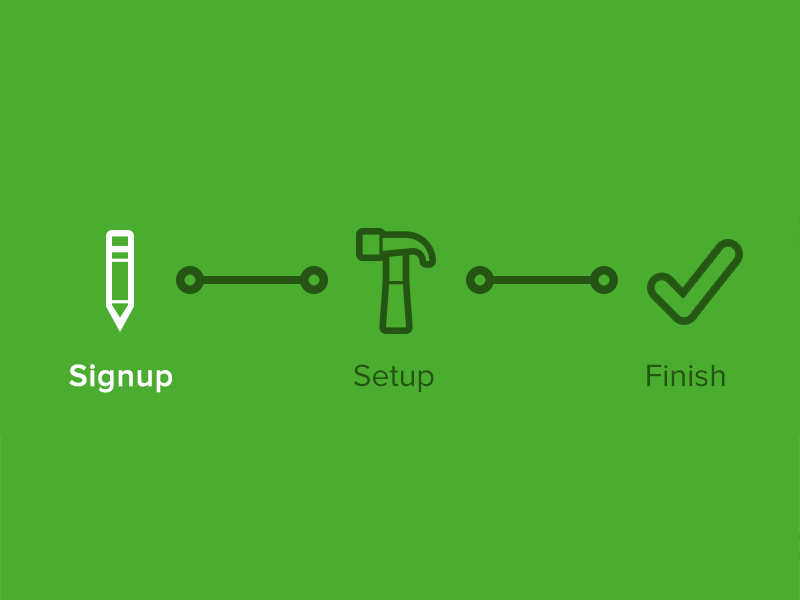
Showing Steps
Instead of showing a percentage number, consider showing the number of steps. Users might not know how long each step lasts, but knowing the number of steps at least helps them form an estimate.
You can follow a classic step-description way:
Or follow more creative approach:
Skeleton Screens
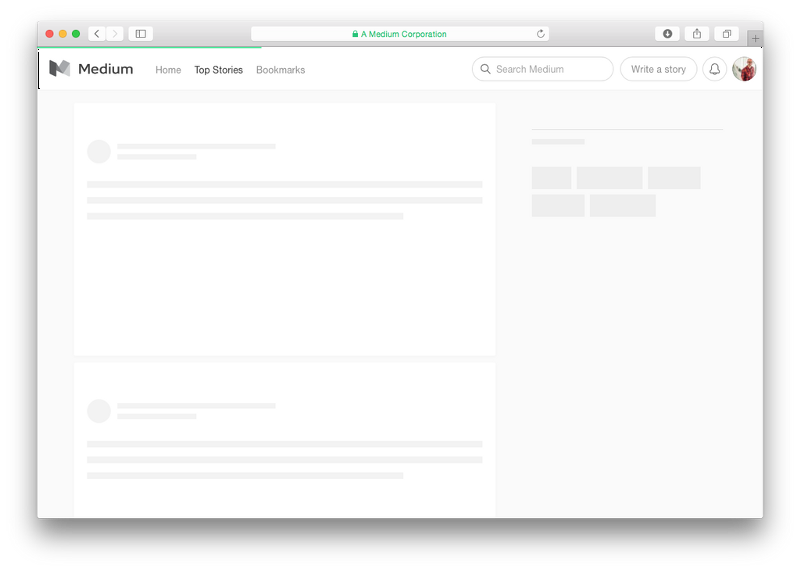
You should always try to make the wait more pleasant if you can’t shorten the line. And wait-time is a right time for skeleton screens (a.k.a temporary information containers). Skeleton screens are another way to focus on progress instead of wait times. A skeleton screen is essentially a blank version of a page into which information is gradually loaded. Such action creates the sense that things are happening immediately as information is incrementally displayed on the screen.
Medium uses this trick, showing a simple wireframe as a placeholder, while the actual content loads. With a such screen, the focus is on content being loaded not the fact that its loading.
Don’t Use Static Progress Indicators
This group of indicators is represented by not moving image or text like “Loading…” or “Please wait…” to indicate that the request has been received. While any feedback is better than none, static indicators don’t offer enough information about what is happening and should be replaced with more meaningful type of indicator.

One Last Thing
To ensure people don’t get bored while waiting for something to happen, offer them some distraction. This can be something fun, something unexpected or anything else that catches your users’ attention long enough for your app to load. Fine animations can distract your visitors and make them ignore long loading times.
Conclusion
Providing feedback is fundamental to a positive user experience. Feedback can reduce uncertainty for users and increase the time they are willing to wait.
Thank you!