Vibrant Colors For Apps and Sites

Color is one of the most powerful tools in the designer’s toolkit. Color can draw attention, set a mood, influence users’ emotions, perceptions and actions. When it comes to web & mobile app design, this is definitely the time of vibrant colors. Designers use vibrant colors to make people focus their attention on important elements and make their design memorable.
Below some practical techniques on using vibrant colors in your design:
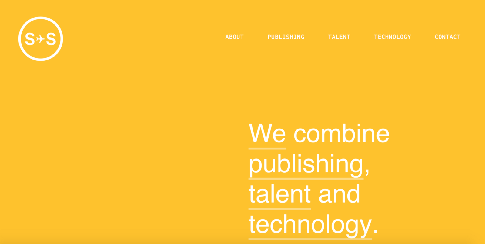
Monotone
One of the most popular ways to use vibrant colors is monotone color palette. Monotone palette includes a single color with a mixture of tints and tones. Such color palettes are visually stimulating — paired with attention-grabbing typography, monotone color schemes are able to create really memorable experience.
- Use duotone to create a dominant image. Select simple high-quailty photos with a single, clear subject. Busy photographs with a lot of details may be obscured.
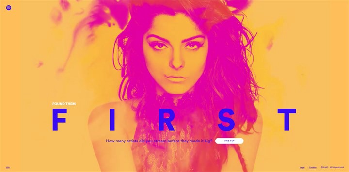
- Pick colors that reflect the mood of the photo. Remeber, that different colors evoke different emotions.
- You design a website and want to create a duotone effect for your image you can do it without any modifications of existing image. Simply use Colofilter.css to apply the effect in CSS code.
Overlay
One way to use color to make a statement is with a design that incorporates a color overlay. You simpy cover an image or video with a semi-transparent colored box. By using one of the bright, saturated colors associated with Material Design, you can evoke feelings of modernism.
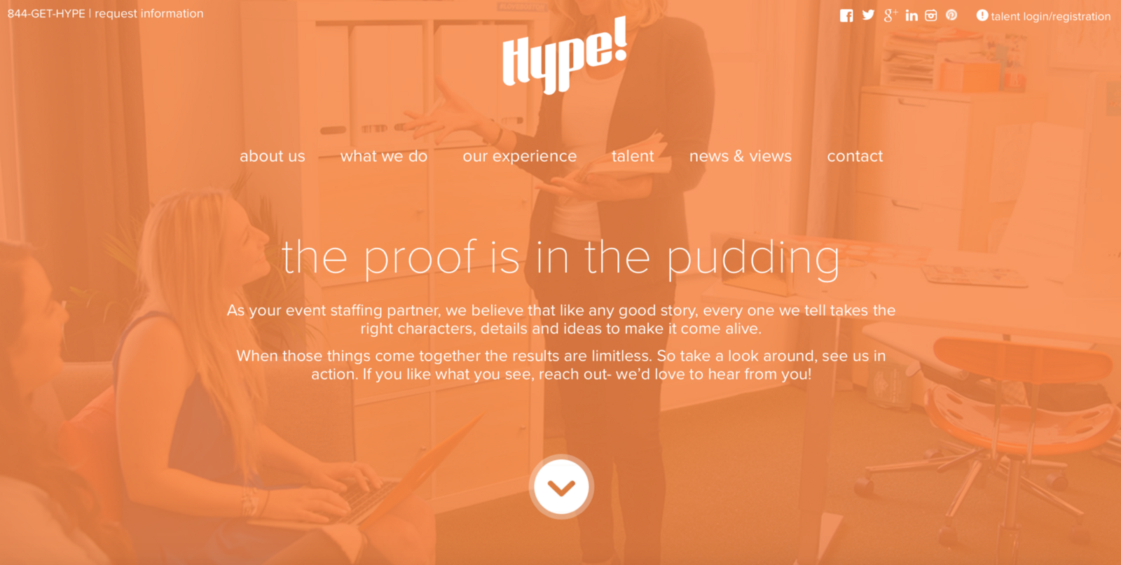
- Heavier color combinations (less transparency and more saturation) put more focus on the color itself than the image behind it.
- Lighter color combinations put more focus on the image.
Conclusion
It’s hard to find a design technique that’s more fun to play with than color. Color effects can be dramatic, impressive and even serene. You the designer really get to experiment when using color effects. Whether you are a fan of bright, bold hues or prefer a more minimalist black and white, the one thing you need to remember:
There are no wrong colors. What matters most is how to use them.
Thank you!