Designing an app may seem easy at first glance, but when you actually get to start prototyping it, things get complicated. What at first seemed simple started to get complex when you realize that it’s not so easy to make a choice how to design a certain element. Even a simple and most common task of visual separation for two or more content blocks starts to get complicated.
Traditional Dividers
You can use horizontal (or vertical) lines to create any necessary visual dividers between related sections of content. They help users understand how content is organized by establishing a rhythm and hierarchy on a page.
A divider is a thin, lightweight rule that groups content in lists and page layouts.
Full-bleed Dividers
Full-bleed dividers emphasize separate content areas and sections that require more distinct visual separation. They separate distinct content sections (e.g. biographic details from contact information) or distinct content elements (e.g. list of emails) in both lists and page layouts.
Take a look at inbox view in Gmail app for Android in example below. You’ll notice that each email item separated by a full-bleed divider. The line across feels like a stop — it distinctly separates items with a hard stop between them.
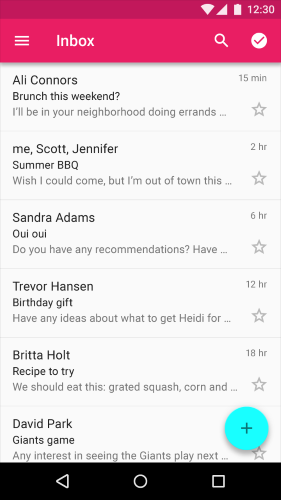
Full-bleed dividers separate email summaries.
##Inset Dividers
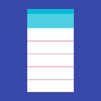
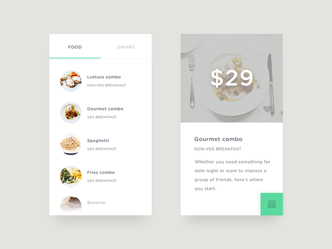
Inset dividers separate *related content*, such as sections in a list of contacts. Inset dividers help users to visually scan the items and present them as a related collection: the whole set of items becomes a continuous flow, which invites users to scroll. Making the separator shorter also gives more room for status items, flags or anchoring elements (such as alphabet letter).
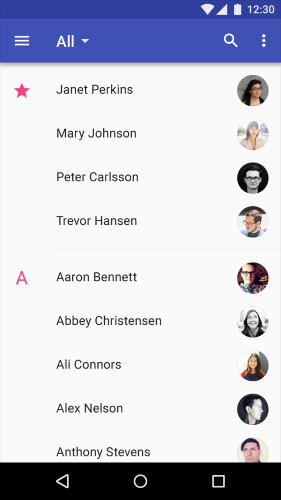
Example of inset divider.
#Alternative Ways to Draw the Line
Traditional dividers might break up content well on a desktop screen, but they have one big disadvantage for mobile apps — they *take up valuable space* on mobile screen. A heavy use of dividers can also lead to visual noise and dense, crowded interfaces. As users’ preferences shift toward a simpler interface, stripping the UI to its very basic, necessary elements is the key to success. The real point behind this change is that it is a shift of *focus onto content and functionality, while doing away with superfluous elements.*
Thus, try to divide by elements and spacing, not lines. Less lines and dividers will always give your interface a cleaner, modern and more functional feel.
Whitespace
Whitespace is the areas of a design where there is no element placed by a designer. Generous whitespace can make some of the messiest interfaces look inviting and simple — it creates the spaces around elements in the design to help them stand out or separate from the other elements. Free space creates an essential breathing room and makes UI that looks less cluttered.
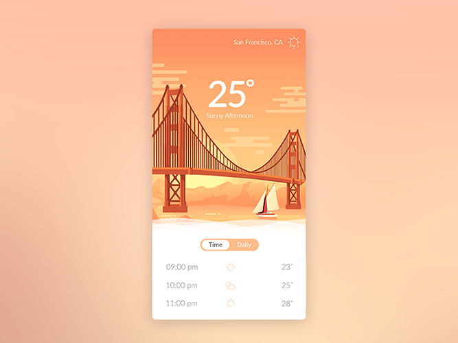
Leveraging space instead of drawing lines helps to define different sections in a non-obtrusive manner. Image credit: Goutham
##Color Contrast
Color contrast is one of your most powerful design tools, use it skillfully and you’ll have a eye-catching design. Creativity will certainly come into play with the separation of content through the [clever use of color](http://babich.biz/the-art-of-minimalism-in-mobile-app-ui-design/). Basically, all you need to do is to find two colors that contrast really well — a pop of color draws the users’ attention to a particular area of the screen without an obtrusive, heavy-handed push to do so. As a result, users can access information more quickly and more easily.
A pop of color can be done with white or a close equivalent in addition to something really really bright like red or orange. Image credit: Awesomed
##Shadows and Elevation
Shadows and elevation are able to create some depth in the UI and visually separate content sections. Calendar App from Google is a good example of how leveraging space and using [shadows](http://babich.biz/graphical-user-interface-as-a-reflection-of-the-real-world-shadows-and-elevation/) instead of drawing lines helps to define different sections in a non-obtrusive manner.
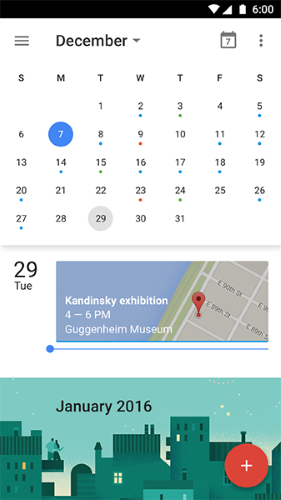
Shadows also helps identify the relationship between different items, and draws attention to certain items.
##You Don’t Need Dividers For Image-based Content
Image-based content in grid lists does not need dividers. Because the grid itself creates visual distinction, grid lists do not need dividers to separate subheaders from content. In this case, the whitespace and the subheaders separate the sections adequately.
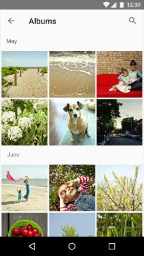
Grid lists adequately separate content using white space and subheaders.
#Conclusion
While the ultimate goal is to simplify our interfaces an make them more functional and usable, we should think twice when separating content by lines and dividers. Developing a cleaner UI design also means removing any unnecessary elements and there are lots of things that can be done to improve mobile UX without adding line elements that just take up space.
Thank you!