10 Rules For Efficient Form Design

Forms is the one of the most important type of interaction for users on the web and in the apps. They are used everywhere — for registration, subscription services, customer feedback, checkout, to initiate transactions between users and companies, or as data input to search or share information. Developers should pay special attention to improving their forms and making them as usable as possible, because careful form design has a huge impact on the speed with which users can accurately complete a form.
In this article, you’ll see practical recommendations that have been crafted from usability testing, field testing, eye tracking and actual complaints made by disgruntled users. Use these recommendations as a starting point for your form design.
1. Order the Form Logically and Only Ask What’s Required
A form is a conversation. And like any conversation, it should be represented by a logical communication between two parties — user and your app. You should:
- Keep questions in an intuitive sequence — they should be asked logically from a user’s perspective, not the application or database logic — this makes the flow from one set of questions to the next better resemble a conversation.
- Order options in an intuitive sequence (e.g., days of the week in the sequence Monday, Tuesday, etc.). If no meaningful sequence is possible, you should order them alphabetically.
- Always question why and how the information you request from your users is being used. Keep in mind that eliminating unnecessary questions reduces user effort and increased completion rates.
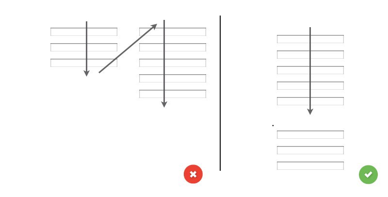
2. Present Fields in a Single Column Layout
One of the problems with form fields in multiple columns is that your users are likely to interpret the fields inconsistently. If a form has horizontally adjacent fields, the user must scan in Z patterns, slowing the speed of comprehension and muddying the clear path to completion. But if a form is in a single column, the path to completion is a straight line down the page. Thus, don’t separate a form into more than one column and only ask one question per row.
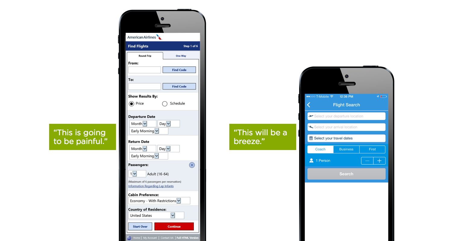
3. Minimize the Number of Input Fields and User Typing Effort
Minimizing the number of input fields makes your form less loaded, especially when you request a lot of information from your users.
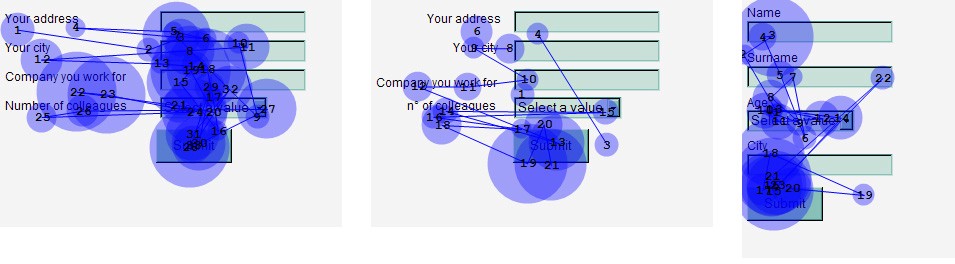
5. Place Labels Above the Corresponding Input Felds
How easy is it for users to scan your form? If your form is hard to scan, it takes longer for users to complete it. The way to avoid this is to make your fields quick to scan when users first see them and after they fill them out. Matteo Penzo’s article on label placement implies that forms are scanned faster if the labels are on top of the fields.
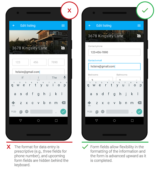
6. Use Forgiving Formatting
Some tasks really do require users to type very precise information, but forcing people to provide this information in a specific format can be at odds with good usability principles. If you are asking users to input numerical information (such as phone number) into a form, be flexible, and design screens that can interpret multiple input formats and show that information in a way that is easily scannable (by humans, not machines) in order to prevent mistakes.
- Once the user clicks on the text box, the label disappears and thus the user cannot double check that what he/she has written is indeed what was meant to be written.la
- When users see something written inside a text box, they may assume that it has already been prefilled in and may ignore it.
If you still want to use a placeholder text for your fields — use placeholder text as a floating label. The placeholder text is showing by default, but once an input field is tapped and text is entered the placeholder text fades out and a top aligned label animates in.

- The right time to inform about the success/failure of provided data is right after the user has submitted the information, because users dislike when they go through the process of filling out a form only to find out at submission, that they’ve made an error.
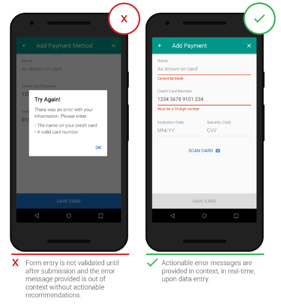
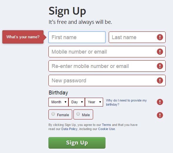
- Error messages must be noticeable at a glance — use color, icons and text to highlight the problem area. Locations near the erroneous input field lead to better performance than error messages at the top and the bottom of the form.
- If answers are required in a specific format, state this in advance, communicating the imposed rule (format specification) without an additional example.

- After an error occurred, never clear the already completed fields!
Conclusion
Users can be hesitant to fill out forms, so you should make this process as easy as possible. We need to make the form design our strength rather than weakness. Minor changes — such as group related fields and indicating what information goes in each field — can significantly increase form usability. And improved form leads to faster completion times, fewer form submission trials, and fewer eye movements.
Thank you!