Bottom Tab Bar Design Best Practices
The bottom tab bar (also known as the navbar) is one of the most popular types of navigation in mobile design. Its located in the easy-to-reach zone, making it easily accessible by the user’s thumb. Despite its relative simplicity, it can be tricky to design right.
In this article, I will share the top 7 things to remember when designing a tab bar.
Anatomy of tab bar navigation
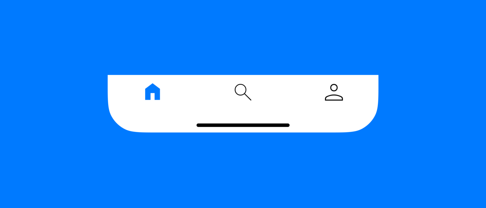
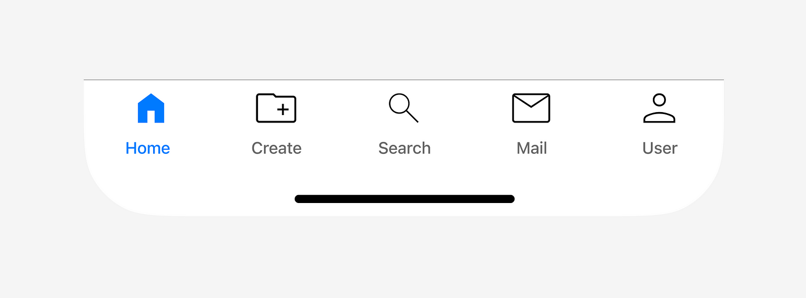
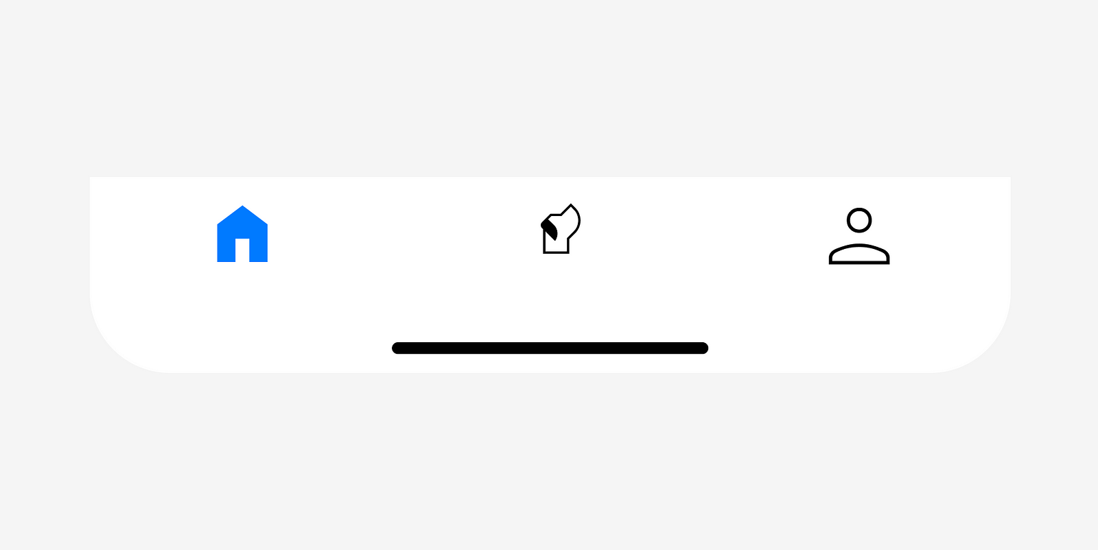
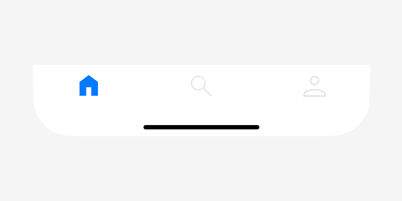
The bottom tab bar can be icon-only navigation:
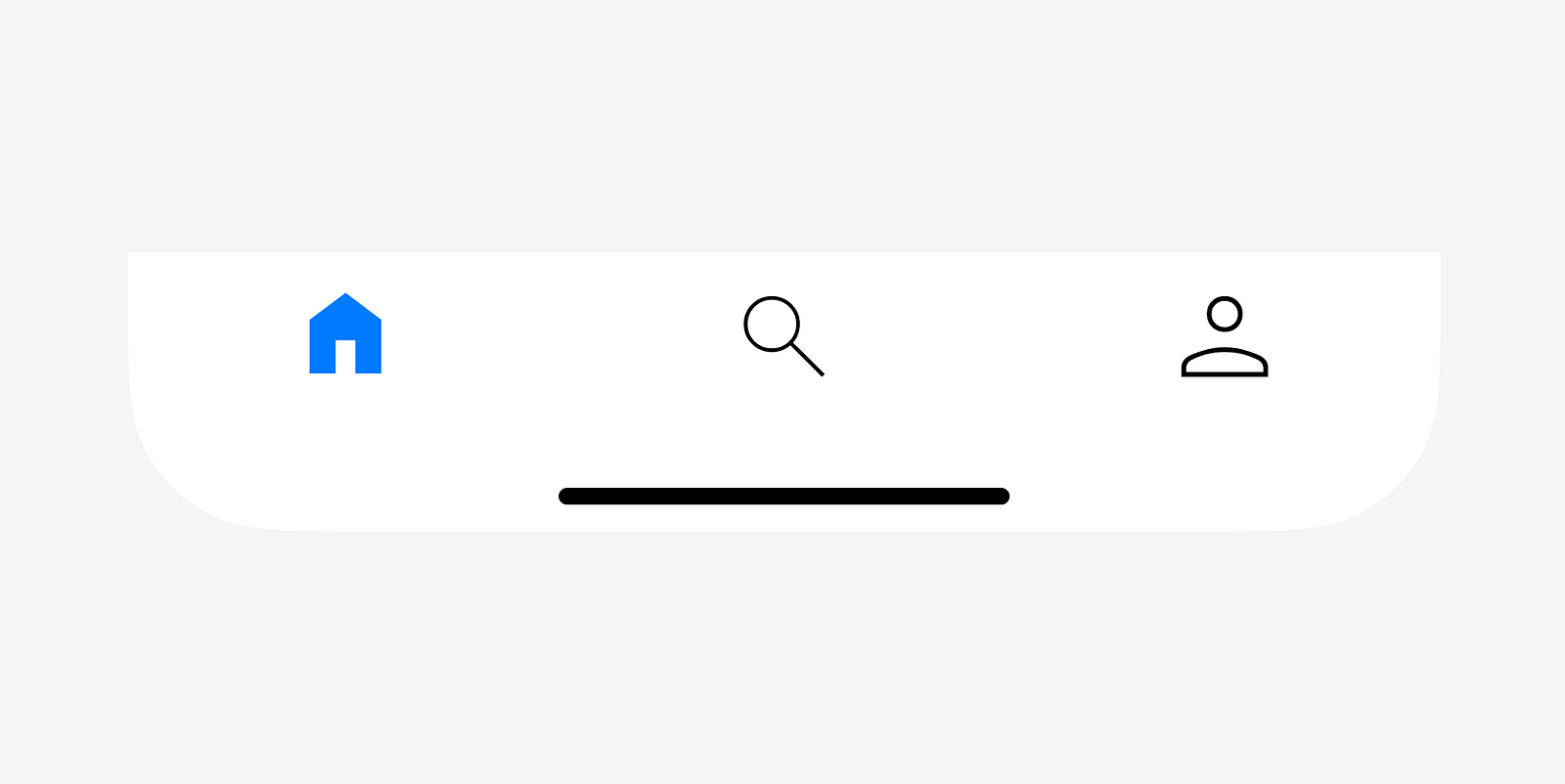
or icons can be paired with text labels:
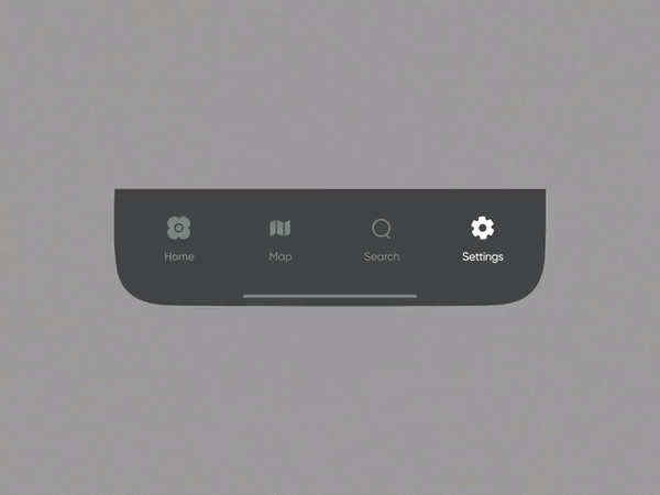
The selected navigation option usually has a different visual style that helps users understand the current location at a glance.
Apple iOS Tab bar
For Apple iOS, the container size for the navigation options is equal to 390x49.
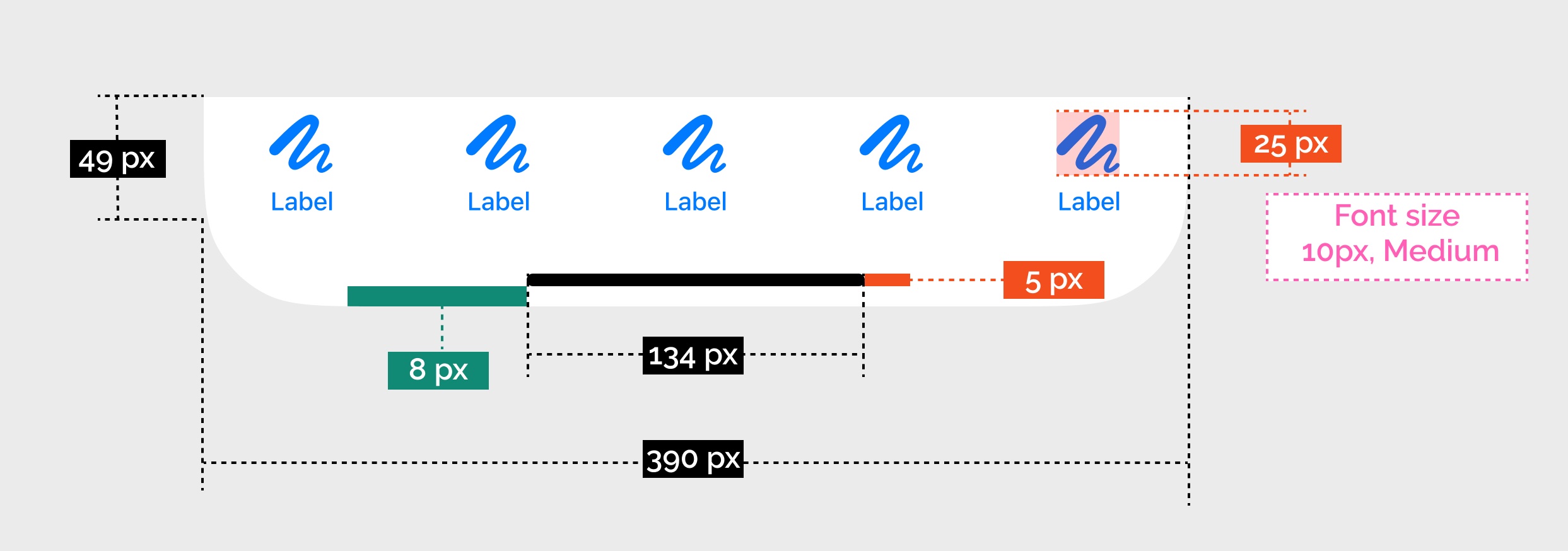
The size of icons in contanier is:
- 25x25 pt for regular tab bars
- 18x18 pt for compact tab bars
For a square glyph the icon should be:
- 23x23 pt for regular tab bars
- 17x17 pt for compact tab bars
For text labels, Apple iOS uses SF font size 10 and Medium weight.
How to design tab bar
Here is a quick guide on how to design an animated tab bar for iOS in Figma:
7 Don’ts for Tab Bar Design
1. Don’t put elements that trigger actions in the bar
Tab bar contains navigation destinations, not actions. Don’t put controls that trigger actions, such as Create.
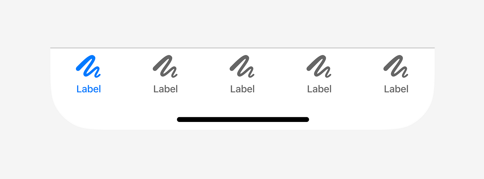
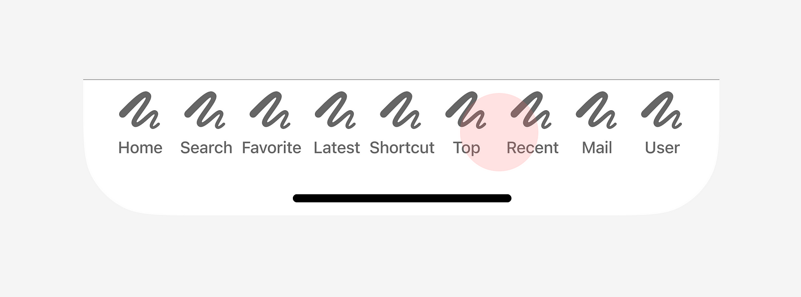
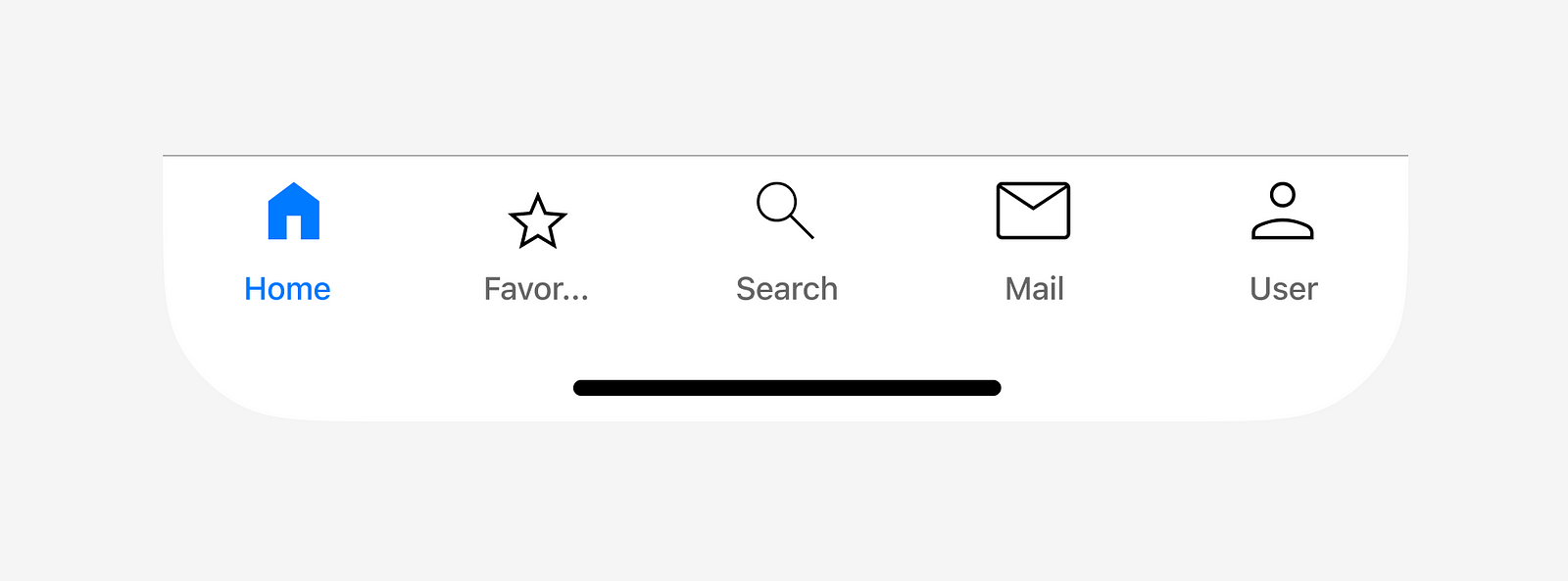
2. Don’t add more than 5 navigation destinations
The Tab bar works the best for 3–5 top-level navigation destinations. Using more than five options will make targets too close to each other and hurt usability. Users might accidentally trigger the wrong option.
What to do:
- You can go for segmented control if you have only two top-level navigation options.
- If you have more than five navigation options, there is a high chance that not all of them are the top priority. You might evaluate navigation options, and if you still have more than five destinations, you can use controls like the hamburger menu.
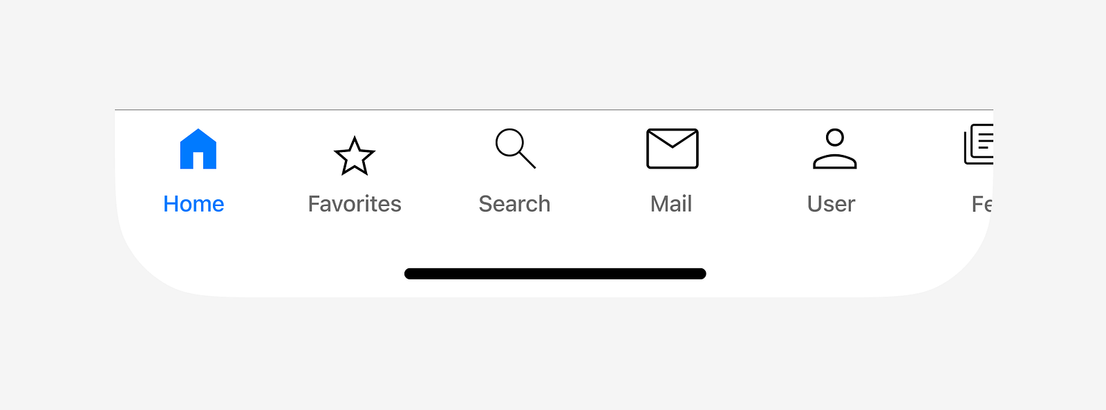
3. Don’t design a scrollable tab bar
The scrollable tab bar harms discoverability. Since not all navigation options will be visible at a time, users might easily miss important options. Plus, the current location might go out of sight when the user scrolls the tab bar.
4. Don’t use unfamiliar icons
Icons that you use in a tab bar should be crystal clear to your target audience. If you doubt the meaning of icons is clear, you should always accompany the icons with labels.
5. Don’t use “ gray on gray” color combinations
Poor color contrast for icons and small font size for labels are two common problems of tab bar design.
- Always check color contrast for text and icons. 3 : 1 is a minimum ratio for active user interface components and graphical objects such as icons and graphs (according to WCAG)
- Ensure that text labels are legible and readable.
6. Don’t truncate labels
You don’t have a lot of space in the tab bar, so when it comes to text labels, every character counts. Never truncate labels because the meaning becomes unclear to users. Instead, try to write short labels that clearly communicate the option.
7. Don’t use fancy animated transitions
Fancy animation might look cool to first-time users but quickly becomes annoying once you start using the app regularly. Every object that demands too much action but doesn’t offer practical value becomes a visual noise that frustrates users. That’s why try to avoid using fancy transitions between options.