Designing More Efficient Forms: Structure, Inputs, Labels and Actions

People who use your app or site have a particular goal. Often the one thing that is standing between the user and his goal is a form. Because forms still remain the one of the most important type of interaction for users on the web and in the apps. In fact, forms are often considered to be the final step of the journey to the completion of goals.
Forms are just a means to an end. Users should be able to complete forms quickly and without confusion.
In this article, you’ll see practical guidelines that have been crafted from usability testing, field testing, eye tracking and actual complaints made by disgruntled users.
The Components Of Forms
The typical form has following six components:
- Structure. It includes ordering for fields, appearance on the page and logical connections between multiple fields.
Input fields. They include text fields, password fields, check boxes, radio buttons, sliders and any other field designed for user input. - Field labels. They tell users what the corresponding input fields mean.
Action buttons. When user presses the button, the action is performed (such as submitting the data). - Feedback. User understands the result of the input by a feedback. Most apps or sites use messages as a form of feedback. Messages notify the user about result, they can be positive (indicating that the form was submitted successfully) or negative (“The number you’ve provided is incorrect”).
Forms could also have following components:
- Assistance. Any help that explans how to fill out the form.
- Validation. Automatic check that ensures that user’s data is valid.
This article covers many aspects related to the structure, input fields, labels and action buttons.
Form Structure
A form is a conversation. And like any conversation, it should be represented by a logical communication between two parties — user and your app.
Only Ask What’s Required
Make sure you only ask what you really need. Every extra field you add to a form will affect its conversion rate. That’s why you should always question why and how the information you request from your users is being used.
Order the Form Logically
Details should be asked logically from a user’s perspective, not the application or database logic. Typically, it’s unusual to ask for someone’s address before their name.
Group Related Information
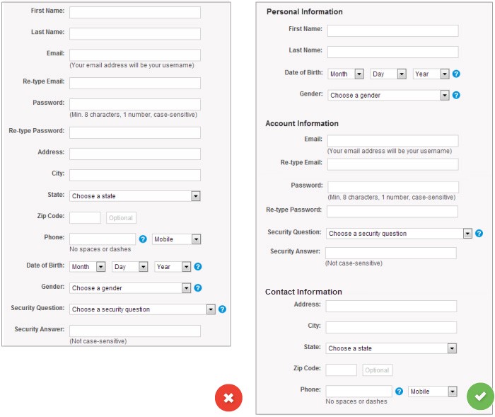
You should group related information in logical blocks or sets. The flow from one set of questions to the next will better resemble a conversation. Grouping related fields together also helps users make sense of the information that they must fill in. Below is an example for Contact Information.
One Column vs. Multiple Columns
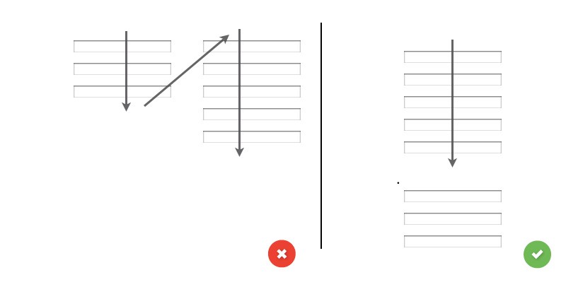
Forms should never consist of more than one column. One of the problems with form fields in multiple columns is that your users are likely to interpret the fields inconsistently. If a form has horizontally adjacent fields, the user must scan in Z patterns, slowing the speed of comprehension and muddying the clear path to completion. But if a form is in a single column, the path to completion is a straight line down the page.
Input Fields
Input fields are what allow your users to fill in your form. Depending on what information you ask, there are various types of fields — text fields, password fields, dropdowns, check boxes, radio buttons, datepickers and others.
Number of Fields
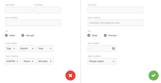
Try to minimize the number of fields as much as possible. This makes your form less loaded, especially when you request a lot of information from your users. However don’t over do it, no one likes a three field form that turns into a 30 field interrogation.
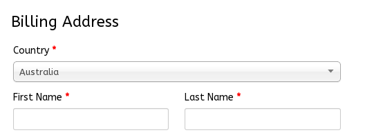
But smart defaults can make the user’s completion of the form faster and more accurate. For example, pre-select the user’s country based on their geo location data. But still you should use these with caution, because users tend to leave pre-selected fields as they are.
Desktop-only: Autofocus for Input Field
Autofocusing a field gives the users an indication and a starting point to quickly begin to fill out the form. You should provide a clear visual ‘notification’ that the focus has moved there — change color, fade in a box, flash in an arrow, whatever. Amazon registration form has both autofocus and visual notification for the user.

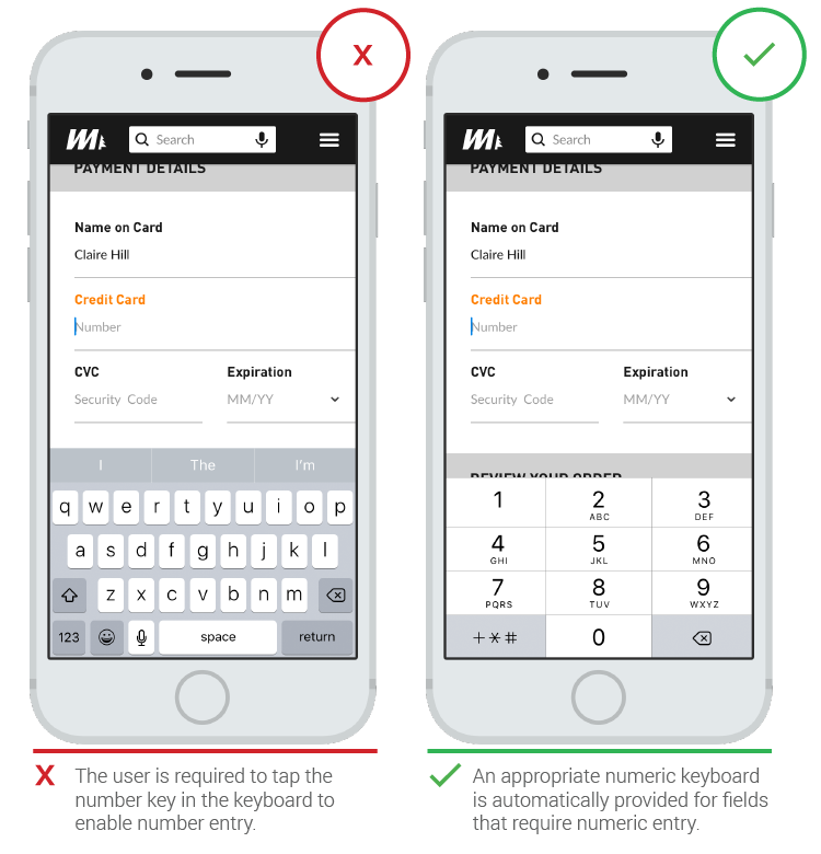
Mobile-only: Match the Keyboard With the Required Text Inputs
App users appreciate apps that provide an appropriate keyboard for text entry. Ensure that this is implemented consistently throughout the app rather than only for certain tasks but not others.
Labels
Clear label text is one of the primary ways to make UIs more accessible. Labels tell the user the purpose of the field, maintain their usefulness when focus is placed inside of the field and should remain even after completing the field.
Number of Words
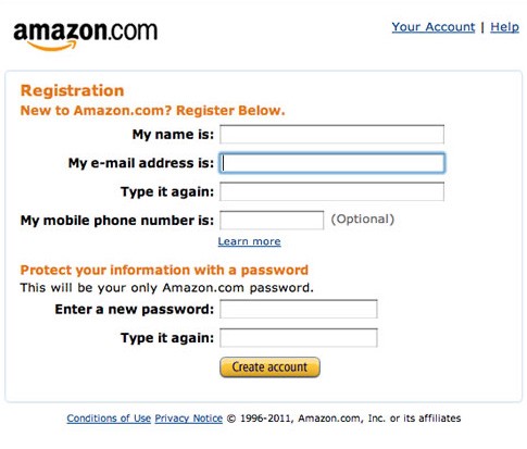
Labels are not help texts. You should use succinct, short and descriptive labels (a word or two) so users can quickly scan your form. Previous version of the Amazon registration form contained a lot of extra words which resulted in slow completion rates.
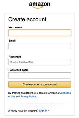
Current version is much better and has short labels.
Sentence Case vs Title Case
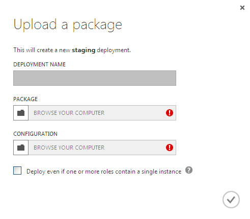
Should it be “Full Name” or “Full name”? Sentence case is slightly easier (and thus faster) for reading than title case. But one thing for sure — you should never use all caps, or else the form would be difficult to read and much harder to quickly scan, as there are no differences in character hight any more.
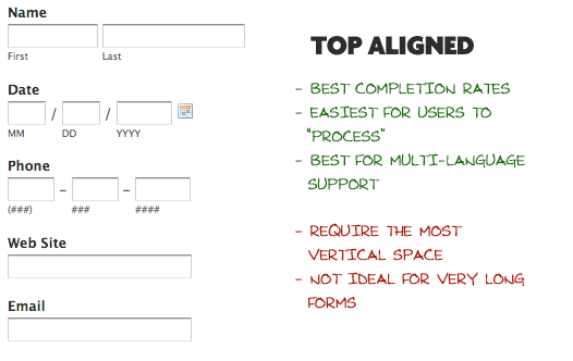
Top aligned labels. The biggest advantage to top-aligned labels — they make it easier for different sized labels and localized versions to fit easier within the UI (this is especially good for mobile screens with a limited estate).
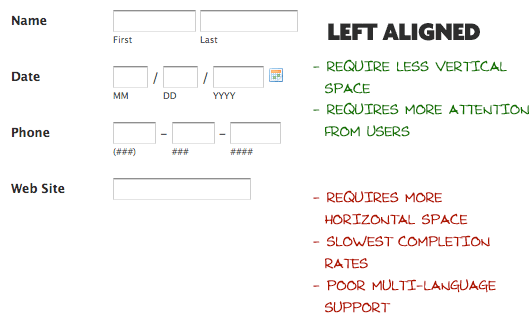
Left-aligned labels. The biggest disadvantage to left-aligned labels is the slowest completion times. This is likely because of the visual distance between the label and input field. The shorter the label, the further away it is from the input. But slow completion rates aren’t always a bad thing, especially if the form requires important data. If you are asking for things like Driver’s License or Social Security Number, you may implicitly want to slow users down a bit and make sure they enter things correctly.
Right-aligned labels. The big advantage to right-aligned labels is the strong visual connection between label and input. Because items near each other appear related. This principle of placing related items closer to each other isn’t new; it’s actually the Law of Proximity from Gestalt psychology. For shorter forms, right-aligned labels can have great completion times. Right-aligned labels disadvantage comes from comfortability. Such form will lack that hard left edge, which makes it less comfortable to look at and harder to read.
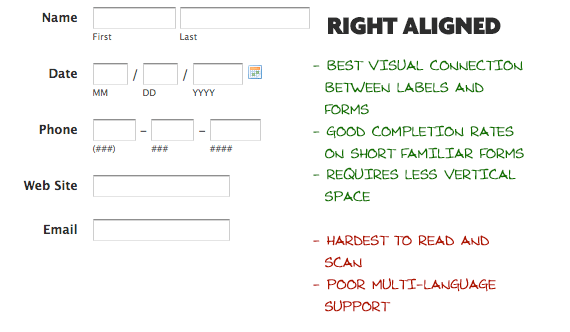
Takeaway: If you want users to scan out a form fast, put your labels above each field. This layout is easier to scan as the eyes move straight down the page. However if you want your users to read carefully, put the labels to the left of the fields. This layout is read in a slower down and right (Z shape) motion.
Inline Labels (Placeholder Text)
Placeholder text works great for a simple username and password form.

Action Buttons
When clicked, these buttons trigger an action such as submitting the form.
Primary vs Secondary Actions
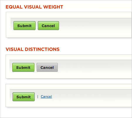
Lack of visual distinction between primary and secondary actions can easily lead to failure. Reducing the visual prominence of secondary actions minimizes the risk for potential errors and further directs people toward a successful outcome.
Conclusion
Users can be hesitant to fill out forms, so you should make this process as easy as possible. Minor changes — such as group related fields and indicating what information goes in each field — can significantly increase form usability. Usability testing is simply indispensable in form design. Very often, carrying out just a few tests or simply asking a colleague to go through a prototype of the form can give you a good insights in how usable the form is.
In upcoming articles I’ll try to cover a feedback and validation for the forms, so stay tuned.
Thank you!