Graphical User Interface as a Reflection of the Real World: Shadows and Elevation
UI design is moving towards removing any unnecessary elements to focus much more on functionality. But while functional aspect of a design is key to product success, visual details are equally important — particularly how they can improve those functional elements.
In this article I’ll show you how visual elements, such as shadows, carry information that is processed by the user of the interface.
Evolution of UI: From Pseudo 3D to Ultra-Flat Design
Three-Dimensional Effects and Skeuomorphism: Illusion of Depth In the Interface
Users screens are flat, but designers and developers invested a great amount of art into making just about everything on them appear be 3D. Since the early days of graphical UIs, screens have employed pseudo 3D effects (shadows, gradients, highlights) to help users understand the available actions at a glance. Such 3-D effects give an illusion of depth to an interface, they help users interpret visual hierarchy and understand which elements are interactive:
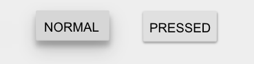
- Elements that appear raised look like they could be pressed. This technique is often used as a signifier for buttons.
- Elements that appear sunken (or hollow) look like they could be filled. This technique is often used as a signifier for input fields.
Windows 95 dialog box clearly demonstrates how the use of shadows and highlights can create 3D effects:
Flat Design: When You Remove Shadows You Reduce Discoverability
For every action, there is a reaction. And in the world of digital design, flat design was a reaction against skeumorphism. Since anything on a screen will never truly look three dimensional, why not to stripping away illusory decoration and focus on functionality instead?
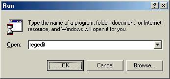
Unlike three-dimensional design or skeuomorphism, original flat design don’t even try to reproduce the appearance of the physical world. It’s literally flat. There’s simply no lighting model which cast subtle shadows that indicate what’s clickable (because it looks raised above the rest) or where you can type (because it looks indented below the page surface).
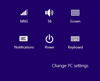
Just take a look on Windows 8 with Microsoft’s Metro design language:
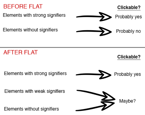
There’s a reason GUI designers used to make objects look more detailed and actionable than they do in the ultra-flat design — signifiers (such as glossy, raised effects on buttons, or inset shadows that made input fields appear empty). Even though signifiers varied from app to app, users could usually rely upon two assumptions:
- Elements with strong signifiers were probably clickable.
- Elements without strong signifiers were probably not clickable.
Almost Flat Design
Recently, designers have begun to realize the usability issues of flat design and as a result, a more balanced interpretation of flat design has emerged. New solution sometimes referred to as ‘almost flat’ or ‘flat 2.0’ design. This design style is mostly flat, but makes use of subtle shadows, highlights, and layers to create some depth in the UI.
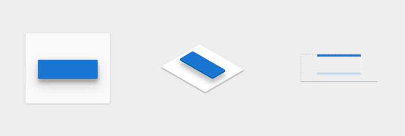
Google’s Material design is a good example of flat 2.0 with the principles borrowed from physics to help users make sense of interfaces and interpret visual hierarchies in content. It provides visual simplicity without sacrificing signifiers.
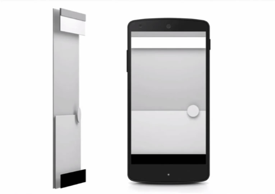
- The shading indicates that element is possible to click.
- Shadows help to tell the user the hierarchy of elements: they help differentiate between two objects and in some cases, understand that one is above another object.
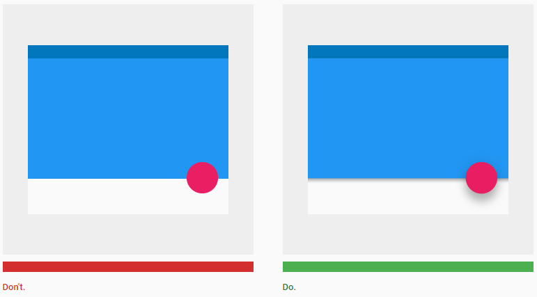
- Shadows provide important visual cues about directional movement.

Conclusion
Your design shouldn’t rely on heavy drop shadows, extreme gradients, or complex lighting effects, all of which can distract users from their purpose. But subtle shadows and other ‘non-flat’ user interface elements can be good for your design because they hold an important information value — they help to create signifiers in the interface. Users prefer things that are simple, clean, and ordered and designers should try to guide human perception of the interface. When you examine the most successful interaction designs of recent years, the clear winners are those who execute fundamentals flawlessly.
Thank you!