Dialogs are effective user interface element when you design and use them right. They can help your users complete reach their goals faster and easier. But dialogs can frustrate them when they’re done wrong. Knowing how to design dialogs will allow you to use them in a way that doesn’t annoy your users.
What is Dialog?
A dialog is an overlay that requires the user to interact with it and designed to elicit a response from the user. Dialogs inform users about critical information, require users to make decisions, or involve multiple tasks. Within apps, on the web and even on mobile dialogs are increasingly used to direct the user’s attention to a specific task, without taking them away from the current screen.
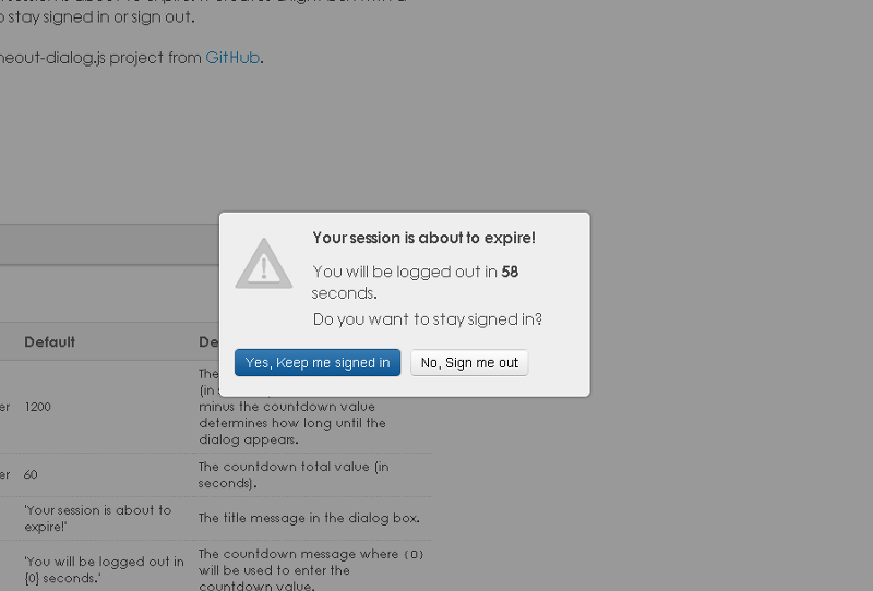
Session expiration dialog.
Now let’s overview dialog design best practices and use cases for them.
#1. Reduce Interruption
Use dialogs sparingly because they are interruptive. Their sudden appearance forces users to stop their current task and focus on the dialog content. Users have to deal with a dialog before continuing and are no longer able to access the page below. Sometimes this is a good thing, such as when users must confirm an important action, but most of the time it’s unnecessary and quite often it’s very annoying.
##Requiring Acknowledgement
It makes most sense to use a dialog in situations where you need the user to interact before continuing, or when the cost of an error could be very high.
Requiring acknowledgement, that inform the user about a situation.
##Don’t Suddenly Open Dialogs
Suddenly opening a dialog without the user having done anything is a very bad idea. Many sites bombard visitors with subscribe boxes like example below.
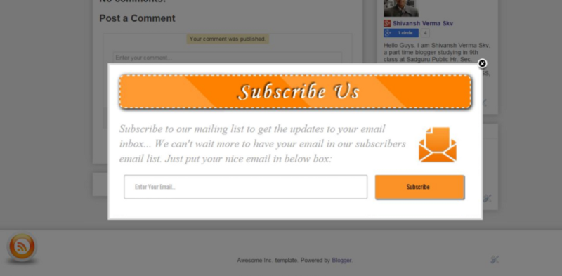
Such dialogs create countless issues for users without keyboards.
A dialog should always open upon the user doing (or did) something. That something might be clicking a button, following a link or selecting an option.
Takeaways
- Not every choice, setting, or detail warrants interruption.
- Alternatives to dialogs are menus or inline expansion, both of which maintain the current context.
- Don’t just pop dialogs up. Make dialog appearance predictable for the user.
2. Match Between Dialog and The Real World
Dialog should speak the users’ language (use words, phrases and concepts familiar to the user), rather than special system terms.
Clear Question and Options
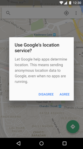
You should use a clear question or statement with an explanation in the content area, such as “Erase your storage?” or “Delete your account?” In general, you should avoid apologies, ambiguity, or questions, such as “Warning!” or “Are you sure?”
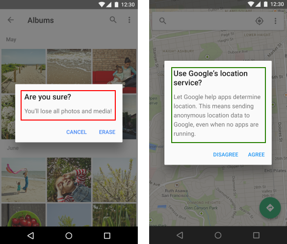
Left dialog poses an ambiguous question and its scope of impact is unclear. Right dialog poses a specific question, describes impact for the user and provides clear actions.
Avoid presenting users with ambiguous or unclear options. You should use only clear options. In most cases users should be able to understand the choices based on the title and button text alone.
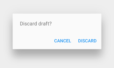
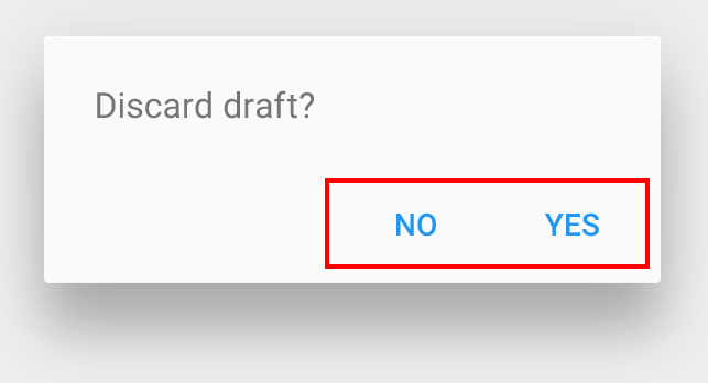
**Bad example:** The dismissive action text “No” answers the question, but does not suggest what will happen afterwards.
System dialog in Android. Source: Material Design.
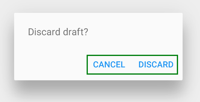
**Good example:** The affirmative action text “Discard” clearly indicates the outcome of the decision.
##Provide Important Information
It’s important that a dialog doesn’t obscure information that might be useful for users. For example, a dialog asking users to confirm the deletion of some items should list the items being deleted.
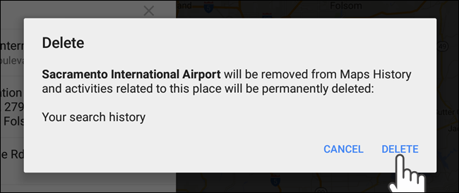
This dialog concisely elaborates on its impact.
Also avoid using a “Learn more” action to access help documentation; in-line expansion within the dialog should be used instead. If more extensive information is needed, provide it prior to entering the dialog.
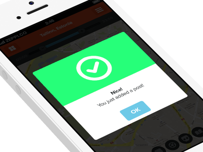
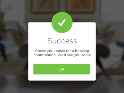
##Offer Informative Feedback
When a process is finished, remember to display a notification message (or visual feedback). Let the user know that she has done all that’s needed.
##Takeaways
* Use a clear question and options in dialog.
* Design dialog to yield closure.
* Notify the user after the action.
#3. Strive For Minimalism
You shouldn’t try to cram too much into a dialog. Keep it clean and simple (follow the KISS principle). But minimalist doesn’t mean limited. All information should be valuable and relevant.
##Number of Elements and Option
Dialogs should never appear partially on screen. You should’t use a dialog which contains scrolling content.
**Bad Example:** Barclays Bank payment processing dialog has a lot of options and elements, part of that options is available only using scrolling (especially for mobile devices which usually have relatively small screen-estate).
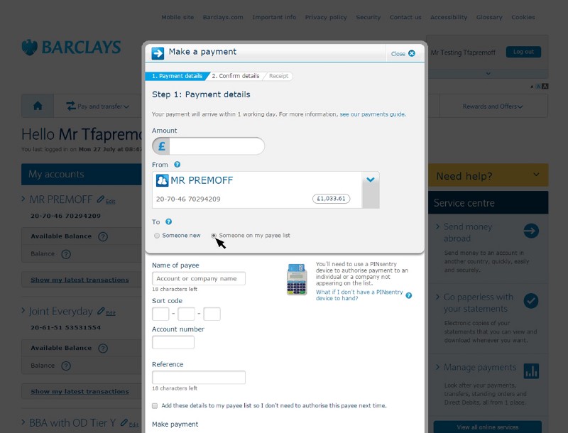
Source: Barclays
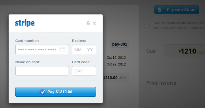
**Good Example:** Stripe uses a simple and smart dialog with only essential information which looks good both on a desktop and on a mobile screen.
##Number of Action
Dialogs should not include more than two actions. A third action, such as “Learn more,” navigates away from the dialog, potentially leaving the task unfinished.
The “Learn more” action navigates away from this dialog, leaving it in an indeterminate state.
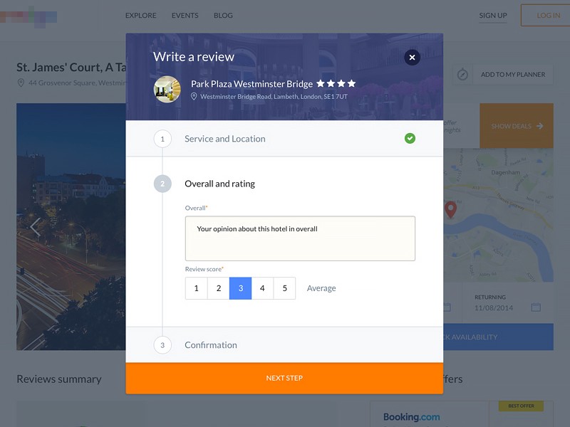
##Don’t Include Multiple Steps in Dialog
Breaking a complex task into multiple steps is a great idea, but it’s also generally a sign that something is too complex to ask users to complete within the confines of a dialog.
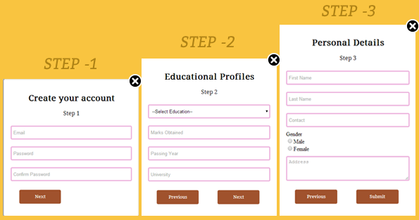
If an interaction is complex enough to require multiple steps (like in example below), then it’s complex enough to *warrant its own page*.
Dialog windows with multiple steps. Source: Dribbble.
##Takeaways
* If you find that you’re trying to cram lots of elements into a dialog then it generally means that an dialog is not the best design solution.
* Simplify dialogs by removing unnecessary elements or content that does not support user tasks.
* Try to avoid dialogs with multiple steps.
#4. Select Proper Dialog Type
Dialogs come in two main types. First type are attention seeking modal dialogs which force a user to interact with them before continuing. Modal dialog usually used for discrete, blocking processes where:
- The surrounding context is not needed in order to decide what actions to take.
- Requires explicit ‘accept’ or ‘cancel’ action in order to close it. It does not close when the area outside of it is clicked.
- It is not acceptable for the user’s progress to be left in a partially finished state.
Second type is non-modal dialog which allow users to click or tap outside of them to dismiss them.
You should use modal dialogs (the first type) only for very important interactions (e.g. delete account, agree to the terms and conditions).
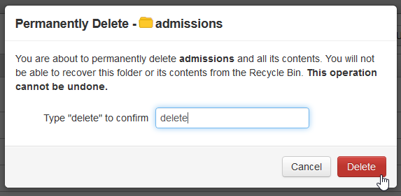
Modal dialog: User must confirm a delete action by actually typing delete.
Also mobile system (native) dialogs are modal and usually have following basic elements — content, actions, and title.
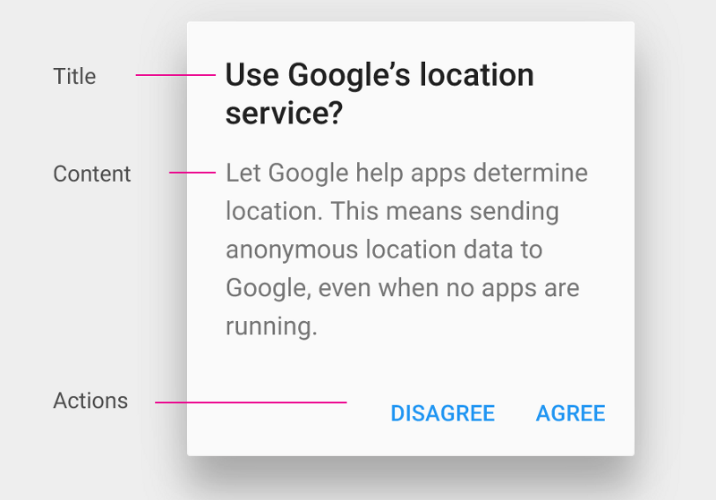
Android modal dialog window.
#5. Visual Consistency
##Background Behind the Dialog
When opening an dialog it’s important that the page behind is slightly darkened. This does two jobs. Firstly it draws attention to the overlay and secondly it lets the user know that the page isn’t currently active.
Android modal dialog.
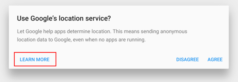
##Clear Close Option
There should be a close option for a dialog in the top right hand corner. Many of dialogs have an ‘x’ button in the corner of the window that users use to exit the window. However, this ‘x’ button is not an easy enough escape route for the average user. It usually takes more time and effort to click the ‘x’ because it’s smaller in size and the user has to spot and click (tap) it.
It’s a good idea to allow users to exit the non-modal window when they click the background area outside of it.
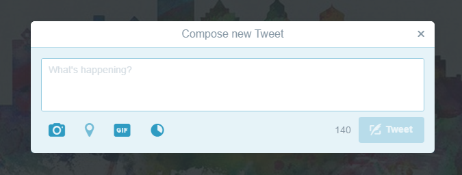
Twitter use both ‘x’ close option and click the background to exit.
##Avoid Dialogs Launching Dialogs
Dialogs should avoid launching additional simple dialogs, as they increase the site’s or app’s perceived z-depth and add visual complexity.
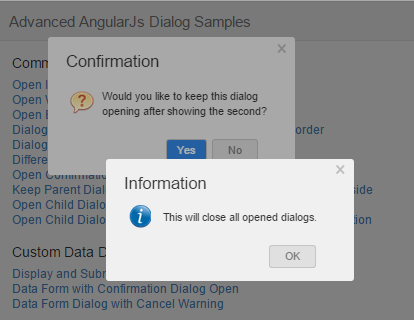
Bad Example: Dialog within a dialog.
#Takeaways
* Allow users to click (or tap) away to close the dialog in most cases (except modal dialogs).
* Dialogs should avoid launching additional simple dialogs.
Conclusion
I hope these best practices were interesting and will be useful during prototyping. Remember, User Experience is about humans, not about technology. It’s easy enough to find out what’s best for your users and their tasks: mock up the leading dialogs, and test them with a handful of users.
Thank you!