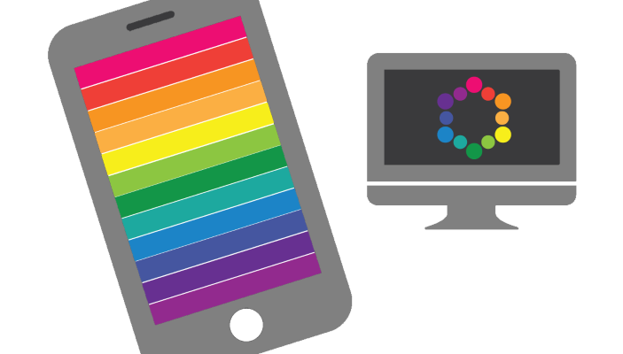
Color is more important now than it ever has been. In modern world we need to communicate without words and color is a key to that.
It should be no surprise that different colors evoke different emotions. To get you started, we’ve compiled a quick reference guide that covers the basics of each color’s unique effects, and how they relate to UX design.
Red
Danger, Importance, Passion
One of the most powerful colors, attributed simultaneously with love and war. The common saying, “to see red” highlights the color’s connection with anger.
Red elements are more noticeable, adding a sense of importance, whether good or bad. Light red draws is good for themes like youth and love, while dark red emphasizes power and durability, like bricks.

Both Netflix and YouTube use red as a primary color.
Red can be used as a warning color, as in traffic lights and signs, a reference that has been taken from nature, where red is used as a deterrent to predators. But you should use it carefully, as a little goes a long way. It’s a great *highlight* for individual elements that need attention, but in excess it will inhibit relaxation.

Negative button “Delete” has higher contrast then neutral Cancel.
Last but not least, red is associated with heat.

Nest use red color for heating mode.
#Orange
##Confidence, Energy, Optimism
Orange shares red’s stimulating aspects, but to a lesser degree. This gives it an energetic aura without red’s aggression. Orange can be associated with health, such as vitamin C, which is commonly found in oranges.

Orange Telecom ad campaign. Source: Adam Hayes
Orange is a playful, upbeat color, great for casual sites but not always the top choice for enterprise sites. Some researches show that it denotes cheapness, for better or worse. Hipmunk uses orange *cheap* property in a good way:

Search CTA button on Hipmunk site
#Yellow
##Attention, Happiness
Oddly, yellow represents both happiness and anxiety. It’s generally energetic and upbeat, but brighter shades dial up this effect, making it a color often used for warning signs.

Breitling use yellow color to focus visitor on CTA button “Discover the Model.”
When combined with black, it can gain a lot of attention. A good example outside of design would be a taxi. The combination gets a lot of attention.

Source: hlvticons
If you use yellow use following simple rule — light yellow reminds users of sun and happiness, and dark shades (like gold) are more serious and also give the impression of antiquity.
#Green
##Growth, Nature, Success
The most obvious associations with green are plants (and by extension, nature). Since most plants are green, it is also associated with growth and health.

Organic Food uses a lot of green color in site design.
Pay attention on the color saturation.

Saturated green colors are exciting and dynamic to the eyes. They grab a lot of attention. This is why they work good for call-to-action buttons.

Combined with blue, green further perpetuates cleanliness.
#Blue
##Trust, Comfort, Relaxation
Blue is one of the most important colors in UI design, and one of the most frequent. Depending on the tint and shade of blue, it can represent different feelings, thoughts, and emotions. Dark shades of blue can give a sense of sadness. An expression that goes along with this is “feeling blue” when someone is sad.
Light blue is the color of the sky and of water, which can be refreshing, free, and calm. This relaxing friendliness also translates into inherent trust, which is why it’s often used by banks.
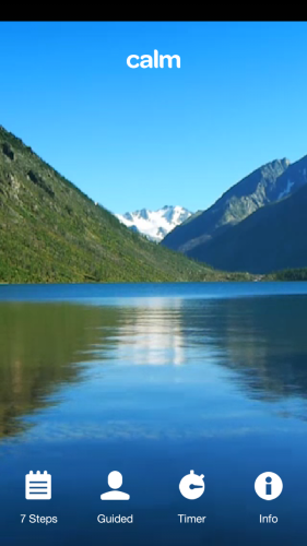
Calm app use light blue as a primary color.
It’s no coincidence that the two biggest social media outlets Facebook and Twitter both use blue as their core color.

Rumor: Mark Zuckerberg once mentioned that he used blue color because he’s color-blind and so he couldn’t really usefully see any other colors when he designed the original site.
Purple
Luxury, Romance, Creativity
Historically linked to royalty, purple retains this air of luxury today. Purple insinuates that a product or site is high-end.
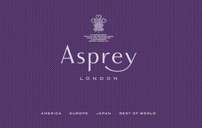
Luxury brands use a purple color in their brand coloring.
Because purple cycles back to red on the spectrum, it shares some of red’s passion features, especially lighter shades like lavender.

Google Forms updated the primary theme to be purple.
#Pink
##Femininity, Innocence, Youth
Pink is often the color of sugary sweets, so the color gives an air of playfulness, almost childishness. That’s why you can delight user with a bit of pink color.

Pink *doesn’t always mean feminine*. In fact, overusing pink for its “feminine qualities” can easily irritates users by pandering to traditional gender roles.

#Brown
##Conservatism, Earth, Stability
London gentlemen don’t “wear brown in town”. Same way brown doesn’t work for most sites, but for the ones it does work with, it works perfectly. It generates a rustic, old-fashioned feel, perfect for outdoorsy sites, or even organic products. The connotations with wood also suggest stability and reliability.

The Dove Chocolate site has an almost exclusively brown website design, with varying shades used to offset different parts of the site.
In general, desaturated brown color is good for menus, panels and backgrounds.
#Black
##Formality, Power, Sophistication
Black is the strongest of all colors, it attracts attention faster than other colors, even red— that’s why it’s most commonly used only for text and accents. When used as a main component in a color scheme, such as a background, black creates its own emotional ties like any color.

Combined with silver or grey, it can represent sophistication, such as in example below.

#White
##Freshness, Sterility, Health
Like its opposite black, white accents other colors around it, making it a popular choice for a secondary color.

When white is the dominant color, its sterility can be overwhelming. If your white site seems too stark, try an offshoot of white — use ivory and cream color combinations. Try to use shades to make white color elements look decent.

White is a primary color for a card.
Grey
Gray represents neutrality. If your site or app uses cool colors, a gray mixed with a tint of a cool color would complement it. If your site uses warm colors, a gray mixed with a tint of a warm color would complement it. To add tint to your gray, increase the color saturation.
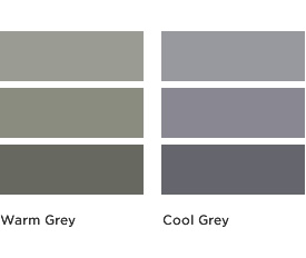
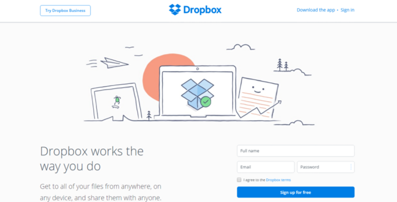
By altering its shade, gray can take on the characteristics of either black or white. When used as a primary color, gray gives the impression of formality, but it doesn’t always mean bad thing. Dropbox use grey to highlight CTA buttons Sign up for free and users able to find the right button really fast.
You can use content and accompanying images to stave off the “gloomy” feel and make a strong focus on a the element.
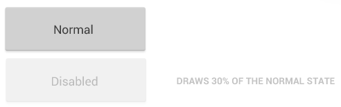
Light grey color works best for the buttons in disabled (inactive) state
Grey colors for buttons.
Conclusion
We’ve covered traditional color associations and these factors are a great place to start when you’re creating a new design. But ultimately, the right design decision is the one that your users think is right.
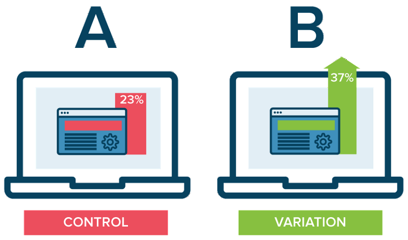
A / B testing for conversion.
Color usage does matter, sometimes a lot. But there is no universal best color. What works on one site or app, doesn’t necessarily work on another. That’s why it’s so important to get feedback from your target market early in the design process.