Designing Perfect Text Field: Clarity, Accessibility and User Effort

For any app or web application, nothing will ever happen without some initial and ongoing input from the user. It is, therefore, critical that product designers, developer and product managers understand the best ways to allow them to do so.
In this article we’ll examine key factors that improve data input by focusing on text fields. Keep in mind that these are general guideline and there are exceptions to every rule.
Text Field
A text field is a basic text control that enables the user to type a small amount of text. No matter what app you use, you’re bound to run across some little text field requiring your personal information. Even typing a question into Google is considered filling out a form which has only one text field.
Clarity
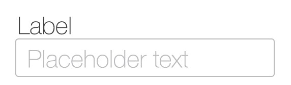
Clear Text Label
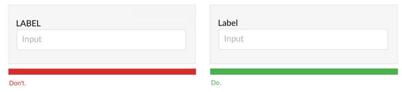
The users wants to know what kind of data to enter in an input field and clear label text is one of the primary ways to tell them that. Of course there are situation when users can rely on icon in order to figure out the meaning of the field (e.g. users recognize a magnifying-glass icon as meaning ‘search’ even without a textual label), but in most cases you should provide clear, always visible labels for each input field.
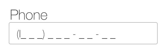
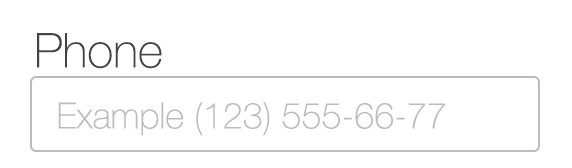
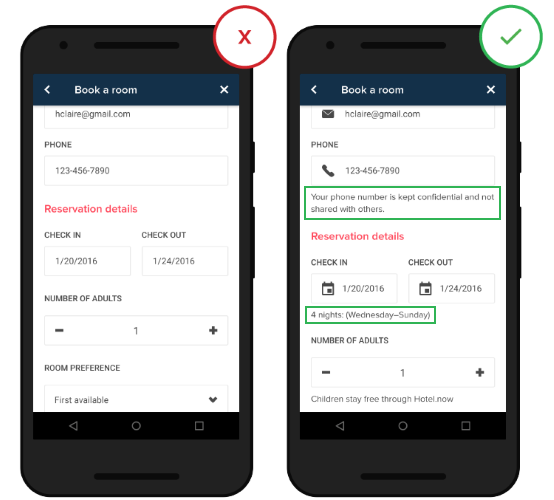
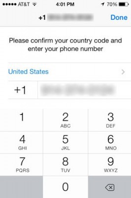
For example, a simple phone number can be written with a ‘+’, a country code, an area code, or without any of these. You can solve this problem by showing instructions, examples or hints to help users figure out what format they should use for this field. A problem with the format of a telephone number can be solved in the following ways:
-
The phone number field can be auto-formatted. This eliminates any formatting ambiguity the customer might have had.
-
Input field placeholder text can also be used for short descriptions and formatting examples, although they have the inherent drawback of disappearing as the customer types.
Helpful Information
Helpful information (or accompanying text) should be used only where needed, such as to explain why credit card data is being requested or how a birth date will be used or to link to the “Terms and conditions.” It can be a great way of eliminating confusion and possible errors that the user might face when dealing with input field. As a rule of thumb, do not exceed 100 words of explanation.
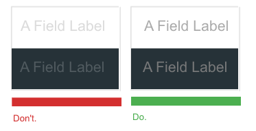
Avoid Caps Labels
You should never use all caps, or else the labels would be difficult to read and much harder to quickly scan, as there are no differences in character height any more.
UPPERCASE text is harder to read because the shapes of all the uppercase letters are all rectangular and users are not used to reading text that way:
- Small text should have a contrast ratio of at least 4.5:1 against its background.
- Large text (at 14 pt bold/18 pt regular and up) should have a contrast ratio of at least 3:1 against its background.
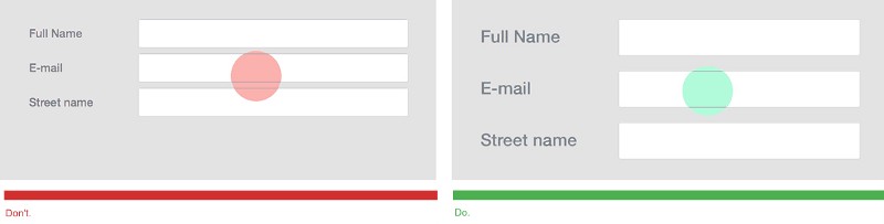
The default input field in Bootstrap 3 is 34px in height, this is a good base size. Input fields shouldn’t be smaller than that to be easily tappable.
Smart Defaults
Entering data into fields is a chore and not a fun activity. Thus, you should anticipate frequently selected items and make data entry easier for the user by providing fields with pre-populated smart default values — you can compute them based on other info (e.g. state based on zip code) — or prompts based on previously entered data.
For example, pre-select the user’s country based on their IP address. WhatsApp is one app which makes entering phone numbers easy. If you access the app from the USA, the country code is pre-filled based on location services by default.
Autocomplete and Autosuggestion
Autocomplete presents real-time suggestions or completions in dropdowns, so users can enter information more accurately and efficiently. It’s especially valuable for users with limited text literacy or who have difficulty with spelling, especially if they are using a non-native language.
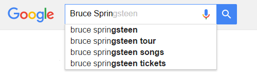
The purpose of autosuggestion is to display a list of related keywords and phrases, which may or may not match the precise query string. While autocomplete helps people finish an original phrase, autosuggest actually throws most probable variations of the original phrase.
Proper autocomplete and autosuggestion functionalities significantly speeds up the user’s actions. Google use both autocomplete and autosuggest functions to provide a highly responsive search experience.
Conclusion
You should make the process of data enter as easy as it possible. Even minor changes such as helpful text or indicating what information goes in each field can significantly increase input field usability together with overall UX.
Thank you!