Mobile users tend to be very goal-oriented, they expect to be able to get what they need from a mobile site easily, immediately, and on their own terms. Whether it’s making a purchase, getting a quote or joining an email list, your user’s experience should be as seamless as possible.
This article discusses how to design your entire site to account for mobile’s form factor and unique user needs.
What Makes a Good Mobile Site?
Recent studies from Google found that mobile visitors are more likely to revisit sites optimized for mobile usage. This means that your site must be mobile-friendly. But what exactly does ‘mobile-friendly’ really means? Actually this term includes the number of important features which you should consider when designing your mobile site. Take a look below:
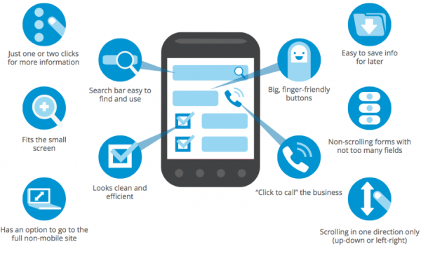
Mobile users will notice and be delighted by the things you do for them to enhance their experience. Image credit: business2community
If you want your site to be accessed easily on mobile devices, then you’ve got to eliminate all mobile usability problems. Here are 12 improvemens that you can make to ensure that your site passes the mobile usability test and delivers a favorable experience for your users:
##1. Optimize Your Entire Site For Mobile
Users are much easier navigating mobile-optimized sites than trying to navigate desktop sites on mobile devices. In example below you can see two versions of Domino’s pizza website — desktop site adapted for mobile and optimized mobile version. The standard site looks cramped and difficult to navigate through on such a small screen. In contrast, the mobile site is clean with large easy-to-navigate CTA buttons.
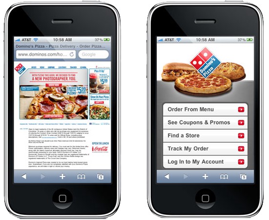
Left: Desktop version adapted for mobile. Right: Site is optimized for mobile
*Your site is easiest to use if all your pages are designed for mobile.* Here is a few practical tips for optimization:
- Use only vertical scrolling. There shouldn’t be pages where horizontal scrolling is necessary to see a primary content — make sure all your pages use relative width and position values for CSS elements, and images can scale as well.
Put your content first and get rid of every element that could distract users from the content.
- Limit the number of columns — ideally you should have a single column site layout.
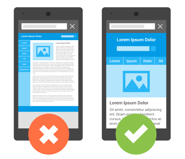
Image credit: Google
- Don’t mix desktop and mobile-optimized pages — sites that have such mix are actually harder for users to use than all-desktop sites.
It can be easy for mobile users to miss UI elements, so always put your key calls-to-action where users will see them. Feature your primary calls-to-action in the most prominent site space — your mobile calls-to-action will probably be different than on desktop, so put yourself in your users’ shoes when determining placement.
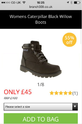
CTA buttons should be easily clickable, and should not interfere with any other elements on the page. Image credit: constantcontact
3. Keep Menus Short and Useful
An extensive menu might work well for your desktop site, but mobile users won’t have the patience to scroll through a long list of options to try find what they want. Consider how you can present the fewest menu items possible — for instance, only major product categories. As a rule of thumb, try to use menu list with no more than 7 distinct categories.
A shorter menu with distinct categories is easier for mobile visitors to navigate
Also this list of categories should be *useful for your visitors*:
- It should be ordered based on popularity or value to users.
- It shouldn’t contain terms that your target user base won’t understand. Menu’s with terms that require business knowledge, or try to mix — e.g. literal and metaphoric terms may confuse users, and increase abandonment.
4. Make Site Search Visible
If search is a primary function of your site display it prominently, as it can be the fastest route to discovery for users with high intent to convert. Users looking for specific information usually turn to search — so search should be one of the first things mobile users see on your site. Place your site search near the top of your homepage via an open text field.
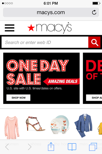
Search should be displayed prominently (e.g. at top of screen) just like on Macy’s site
##5. Design Your Site So Users Don’t Have To Pinch-To-Zoom
Users usually frustrated when they needed to zoom in or out in order to read a text or see an image. Visitors can miss important details if they have to zoom in a site. Thus, design your mobile site so that users won’t ever need to change the size.
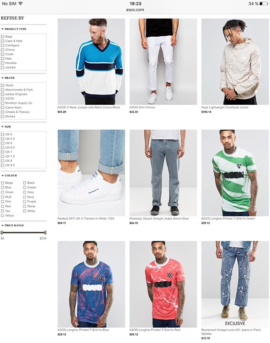
Asos uses properly sized images, but font size isn’t large enough. Tiny type on a small, bright screen can be a real headache for users.
##6. Use Only High Quality Assets
Your images/videos/other *assets are the product*, since there is no physical dimension of the product. Thus, they should be high quality, to capture the attention of site users who may skim, and drive call-to-actions.

Left: Degraded imagery. Right: Correct reolution. Image credit: Yoox
##7. Design Finger-Friendly Touch Targets
If you’re designing a finger-friendly interface, then your site buttons should be sized appropriately. Results of an [MIT Touch Lab study](http://touchlab.mit.edu/publications/2003_009.pdf) found that averages for finger pads are between 10–14mm and fingertips are 8–10mm, making 10mm x 10mm a good minimum touch target size.
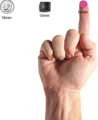
Image Source: uxmag
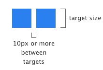
Another important moment which you should consider is a relative distance (margin) between touch elements. If buttons are close to each other, a mobile users can accidentally tap a wrong button with their finger. To fix these errors and prevent users from touching and invoking the incorrect action, make sure to correctly size and space buttons to be suitable for your mobile visitors. Below is a suggested minimum distance between touch targets for mobile sites:
8. Let Users Explore Before They Commit
Demanding that users register or log in before they can see website information has a high interaction cost and defies the reciprocity principle. Forcing registration too early can cause more than 85% of users to abandon the site.
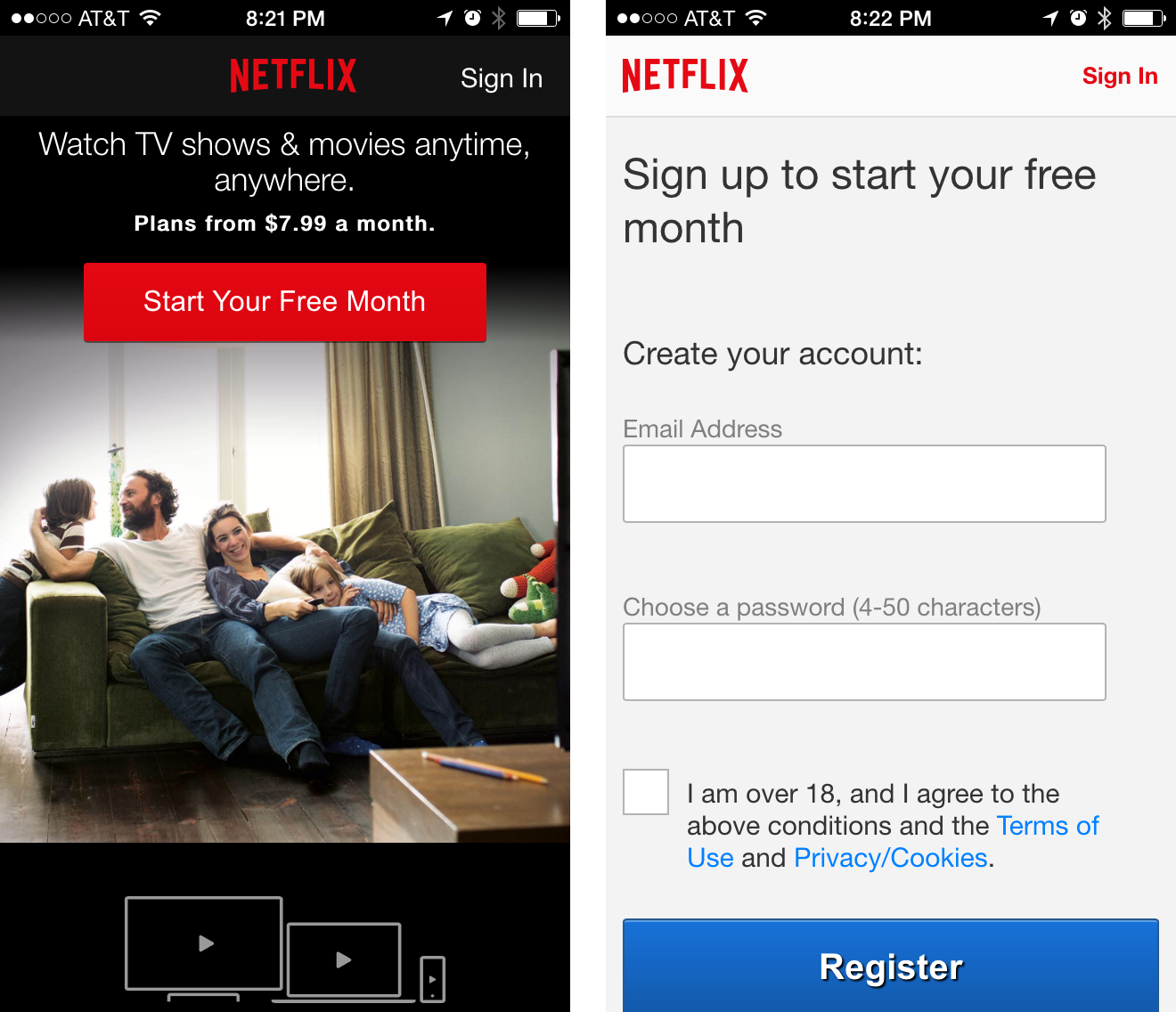
Netflix provides a free month trial but asks a user to sign up before they can see what content will be available to them.
Before offering their personal information, users usually want to browse content and get a sense of what a site had to offer them (this is especially true for the sites by unfamiliar brands). To provide a user experience with the least barriers to conversion, mobile sites should:
- Provide non-signed-in journey.
- Let users purchase as a guest.
- Request sign-up only when it is dependent on providing value, and then request minimal data.
9. Tell Users Which Screen Orientation Works Best
Either design for both landscape and portrait, or encourage users to switch to the optimal screen orientation, because users tended to stay in the same screen orientation until something prompted them to switch (e.g. an information dialog). Make sure your important call-to-action can be completed even if they ignore the suggestion to switch.
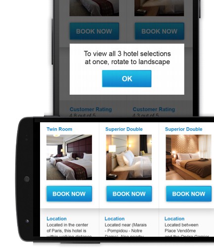
Image credit: Google
##10. Make Product Images Expandable
Customers want to see what they’re buying. On retail sites, participants expected to be able to view high resolution closeups of products (especially apparel) to get a better look at details, and got frustrated if they weren’t able to. Users should be able to easily zoom into a product image to inspect it in more detail, by double clicking or selecting a zoom button. The zoomed-in images also need to maintain high quality.
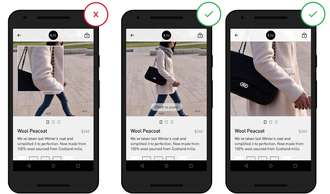
Include high-quality closeups of key images like product photos and keep in mind that users want to be able to control the level of zoom when they view an image. Image credit: thinkwithgoogle
##11. Make It Easy To Finish Converting On Another Device
Not all users are comfortable converting on their mobile device — some of them use mobile devices only for product search. Offer an easy way to save or share information across devices to keep users in your funnel. Users should be able to switch from their smartphone app and continue research, shopping or booking on any of their other devices / browsers:
- Enable users to share an item via email or social network for further consideration.
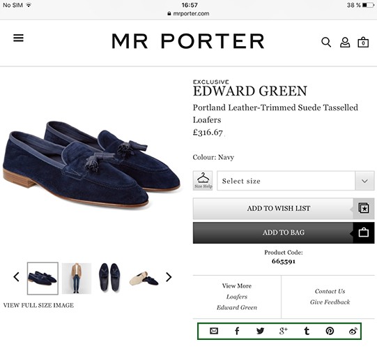
MR.PORTER provides a set of options to share the item
- Sync wishlist, favorites and basket for a customer account.
12. Keep Your User In a Single Browser Window
Switching between windows on a smartphone can be troublesome, and raises the risk that visitors might not find their way back to your site. Try to keep users in one place by avoiding actions that launch new windows and ensure that user’s action calls-to-action stay in the same browser window.
Bonus. Avoid “Full Site” Labeling
When visitors see an option for “full site”, they assume the mobile site is condensed and chose the full site instead.
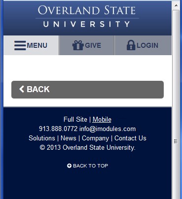
‘Full site’ makes user think that this version offers much more information than mobile one, even when they have the same content.
Using terms like “desktop” instead of “full” can help avoid these perceptions. Make it easy to switch between site experiences, but use labels like “desktop”/”PC version” instead of “full” to be clear that both sites offer a full experience.
#Conclusion
Just like with any other design elements, tips specified above are just a place to get started. Make sure to mix and match these ideas with your own for the best results. Just remember that **design isn’t just for designers — it’s for users**. Your design should support user goals in a way that never adds to the user’s cognitive load.
Thank you!