While sign-in walls (demanding that users must register or log in before they can fully access an app or site) generally isn’t a very good practice, they are still very common in our digital life. Most likely you go through a login process pretty much every day. However, even though they are so common thing, they also are one of the trickiest parts to design and designer’s job is to figure out which elements they should include or exclude to create great user experience.
Make sure that your login page isn’t an obstacle to your users by following these tips for designing a better login process.
Show Input Text Fields
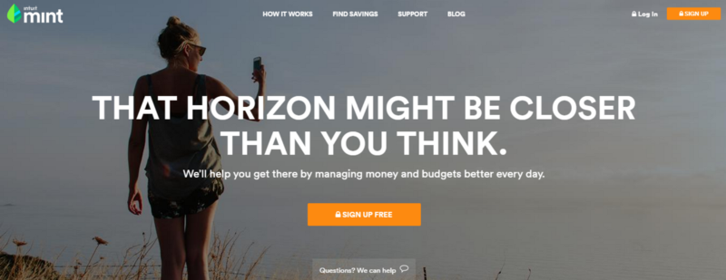
If logging in is required action for work with a site or an app then it should very much be the primary feature of the page. Users should’t take any extra steps to figure out how to login. For example, Mint require log in before using a service, but login form is hidden behind the controls.
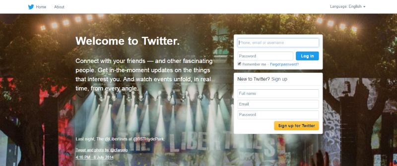
When registered users come to a site or launched an app, it should be immediately clear where they can login. Twitter shows login input fields straightforward on the main page of service and this makes it clear for users where to log in.
Takeaway: Rather than providing a ‘Login’ or ‘Sign in’ buttons, it’s better to show the input fields, so users can login.
Don’t Use ‘Sign In’ and ‘Sign Up’ Together
How fast can you spot the difference between ‘sign up’ and ‘sign in’ on image below?
Bad: ‘Sign in’ and ‘Sign up’ looks
‘Sign In’ and ‘Sign Up’ are quite close. When buttons looks too similar and both use the same verb in their labels it’s pretty easy for users to get confused. Users might click one instead of the other, and usually this problem frustrates the users who log in because they make the mistake the most. Even if users didn’t make the mistake, they’ll spend extra time to distinguish the two buttons.
Users shouldn’t have to pause and and think what button should they click. If you want to provide a good user experience in login, avoid using ‘sign up’ and ‘sign in’ together. Instead, make the button distinct from each other by using different verbs in labels and different visual appearance.

Good: ‘Login’ and ‘Register’ are more clear to users.
If you’re focused on conversion — test a variation of your “sign up” button with something that gives, compels, and is tied to your product. This helps prevent the button from being overlooked.

Good: Mailchimp uses same prepositions, but different graphical styles for login and registration.
**Takeaway:** Don’t use ‘Sign in’ and ‘Sign up’ together. Use different visual appearance for buttons (colors and styles) and make the difference more evident.
Differentiate Login from Registration
Many sites and apps use almost the same number of input fields (email/user name and password) for login and registration forms and showing the two side by side:
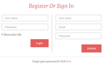
Bad: Two forms side by side.
However, it’s very *important to clearly differentiate the registration from login*, and to minimize the chance of users accidentally attempting to log in via the registration form. Again, Twitter’s login and registration forms not just look different, but they also have different color for CTA buttons and proper help text (‘New to Twitter? Sign up”)

Users are growing increasingly resistant to traditional registration processes. Why force users to create another set of login details when you can let them login via an external account, such as a Facebook, Google or Twitter? This feature can alleviate online registration headaches, but comparing to the standard registration with email, it has both pros and cons.
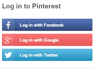
Pinterest provides login option via social network account
**Pros:** Users don’t have to fill out registration form, to create another usernames/passwords and to verify emails, hence can sign up in like 10 seconds instead of 10 minutes. And most important, users don’t have to remember a new usernames/passwords.
Cons: Since the information about the user is loaded automatically it raises a huge privacy concern and not everyone is likely to be happy to share her profile data. For such cases you should have traditional login system running in parallel.
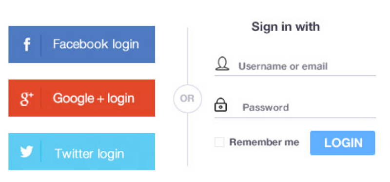
Traditional login system ‘Sign in with email’
#Let Users See Their Password
A common problem during login is mistyping a password. And this is fairly easy to do as the password field is masked (of course because of security reasons). People aren’t perfect typists and they often mistype their password, especially on mobile devices. Mistyping password for iCloud is my number one problem in Apple iOS — it’s also pretty annoying thing, cause you access the service only after 2-nd or even 3-rd attempt.

Apple iCloud: Password mistyping
Implementing a ‘show password’ option is easy to do. You can place a checkbox or icon button near the password field. When users click it, it’ll display their input unmasked. This is especially good for mobile login pages, as getting the wrong key is all too easy on a small mobile keyboard.

The password is always masked by default. ‘Show Password’ is a user controlled unmasking option.
**Takeaway:** Users make more errors when they can’t see what they’re typing while filling in a form. They therefore feel less confident. So the best practice for users is show password toggle and allows users to have control over the unmasking the field.
Use Email Address or Phone number as a Login
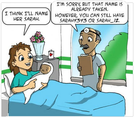
If you are using username as a login data, most probably you’re dealing with following difficulties:
- Since usernames have to be unique, users might need to spend a few minute before they end up with a proper name, because preferred usernames have already been taken by other users.
- Users end up registering with a brand new username that they are hardly remember after a while.
Simplify the process for users by providing multiple options to login and allowing them to choose instead of going by a trial by error approach where users try multiple variations of user names and find all are taken leading to additional frustration. You site or app should allow users to login with their email address or phone number.
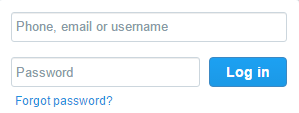
Phone, email or username can be used for the login
**Takeaway:** Use multiple options for login (Phone, email or user name), rather than just username.
Design the UX so that new users stay signed in immediately after registration, making the overall user experience smoother. Rather than having a ‘Keep me signed in’ option it’s better to automatically keep users logged in to a site or app.
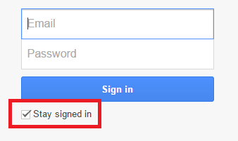
Stay signed in should be a default option, no need to show it.
#Warn Users That Caps Lock is ON (Desktops-only)
The idea is simply that a warning is shown when the user types into a password field with caps-lock enabled. It might be a textual notification or a warning icon. It’s a simple addition to password-field usability that protects against entering unintended capitals.

Tell users that Caps Lock is on.
#Auto-focus The First Input Field (Desktops-only)
Once the user sees the log in form, they should be ready to log in. Make the process more efficient by automatically focusing on the first input field. This small feature saves users the time of hovering and clicking. The auto-focus should also highlight the text field so users know that can start typing.

Conclusion
Your log-in forms shouldn’t make the user’s life difficult. Spending time filling out the form is an extra work for users. These simple techniques will make your forms efficient, so that users can log in smoothly and start enjoying your service.