Most Common Log-in Problems and Solutions
For many of us, logging into sites or apps is a part of our daily routine. In fact, we probably do it so often that do it’s almost automatic… until something goes wrong: we forget our password, our user name, the email address we signed up with, or even if we ever signed up at all.
Detailed analysis of a major ecommerce sites found that 45% of all customers had multiple registrations in the system, 160 000 people requested their password every day, and 75% of these people never completed the purchase they started once they requested their password.
Log-in is a big deal — big enough that most sites and apps have started exploring new designs solutions for the problem. Here’s where to start, and what to focus on for the good user experience:
Tell Users What’s Wrong
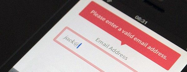
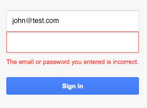
It’s possible that one wrong combination for a username and password could lead to multiple attempts before successful log in… or frustrated enough to quit. Generic responses (like ‘Your email or password doesn’t match’) don’t provide a meaningful feedback for your users and don’t allow them to fix their problem. Users, who are not logged in, read “One of these two fields is wrong but I won’t tell you which one”, and this reduces conversion rates and engagement.
You should help a user get through a log in task efficiently and effectively. The response should explain what isn’t matching correctly — the password, or the email address.
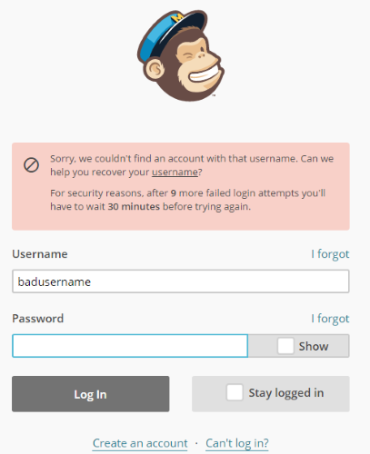
The stress of forgetting a username/password combo is alleviated on the MailChimp. If a username does not exist, they tell you before you even attempt retype your password. They detect the problem and offer a link to let the user fix it.
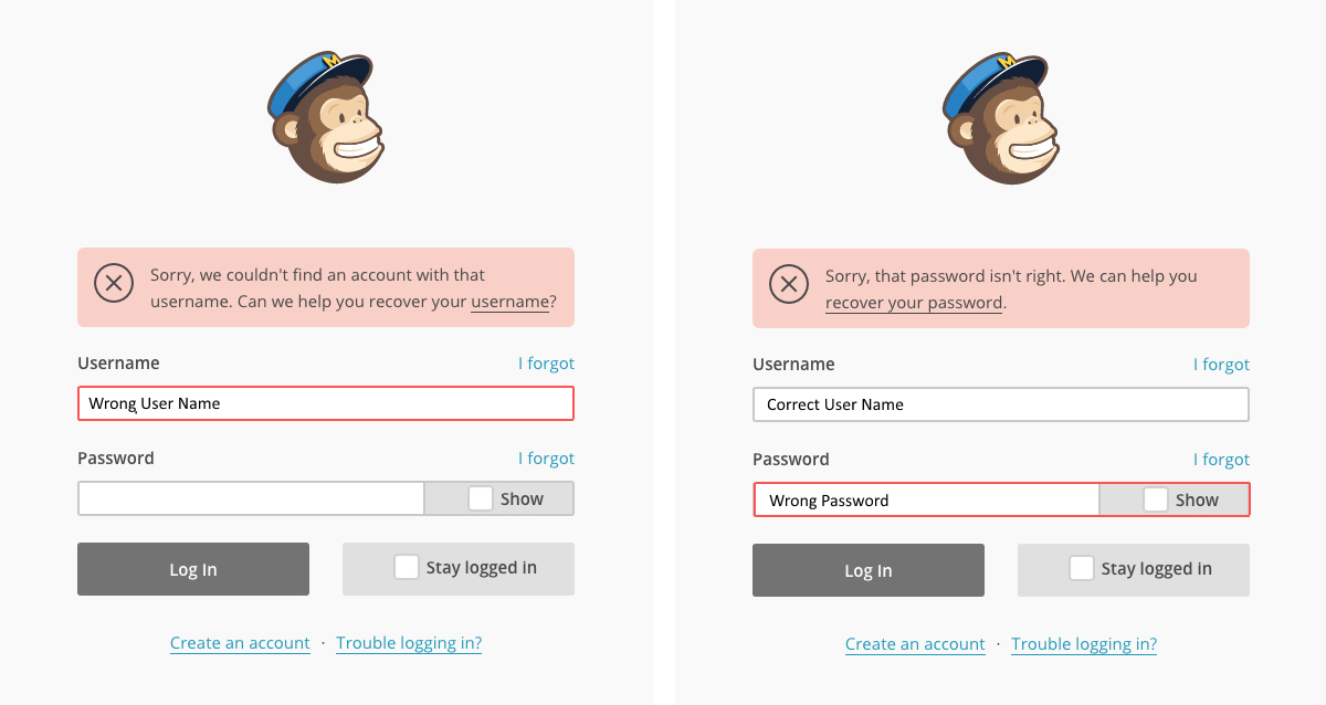
It’s ultimately up to you whether or not you want to do this. From a usability standpoint, you’ve just helped users figure out which of their emails or countless usernames they used on your account, and can get logged in sooner.
Remind Users They Changed Their Password
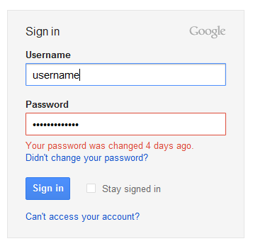
Users can get so used to typing in their old password that they can forget they changed it. And when they get an error message, they’re led to believe they’re mistyped the password.
What users need in this case is a reminder that their password was changed. Instead of giving users a wrong error message, tell them how long ago they changed their password. This message should only appear when users type in their old password. If users mistyped a password, the system should display a regular ‘Wrong password’ error message.
For example, if users change their Google account’s password and try to log in using the old password, Google shows a special message: “Your password was changed X days ago”
Solve Multiple Log-In Problems
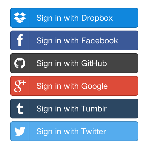
When faced with multiple sign-in options (such as sign-in via Facebook, Twitter or Google+) on a site or app, people might forget which service they used to sign up (or if they used one at all), and thus hesitate or fail to log in. Worse to come, if someone picks the wrong provider, instead of signing in to the service they’re trying to use, they might end up signing up again, thereby creating a second account.
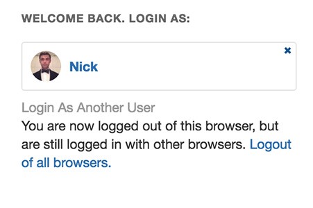
Another good solution is remember users when they return. Quora eliminates the need for you to enter a password when re-logging into service. All you need to do to enter the website is click on your profile picture or name on the log-in screen.
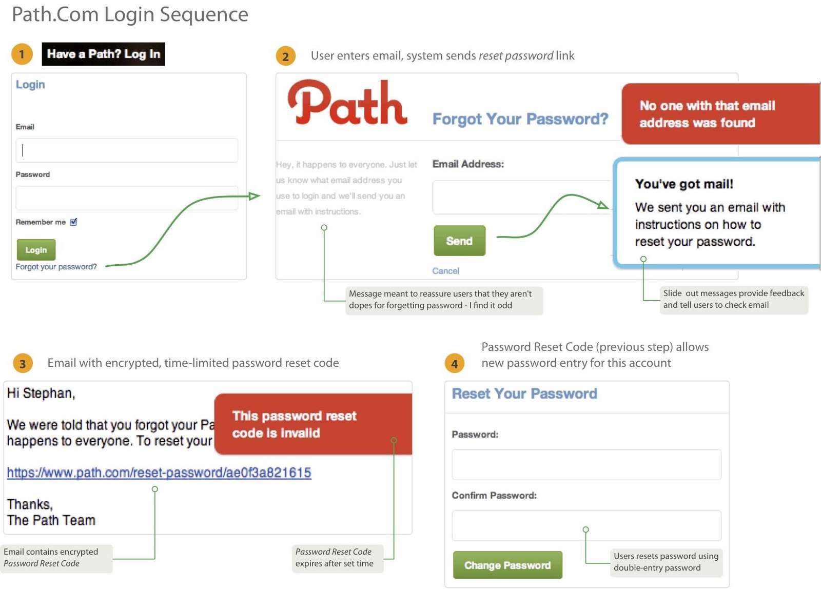
Design a ‘Forgot Your Password?’ Flow
Just as everyone sometimes forgets where they left their wallet or keys, users will forget their password. It’s therefore very important that this situation should be well handled by the login process. Login forms should offer a ‘Forgot Password’ link to reset the password.
- Don’t show this link only after the user clicked on the password field or has already entered a wrong password.
- Don’t make users reenter their email address on the forgotten password page if they already entered their email address and then used the forgotten password feature.
- Don’t send the current or temporary password via email.
The right thing to do is to send a reset password link on the registered email address. Also, make sure the reset password email is delivered as fast as possible (users might be upset when they’ll have to wait to login because the forgotten password email takes tool long to arrive).
Mailchimp warns users after the third attempt that their account will be locked for 30 mins after 9 more unsuccessful login attempts.
Conclusion
As these examples illustrate that even the most common interactions on the web and in apps like logging in could benefit from such simple ideas and design improvements. But try not to generalize these solutions too much. Avoid making them patterns for good error handling. Instead, design your user interfaces and interactions to prevent errors.
Thank you!