5 Techniques For Effective User Onboarding
What happens during the first experience can make or break any app. To ensure users don’t delete your app after the first try, you must successfully onboard and engage them during the first interactions.
In this article, I’ll describe the concept of onboarding and share 5 common onboarding techniques for web and mobile apps, along with tips on how to use them.
What is onboarding
Onboarding is a human resources term that was borrowed by product designers. Onboarding is the process of making new users familiar with an app. Good onboarding increases the likelihood that first-time users become regular users.
When to use instructional onboarding
Should I design onboarding for my app? To answer this question, you need to evaluate the complexity of your product. Once new users open your app, they need to know how to use it. Most of the apps don’t require reading instructions. If your app is self-explanatory, you can safely skip onboarding.
You may need an onboarding strategy when :
- Product uses non-standard interactions. For example, you use non-conventional gestures as a primary method of interaction.
- Product has a complex workflow. For example, your app has a complex business logic that users need to learn in order to use it.
- Product has undergone a major redesign. You did a major redesign of your app and want to introduce existing users to new features and changes.
- Product introduces a brand new concept itself. Your app is a prime example of an innovative design.
If you are unsure if your app needs onboarding, test it without onboarding to see if users face problems interacting with your product for the first time.
5 onboarding techniques
1. Walkthroughs
A walkthrough is perhaps the most popular way of introducing an app to a first-time user. Walkthroughs can take many forms, but a swipe-through set of static screens is by far the most common form.
Every second app on the market shows this type of onboarding during the first launch of a mobile app. Unfortunately, a walkthrough is not the most elegant way to explain the core functionality of a product or demonstrate its value to users because it blocks users from using a product. Instead of interacting with your product, users have to go through a series of screens that tell them what this app is all about. No wonder why the vast majority of users prefer to skip the walkthrough.
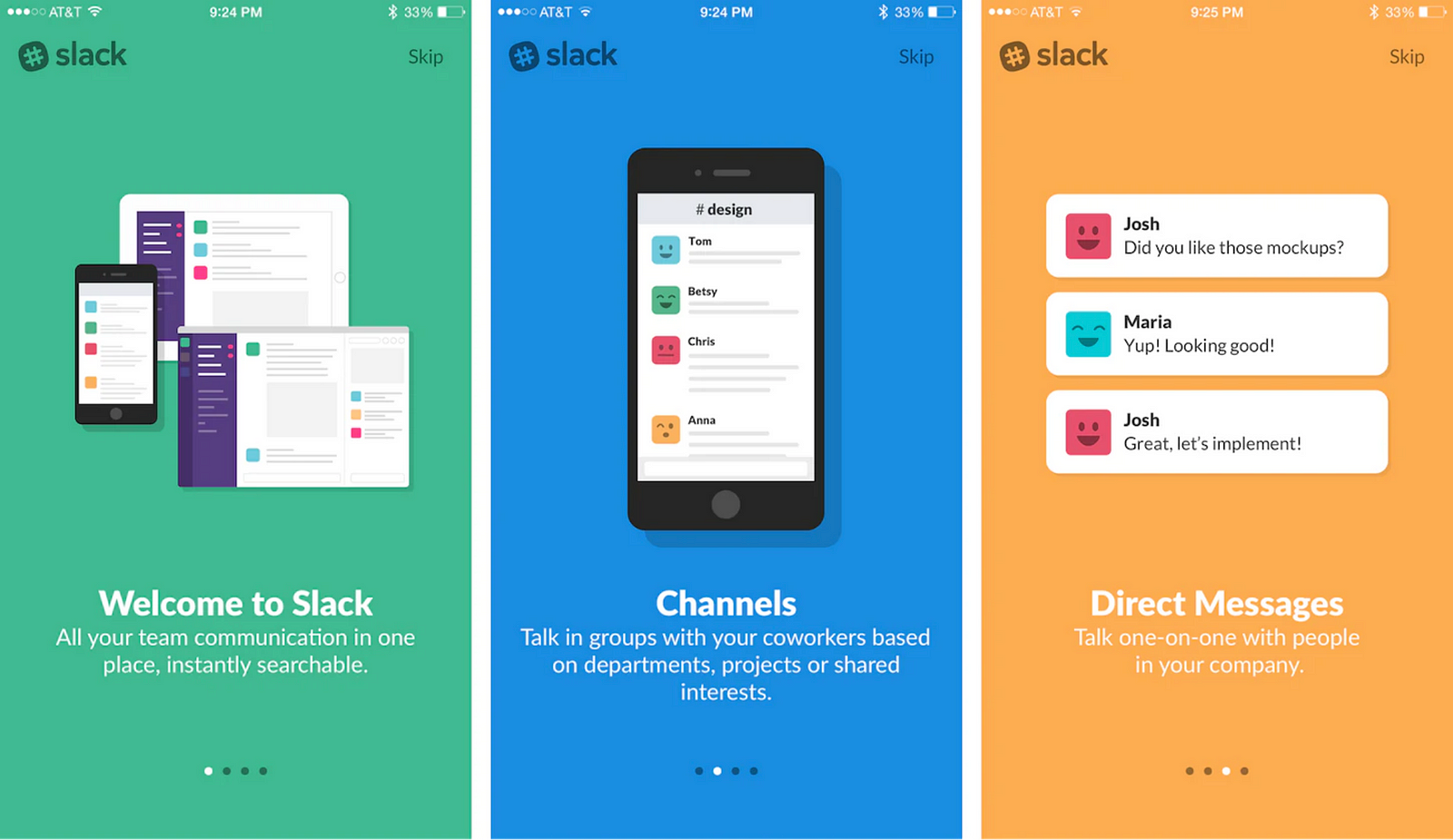
When you use a walkthrough to explain your app’s core functionality, you increase your users’ cognitive load. You are giving too much information to users at one time. And since this information is provided out of the context of interaction, users will likely forget everything they see on the screens once they finish the onboarding.
Its possible to slightly improve the effect of this technique by reducing the number of slides and adding animation. Animated walkthroughs are more engaging than static ones since animation is excellent at grabbing attention. Yet, its better to avoid using this technique.
Tips for designing walkthroughs:
- Don’t use it for value proposition. Users already choose to use your app, and they have a clear idea of the benefits they will have.
- Try to use a maximum of 3 slides.
- Add animation to make the experience more dynamic.
- Offer a skip button to allow users to skip this part.
2. Interactive tour
It’s always better to explain how something works in the context of the interaction rather than present a set or static instructions before users get started. And the second technique, which is called the interactive tour, can help us with that. Interactive tours are user-guided tours, where tutorials are only triggered when the user reaches the appropriate point in their journey.
The best way to learn anything is to learn by doing.
That’s why the best example of an interactive tour is a practical exercise in which users are taken into a flow to complete tasks that represent the main interactions of the app. Duolingo uses this technique to educate its users — users are invited to do a quick test in the selected language before they start using an app.
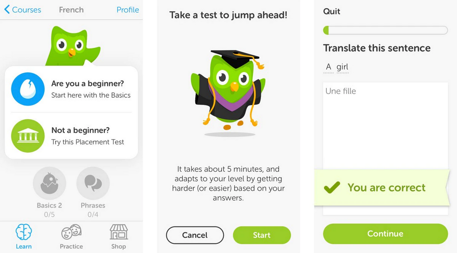
Tips for designing interactive tours:
- Make the interactive tour contextual. Trigger the tour when the user reaches the appropriate point in their experience.
- Let users complete the tasks themselves.
- Ensure that the tasks that users will complete resemble real tasks that actual users want to do in your product.
3. Visual hints
Visual hints appear on the UI and assist users in better understanding how to interact with an app’s interface. This technique is especially useful for screens that contain a lot of interactive objects or a unique navigation method.
When using this technique, it’s better to avoid showing all visual hints simultaneously. Similar to long up-front walkthroughs we’ve discussed before, visual hints require users to work upfront — users have to remember all information they see. In practice, this is hardly achievable because our short-term memory cannot retain much information. And because there is no context, the interface seems much more complex than it actually is.
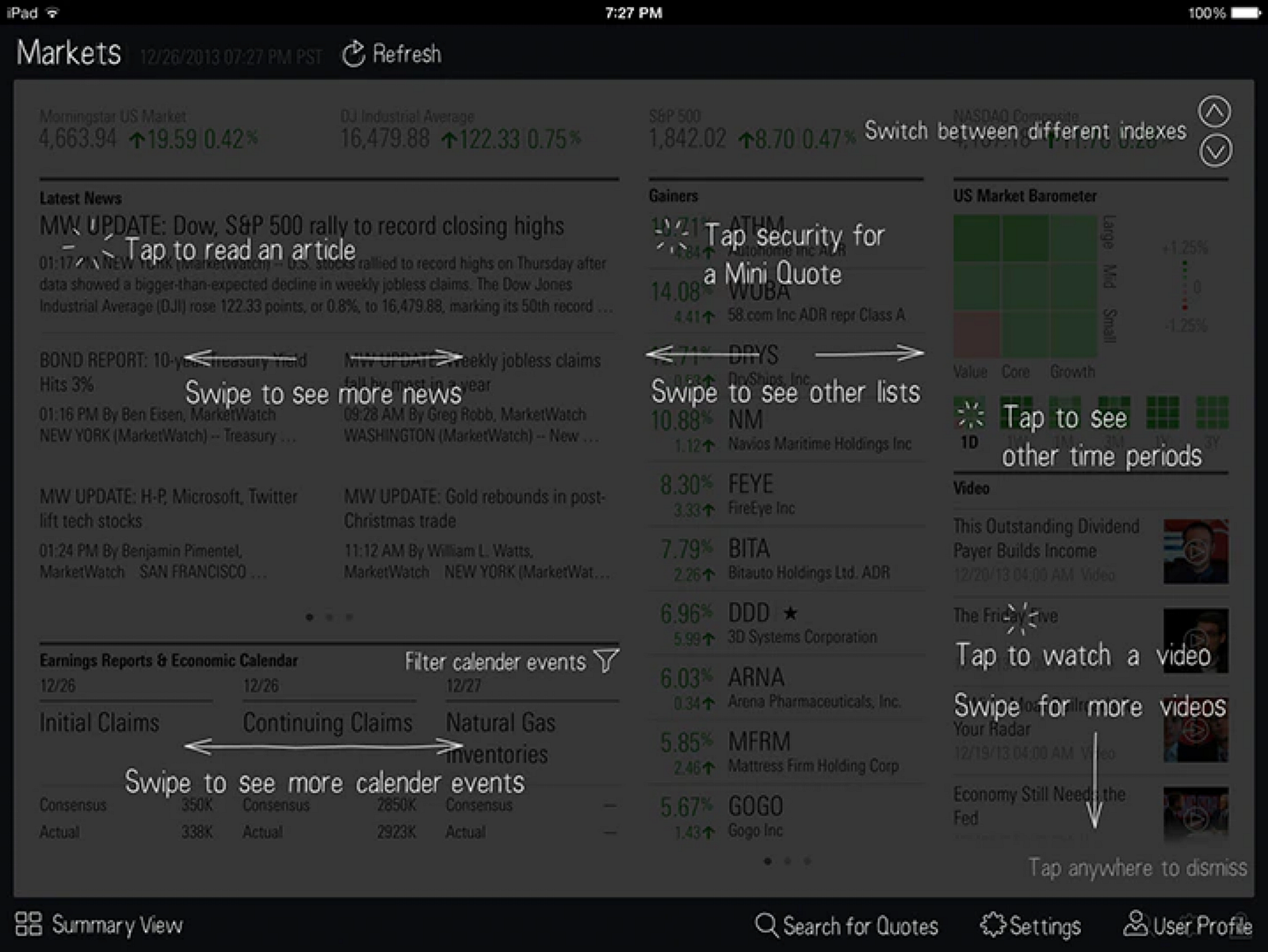
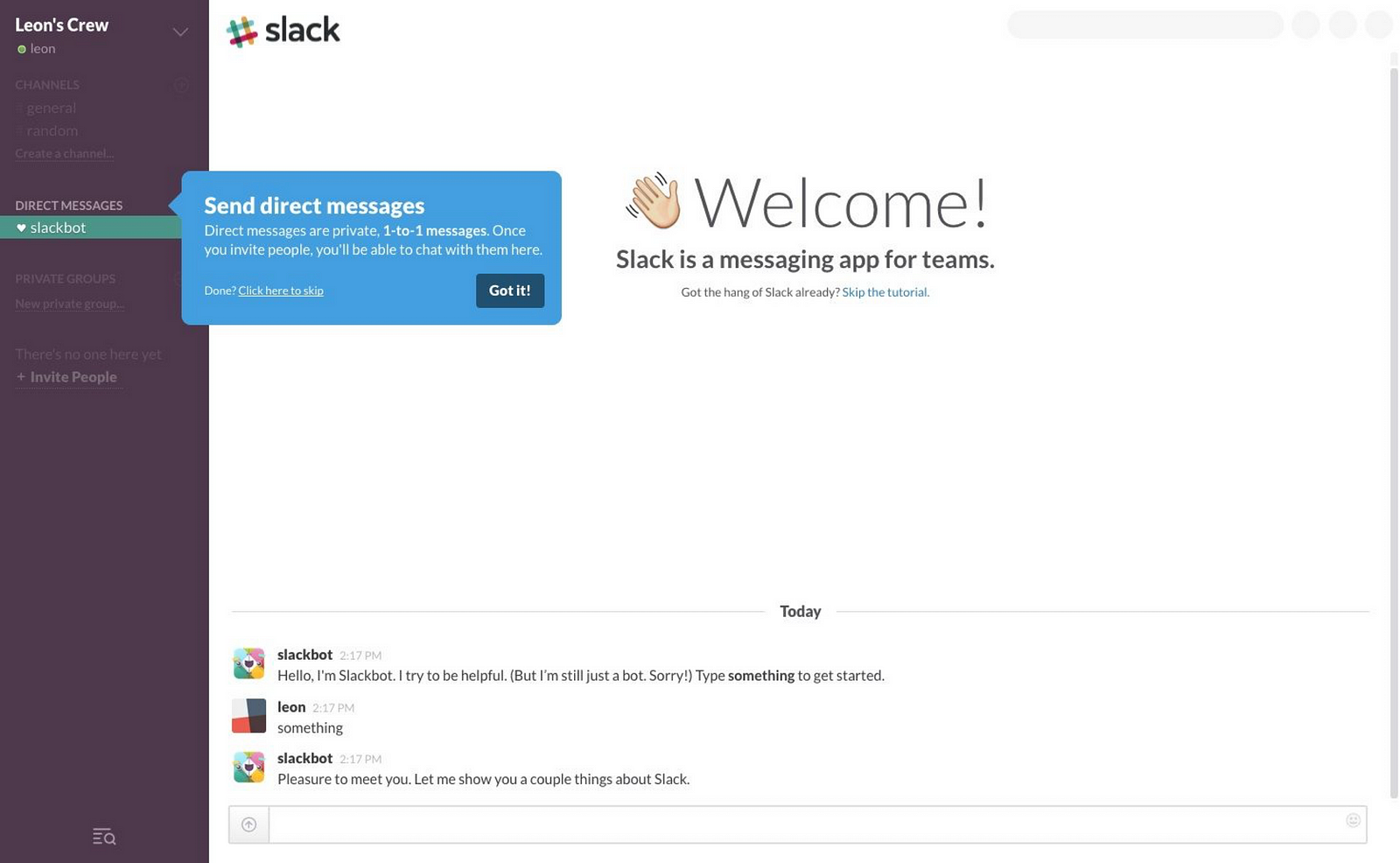
It is better to minimize the number of visual hints and show them at the right time and place. Contextual recommendations are an excellent way to avoid screens full of visual hints. Contextual tips can be found in the Slack web app. The app minimizes the number of instructions by focusing a user’s attention on a single, primary subject.
Tips for designing visual tips:
- Don’t show visual tips for every possible action a user can perform on the screen. If you think that users need to learn a lot of instructions to use your product, there is a high chance that your UI is not intuitive and you need to redesign it rather than apply bandages like visual tips.
- Show one tip at one time
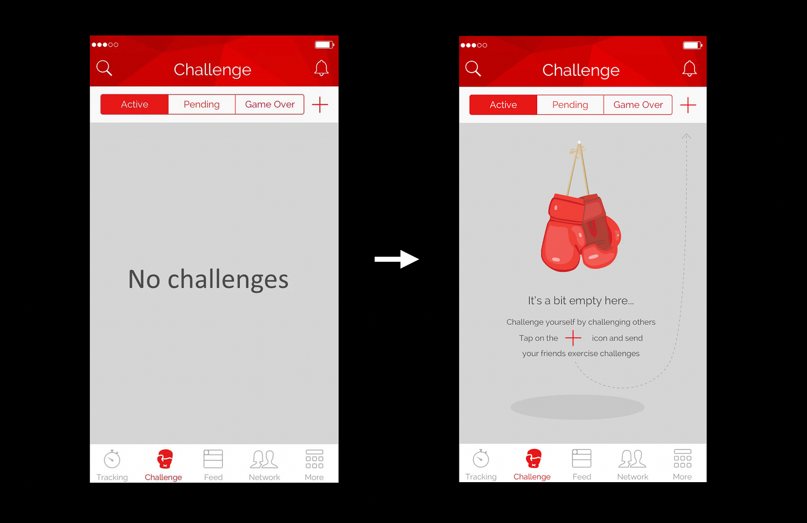
4. Empty state
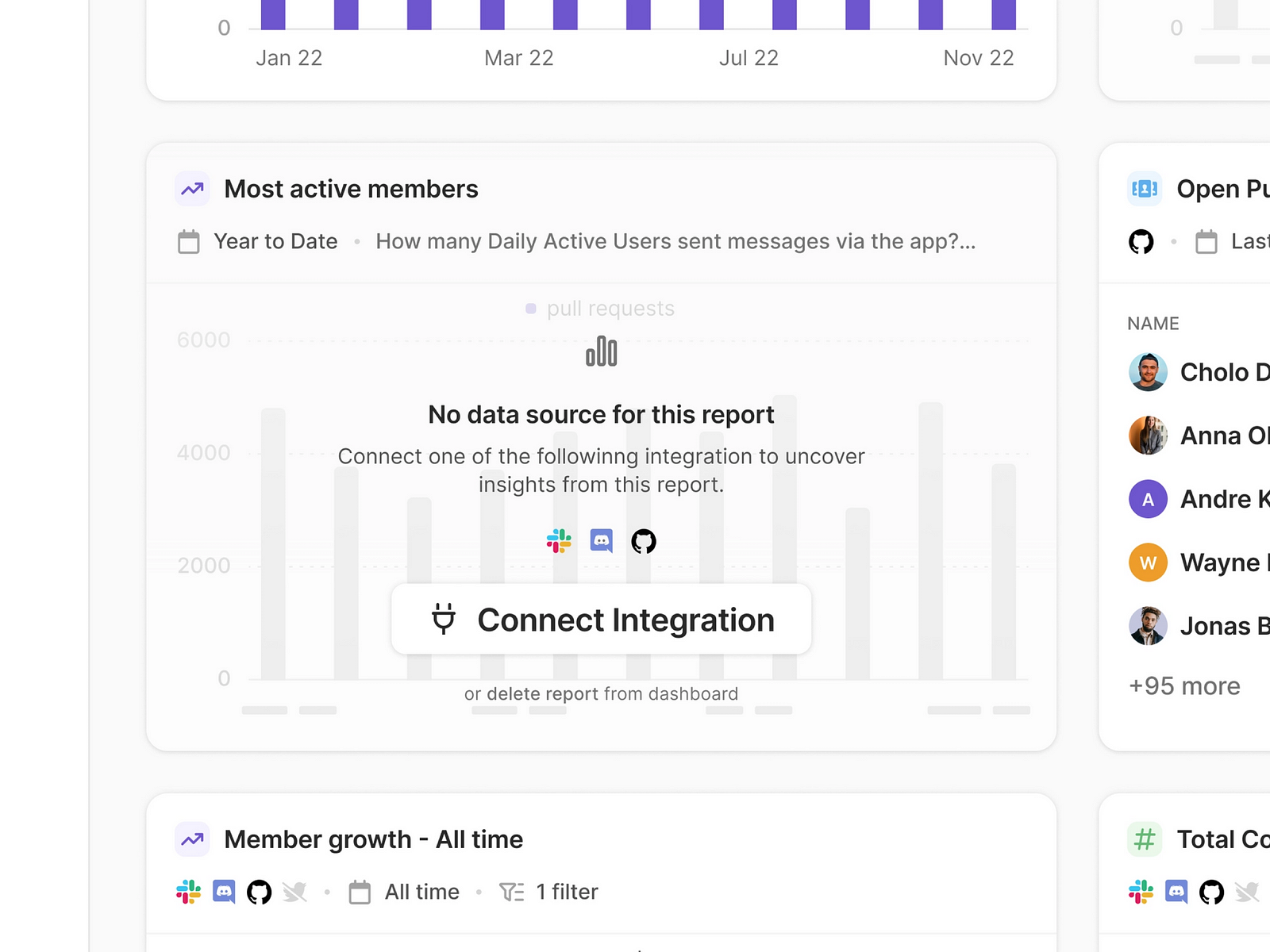
When we think about a product, we always imagine a product with data. Content is what provides value for most apps. It’s the primary reason why people start using apps. However, it’s critical to consider places in the experience where a user might not have content yet. Such places are called empty states.
Poorly designed empty state becomes a dead-end that prevents users from moving forward.
Even if an empty state is meant to be an in-between step in user flow, you should maximize its functional role for users. Instead of leaving an empty state blank, you should use it efficiently — to guide the user on what they should do next. The example below shows how the app educates the user to complete a certain action.
Another way to use empty states for onboarding is to set expectations. You can show the user what the screen will look like when it’s populated with actual data, and tell them with words how to achieve that.
Tips for designing empty states:
- Think about onboarding as a user flow. Think about how users go from one screen to another and when they can see an empty state. Empty states should also help users understand the context and set expectations for what will happen.
- Don’t design dead-end states. Add text and call-to-action buttons that help the user move forward.
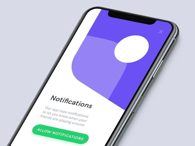
5. Customization
Sometimes apps request users to provide access to specific functionality or personal data to be able to customize the user experience. For example, the app might want to send users a notification to let them know their friends are around. If you want to ask for permission, always explain why you ask for a particular thing.
Tips for requesting data / permissions:
- Always explain why you need access to data or feature.
- And allow users to decline the request and decide later.
Before designing your product’s onboarding, stop and think about what kind of experience first-time users should have. Choose the techniques that will help you create this experience.