Empty State: Mobile App “Nice-to-Have” Essential
The average app loses 77% of its daily active users within the first 3 days post-install. What’s worse: within 30 days, approximately 80% of daily active users are gone.
Are these low retention rates a result of poorly made apps? Not always.
Users try out a lot of apps but decide which ones they want to delete within the first few days. The key to success is to get the users hooked during that critical period.
Your task is ensuring the user sticks around long enough and takes enough actions to enjoy your app. But before that happen they should enjoy a first use.
The Power of First Impressions
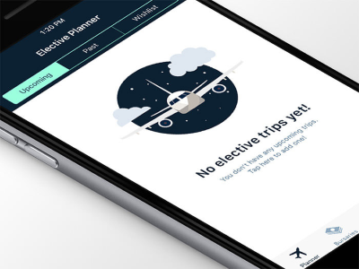
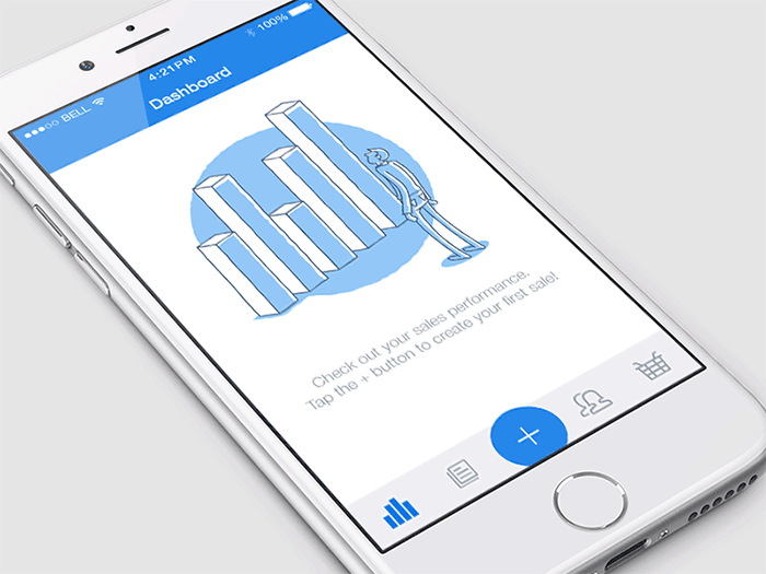
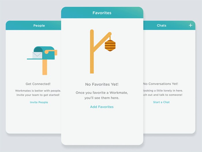
We normally design for a populated interface where everything in the layout looks well arranged. An empty state is the thing you usually design last. But empty states are actually full of potential to drive engagement. Even if it’s meant to be just a temporary stage, we must respect its communication value for users.
When do users encounter empty states?
- First use: App first launch
- Errors: Runs into some issue
- User cleared: When clearing the content
A successful screen accomplishes these three goals:
- Educate and help
- Delight user
- Prompt action
Educate and Help Your User
The first goal with an empty state is to teach people how to use your app. If they don’t understand the functionality, they’ll bail. So you should help them get comfortable by setting expectations for what’ll happen.
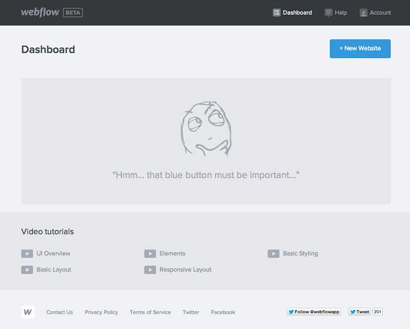
Bad Example: Spotify’s error screen has only “An error occurred” message.
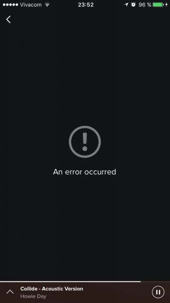
- An explanation of what the type of content is used for the section.
- An orientation of where the user is in the application.
- An explanation of the action or event that must occur for data to appear on this screen.
Delight Your User
A good first impression isn’t just about usability, it’s also about personality. If your first empty state looks a little different from similar products, you’ve shown the user that your entire product experience will likely be different, too. Your goal with this state should be a pleasant surprise.
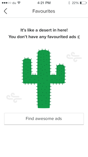
Can you do something fresh or unexpected? Like an animated empty state:
- Introducing your brand elements ( Differ from other products in an interesting way).
- Showing a sense of humor and entertain (Use positive emotions and surprise your users).
- Showing the human side of your business or product (Offer incentives, or offer help even if you’re not obligated to).
To prompt action on an empty state, you should:
- Motivate your user: use motivational language and design that’s appropriate for your users such as: “Learn more” or “Let’s get started.”

Dropbox iOS app - Persuade your user: remind the user of the benefit they will receive when they use your product.

Flipboard mobile app - Direct your user: recommend and show them the single best way to get started. Provide a call-to-action button (or arrow to the button) to guide user with the necessary action to stop seeing empty screen, and get a more meaningful one: 
Takeaways
- Invest in empty state because it’s not a temporary or minor part of the user experience. Make your app a joy to use and connect feelings with features. Explain the app’s benefits so your users know why they should care.
- Keep it visually simple: concise copy, clear icons or illustrations and a CTA button is normally more than enough.
- If the empty state was triggered by positive user action, reward them with a delightful message.
- If the empty state was due to user error, it’s a very important that you clearly explain how to solve the problem and get back on track.
Conclusion
Empty states are just as important as other design components because UX is the sum of all parts working harmoniously. User interfaces requires a delicate balance of information and action. A blank state can stand between your user and the UI work you have done, and hence warrants a lot of attention.