Functional Minimalism for Web Design

Functional Minimalism for Web Design

Rooted in the post-World War II artistic movement, minimalism has reemerged as a powerful technique in modern web design. This technique sometimes presents as an attempt to prioritize content over the chrome. Applied correctly, minimalism can help designers focus their designs to simplify user tasks. It brought additional benefits to websites, in the shape of faster loading times and better compatibility between screen sizes. The simplicity of minimalism may seem simple enough, but under the surface lies far more than just “less is more.”

Below are a number of principles of minimalist design, as well as best practices for this technique.

What Is a Minimalist Web Design?

Many of today’s most popular design trends (such as flat design, hero images, and hidden global navigation) are directly influenced by minimalism, a web-design movement that began in the early 2000’s.

Google is often credited as the pioneer of minimalist web interfaces. It has prioritized simplicity in its interfaces ever since its beta offering in the 1990s.

Even though Google now offers a huge variety of products, its homepage has changed very little over 15 years.

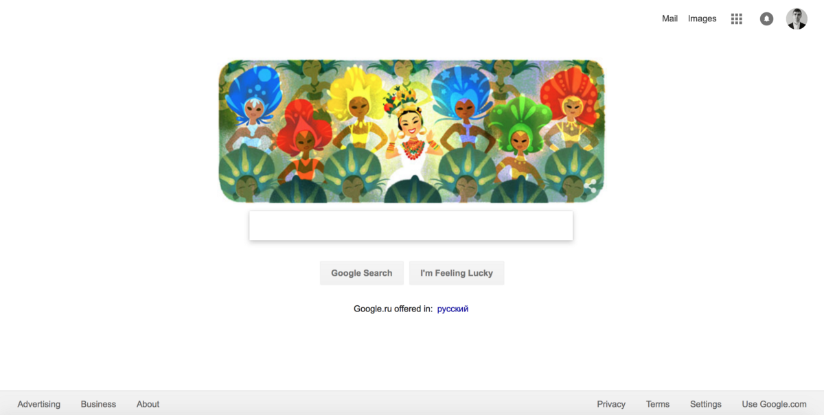
The success of Google’s search page paved the way for minimalism.

Although there is some debate about what exactly qualifies as minimalist web design, there are a few common features that most designers can agree upon. Let’s define characteristics of minimalism:

Only the Essentials

The philosophy of minimalism sounds very simple — “less is more.” In web design, less is more is achieved by using only elements that are essential to a given design. A minimalist web-design strategy is one that seeks to simplify interfaces by removing unnecessary elements or content that does not support user tasks, because

The less elements on a screen, the more potent the remaining ones becomes

By that logic, if you had only a single element on the screen, you could be sure that your message is communicated to the user.

Fewer elements on a page results in lower cognitive load for users.
Minimalism is the intentional stripping away of everything that distracts users from content. But at the same time you must be sure that you aren’t making your users’ primary tasks more difficult by removing or hiding content they need. Thus, >Design around the content, and leave just enough secondary elements (such as primary navigation) so that users don’t get confused.

Negative Space

It should be no surprise that the most common element in minimalism is no element at all. Negative space — also known as whitespace — is the most important feature of minimalism, and what gives it much of its power. It serves to manipulate the user’s visual flow:

The more negative space around an object, the more the eye is drawn to it

The primary design element that most people associate with minimalism is negative space. Image credits: bouguessa
##Visual Characteristics In a minimalist design, every detail has significance. What you choose to leave in is vital:
  • Flat textures. Minimalist interfaces often use flat textures, icons and graphic elements. Flat interfaces don’t make use of any of the obvious highlights, shadows, gradients, or other textures that make UI elements look glossy or 3D.
Minimal visual hierarchy accentuated with touches of flat design in UI elements is quite common combination in modern websites. Image credits: F-Secure
  • Vivid photography. Images are the most prominent form of artwork in minimalist design, they enable an entire world of emotional connection and set an atmosphere. However, remember one key tip when selecting the photo: all the visual minimalist characteristics should be present in selected image. Choosing a wrong image (e.g. busy photograph full of distracting items) can negate the benefits of the surrounding minimalist interface.
The most prominent form of artwork in minimalist design, hero images are defined by a dramatic image placed near the top of the scroll. Credits: adablackjackgoods
  • Color Minimally. In minimalist design we use color to create visual interest or direct attention without adding any additional design elements or actual graphics. Since you should design with fewer colors, you need to get creative when it comes to creating a visual hierarchy.
With less visual information available for a user, color palettes are more noticeable and will be more influential in a site’s impact. Image credits: Mixd
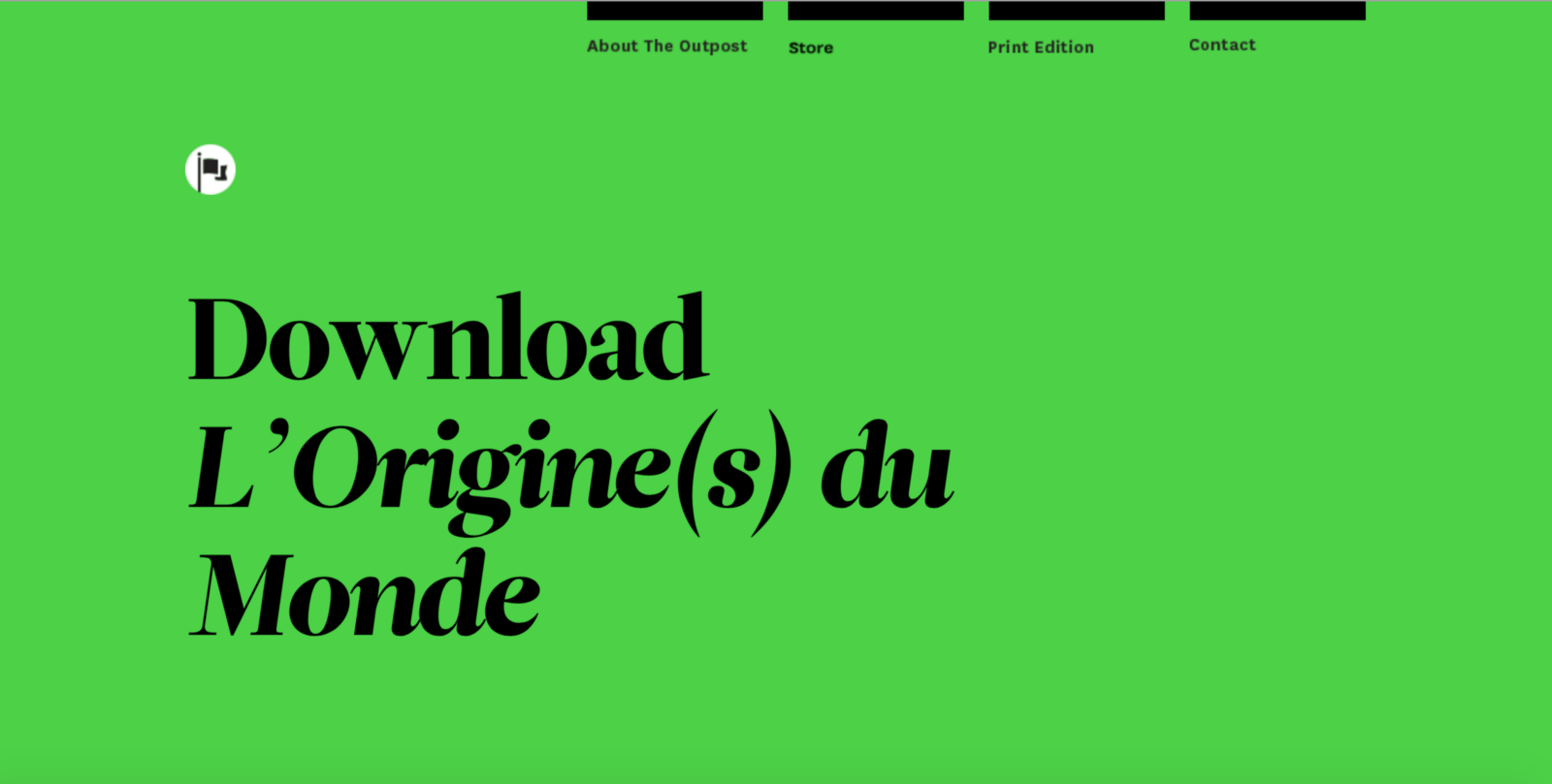
  • Dramatic typography. Bold typography brings immediate focus to the words and content while crafting a much larger intriguing visual. The most impressive examples of minimal design and typography often include bold styles and interesting letterforms. But remember, drawing attention to bold typography is only useful when that text communicates meaningful information.
Use typography to convey meaning or create visual interest.
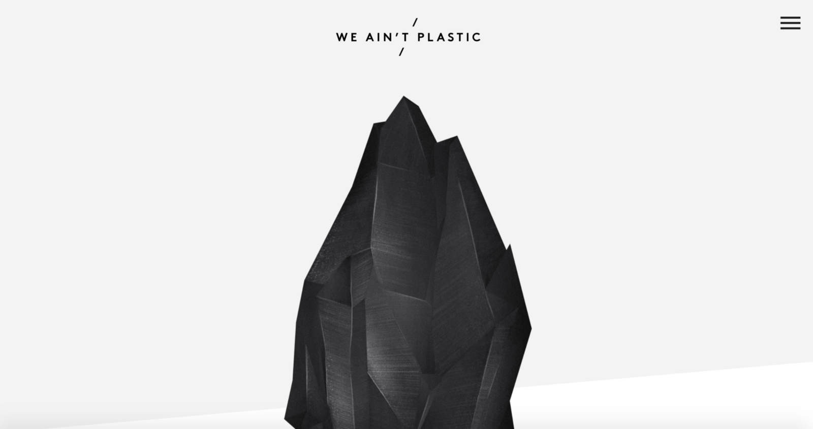
  • Contrast. Because you should design with fewer elements, you need to get creative when it comes to creating a visual hierarchy. In the We Ain’t Plastic example below, you see the staple of minimalism, the white background contrasted with the black gemstone.
Many minimalist designs use only one bold color as an accent. They use it to highlight the most important elements of the page. Credits: weaintplastic
#Minimalist Web Design Best Practices When it comes to minimalism, don’t think it’s easier just because it’s simpler. Because there are fewer elements, you must provide the *same level of usability with less interface elements.* ##Use single focal point per screen Follow the rule “one concept, one page” and design each page/ screen to focus on only one concept, centered around a single visual. ![](/content/images/2017/02/1-_9BWRFFqTzmgA1ItRcq_yA.jpeg)
Image credits: Bureau Tonic
##Make above the fold area set great expectations Place high-level content with ample negative space at the top of the screen, then increase the content density as the scroll deepens. ![](/content/images/2017/02/1-hEDS4Kx_Xd5KfX9dKVuLfA.png)
Apple’s homepage (above the fold area)
##Write a crisp copy In their book *The Elements of Style*, Strunk and White coined the phrase “Omit needless words.” Thus is true for minimalism. Edit your written content to include only the bare minimum needed to thoroughly explain your message. ![](/content/images/2017/02/Screen-Shot-2017-02-10-at-2.04.24-PM.png)
Get rid of all unnecessary words and communicate as succinctly as you can. Image credits: BFF
##Simplify (but don’t hide) your navigation Easy navigation is always one of the top goals of web design. But easy navigation doesn’t mean hidden. Before you implement a hamburger menu to help simplify your interface, make sure you’re doing it for the right reasons. Keep in mind that hamburger menus also result in less discoverability of navigation items. In most cases, a permanently visible navigation options works better for your users.

Just compare this site’s navigation:

Primary navigation is visible only on request
With this one: ![](/content/images/2017/02/1-pdFWkWeNMxH3bnuaMSdR6A.png)
Permanently visible navigation
##Use animation Animated effects are on the rise, so minimalist sites risk falling behind if they don’t implement them. However, these new effects should also follow the principles of minimalism: *subtle, and with only what is essential.* ![](/content/images/2017/02/1-UmElmC5h4aOELFTBHJY3UQ.gif)
Animation makes interaction with a site more dynamic. Image credits: Intercom
##Leave minimalism for landing pages and portfolio sites While minimalist philosophy of content-driven design applies to every site, minimalist aesthetic might not always be appropriate. Minimalism is well suited to landing pages and portfolio sites like in example below, which have fairly simple goals, relatively low amounts of content. ![](/content/images/2017/02/1-n4h1VMo_oMycvcWasHKdpg.png)
The portfolio of designer Brian Danaher is a typical example of what many designers would call a minimalist site.
Applying minimalism effectively to more complex sites can be much more difficult. The lack of elements can be harmful to content-rich sites. For such cases, a better option might be in creating a minimalist landing page that leads to a more detailed pages.

Resources and Tools

  • Minimalist Color Palettes — Some common minimalist color schemes deviating from the standard black-on-white.

  • Color Contrast Checker — Enter your background and foreground colors to calculate the ratio of contrast to create the most accessible color combination.

Conclusion

Minimalist sites seeks to simplify interfaces by removing unnecessary elements or content that does not support user tasks. What really makes such sites inspiring is when a design combines the usability factor with refinement: an easily navigated, simple site can be a very powerful form of communication.

Thank you!

Subscribe to Nick Babich

Don’t miss out on the latest issues. Sign up now to get access to the library of members-only issues.
jamie@example.com
Subscribe