Trends in Modern Web Photography

Lately, photography has been playing bigger and bigger roles on the internet, furthering web design as a visual medium. As stunning photography continues as a timeless technique, especially as HD screens become more affordable.
In this article, we’ll take a look at 6 most popular trends for web photography.
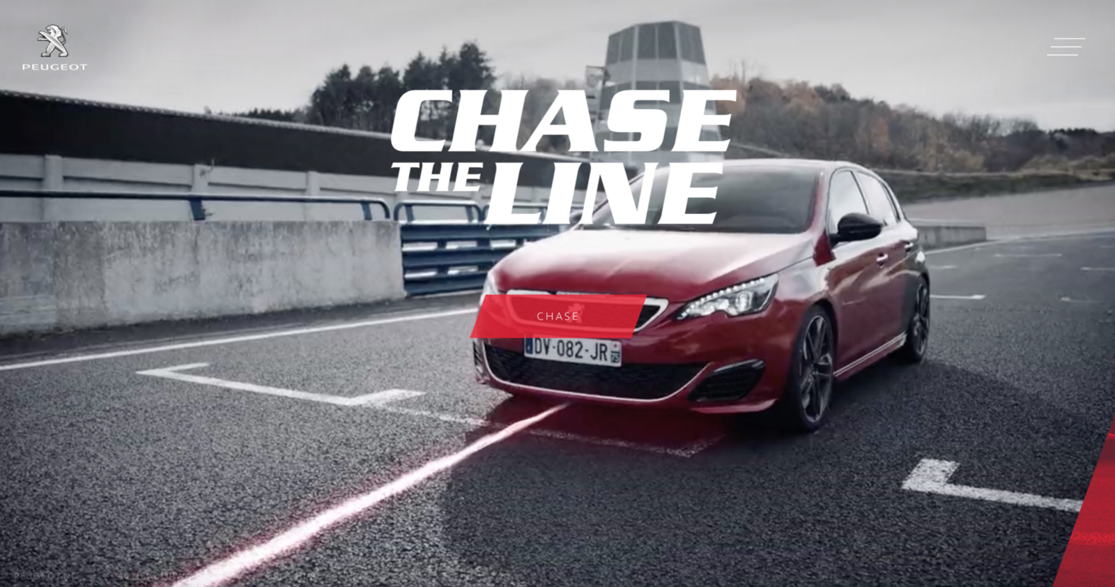
Eye-Catching Hero Images
Full-width above the scroll images are one of the most popular trends in website design. Their value lies in creating an immersive experience right away: since vision is the strongest human sense, HD hero images are one of the fastest ways to grab a user’s attention. They draw the user in immediately give users a sense of what to expect from the rest of the site.
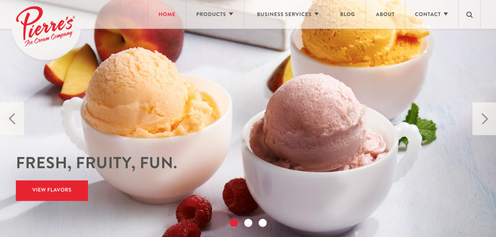
- Use only HD images for the hero area. Nothing is worse than a large, low quality photo. The image is everything if you’re going to use this trend.
- If you are planning to use a text-on-image design, ensure that the main part of the image is visible and understandable when text is placed.
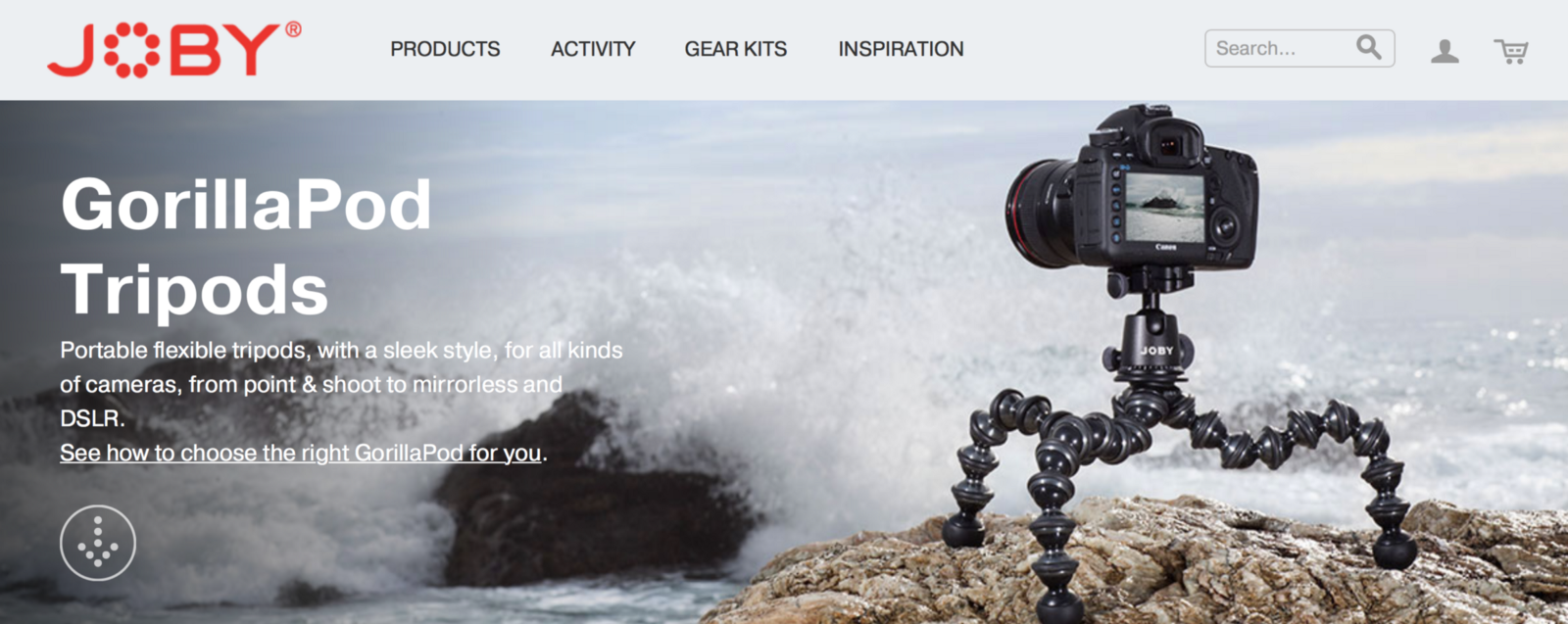
Showing Objects in a Natural Environment
Showing objects in context is a popular strategy for ecommerce sites. It’s a proven fact that such photos boost conversion rates. For example, the GorillaPod shown below. The hero background shows the device in a possible real-life situation. With the tripod large in the focus and no head to distract from it, the product is displayed creatively and efficiently.
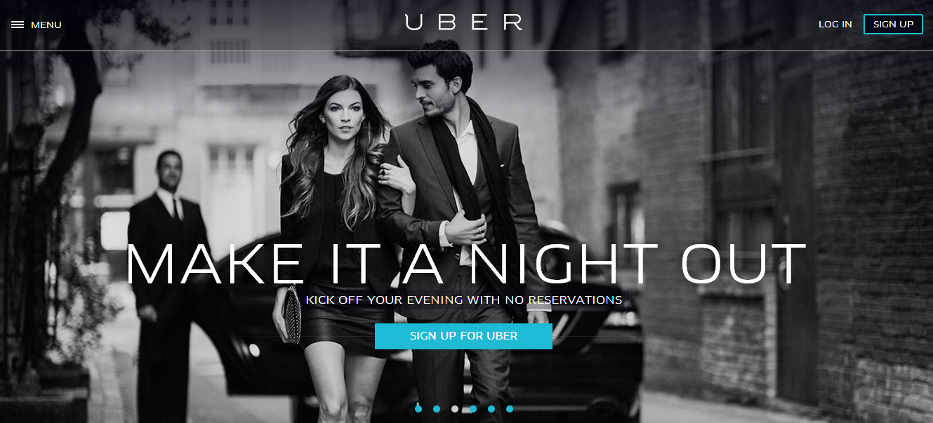
Color takes attention away from the visual building blocks of a the photo itself; and it also takes attention away from other important elements on the page such as CTA buttons.
Tip: If you have black and white photo as a background, you can use a bright color to drive user attention towards the CTAs. As you can see in example below, a black-and-white photo background amplifies colorful accents.
Color Overlays
Color overlay is a cover for the image with a semi-transparent colored box. This technique can modify images to suit more specific goals such as brand identity (using a brand’s color scheme) or emotional response (for instance, a sepia overlay might give a neutral photo a sense of old).
- It’s fairly easy to add the effect for your image, here are tutorials for creating color overlay in Photoshop or CSS.
- When using a single color as an overlay, think about the degree of transparency of the color. Heavier color combinations (less transparent) put more focus on the color itself than the image behind it. More subtle combinations put more focus on the image.
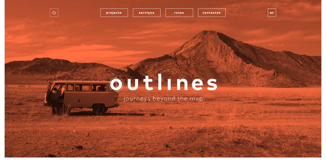
Photo Paired with Dramatic Typography
Custom typography can enhance your brand’s personality. When combined with custom photo, the effects can multiply. The style or message of the text influences how the user interprets the photo.
- Dramatic typography can act as a visual element in its own right, but it shouldn’t compete with images.
- Because legibility may be an issue, try limiting the use of dramatic typography to big titles overlaid across images. And don’t forget to check color-contrast rate.
- Dramatic doesn’t mean complex. Dramatic typography and simple typography are not mutually exclusive. If possible try to use simple typefaces, because they are easier to read and better for loading.
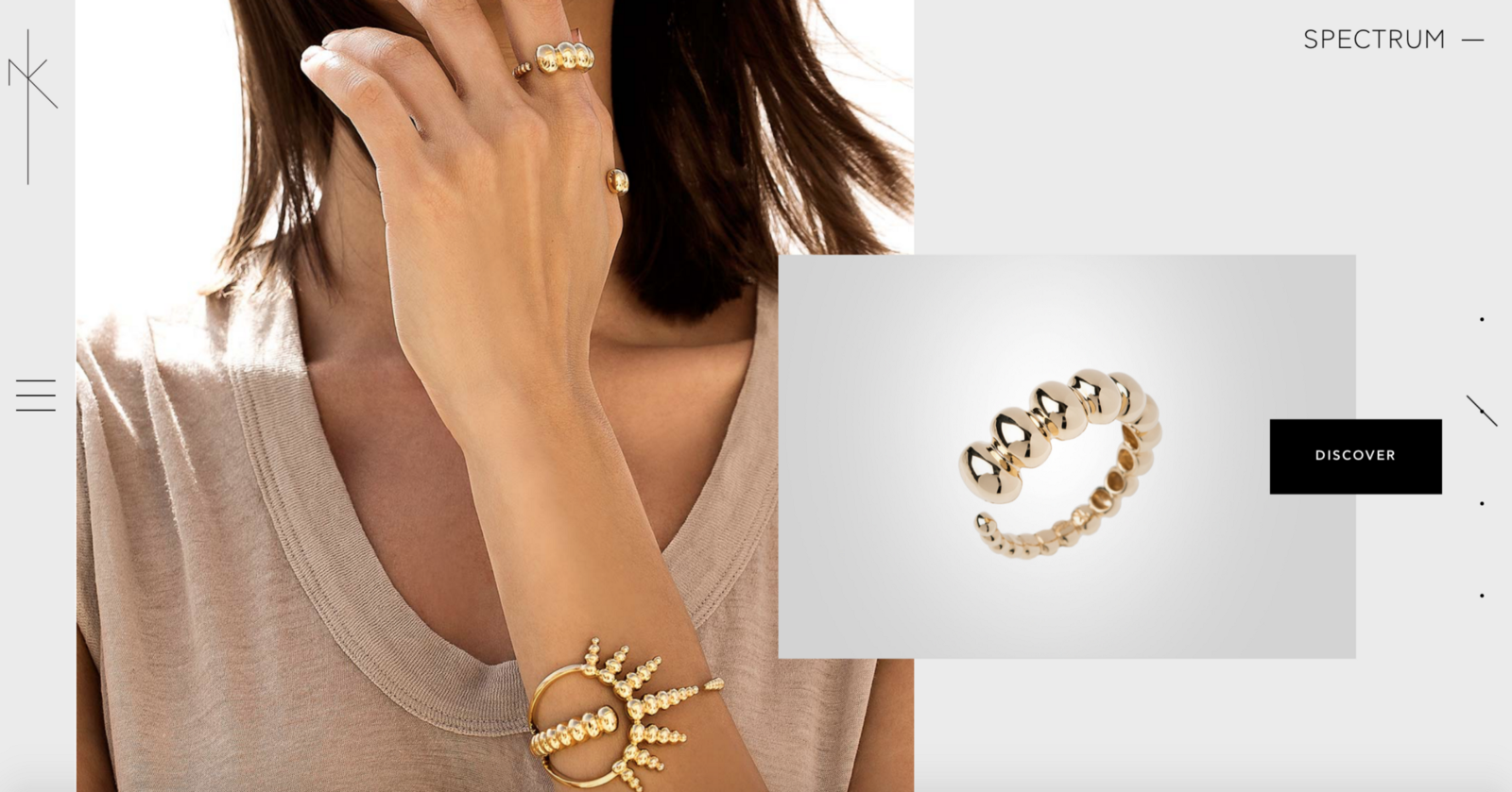
Asymmetrical Layouts
Asymmetrical layout is a popular choice among many web desiners. It helps designers create a visual flow that matches the user’s scanning patterns: this technique helps to direct the eye around the page in a smooth, logical way.
You can create asymmetry by shifting either text or visuals to a certain side of the page. While the composition may be the same, the visual weight is equal on both sides of the screen. For example, one large element balanced by several smaller elements. As you can see below, the large visual on the left is balanced by the copy and CTA button on the right.
Thank you!