When you examine the most successful interaction designs of recent years, the clear winners are those who execute fundamentals flawlessly. They feed off natural human behavior, then quietly remove barriers without us ever noticing, and they are focused on visual presentation and interactive experience, especially scanability. Let’s overview the most important design techniques and how they can work for you.
Effective Typography
The purpose of text on your site or in app is to establish a clear connection between the app and user and to help your users accomplish their goals. And typography plays a vital role in this interaction. The size and layout of your text can make a huge impact on the experience of reading something on screen: it takes the user much longer to process smaller text, small leading and paddings and, as result, the users are skipping most of the information. This is especially true for mobile, where tiny type on a small, bright screen can be a real headache for users. Thus, the smaller the screen, the more meaningful the typography.
Image credit: usertesting
The trick with mobile typography is balancing legibility with space conservation. Selecting a proper *size and space* is the most important moment when designing type for mobile devices . Type must be large enough to read easily and there should be enough space between lines so that text does not feel cramped in the small space.
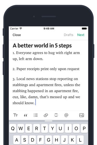
Example of good size and spacing in Medium app for iOS. Image credit: Medium
**Tip:** To ensure legibility in mobile devices, [aim for 30–40 characters per line](http://designshack.net/articles/typography/tips-for-designing-better-mobile-typography/). This conservative estimate is half of the recommended 60–75 characters for desktop.
#Simple Color Scheme
Color is the most complicated area of visual design. Simplifying the color scheme improves the user experience *while having too many colors can have a negative impact upon it*. Say “No” for complicated color mixes! By modifying the saturation and brightness of a single hue, you can generate multiple colors, and color scheme that’s not overwhelming on the eye.

Single-hue blue color scheme. Image credit: Smashing Magazine
The app in example below has a monochromatic color scheme which is made up of different tones, shades and tints within a specific hue.
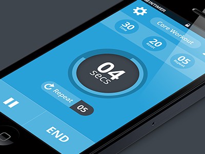
Image credit: Louis Saville
**Tip:** Creating your own color schemes can be a bit intimidating, but it’s not as complicated as many people think. Adding a bright accent color into an otherwise-neutral palette is one of the easiest color schemes to create. Bright accent color immediately draws the eye simply and effectively.
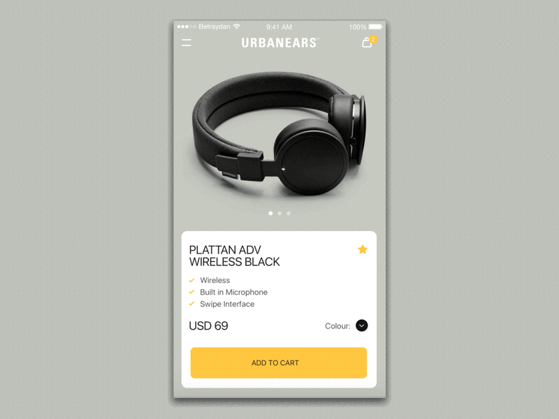
Image credit: Maximlian Hennebach
#Content-Based Navigation Together With Cards
No matter what kind of content you want to include in the design of your app, you always want to make the user to experience that content as much as possible. Content-based navigation is a design pattern used for incorporating seamless transitions between overview and detailed states of items. This kind of navigation works especially well together with cards, because cards are a great way to organize and develop massive amounts of your content in a way that’s easy to digest:
- Cards divide content into meaningful sections which occupies less screen space. Similar to the way text paragraphs group sentences into distinct sections, cards can gather various pieces of information to form one coherent piece of content.
- Cards are made for thumbs. Users don’t have to think about how to make things work, they intuitively understand the physics of turning a card over for more information or swiping for next chunk of information.
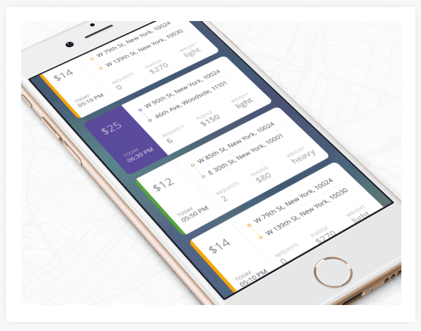
Image credit: Ramotion Agency
**Tip:** Keep the UI as invisible as you can — focus on the content.
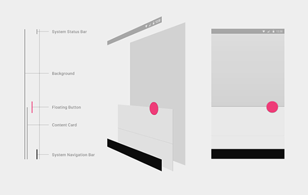
Layers and Depth
The biggest difference between desktop and mobile screens is the size. Since mobile sites and apps have less room, to help neutralize this drawback, more and more interfaces are taking full advantage of the z-axis by implementing multiple layers, one on top of the other.
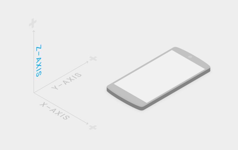
Layering approach gives a sense of depth to the interface making the experience more tangible
Layered interfaces work within the principles of Google’s Material Design, which mimics how people interact with objects in the real world. Layers help users interact with the design. Surfaces and shadows play an important role in conveying the structure of the app — they differentiate elements and objects with shadows seems to pop off of the page.
Layers are interaction cues. Image credit: Material Design
Some common applications of the layered interface include:
- Floating action button. This type of buttons is used for a promoted action. They are distinguished by a circled icon floating above the UI.
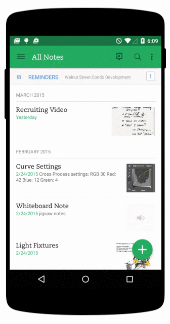
Image credit: pocketmeta
- Zoom-in. A common example of such layering is when the user selects an item in a list to zoom into its detailed view (which overtakes the list view) and is able to go back to the full list view.
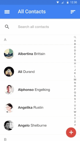
Image credit: androidcentral
- Sticky navigation. A menu with only the essentials that remains on the screen at all times while the user interacts with the views.
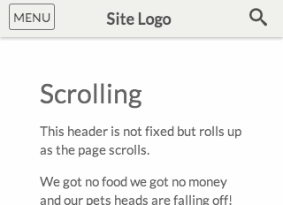
Top navigation bar scrolls with content. Image credit: exisweb
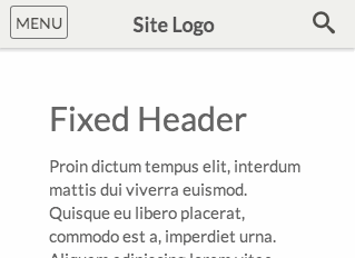
Top navigation bar is fixed. Image credit: exisweb
- Modal window. Just like with desktops, you can superimpose entire windows over existing ones to ensure they’re noticed, such as logins, ads, or reminders.
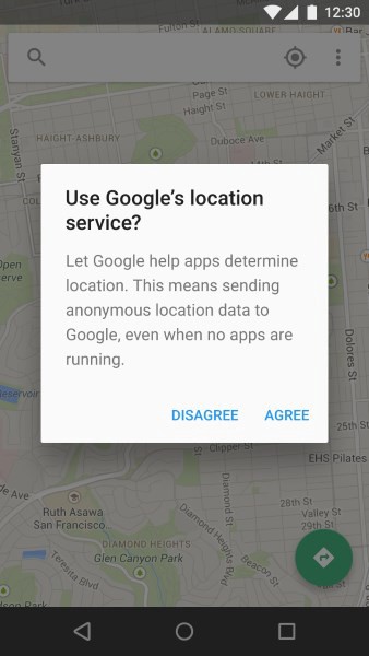
Image credit: Material Design
**Tip:** Simplify user flows — design each screen for one thing and one thing only.
Familiar Gestures
The rise of gesture-driven devices dramatically changes the way we think about interaction. The screen becomes not only a touch target but also a gesture target. Swiping, tapping and zooming are the most common gestures, they are almost instinctual as pointing and clicking by now. We use gestures to go back, reach the menu, change a current item or trigger actions such as like or delete item.
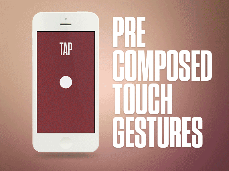
Image credit: Aaron Wade
The more an app relies on gesture controls, the less buttons on-screen, thus more space for valuable content. This make the app *very content-focused*.
Image credit: Bady
**Tip:** All that is mentioned above refers to standard (“intuitive”) gestures. Be careful if you want to use creative gestures. The main thing to know about gestures (standard or creative) is that *they are always hidden*. So without *visual cues*, users could get confused about how to interact with the app.
Functional Animation
Functional animation is subtle animation that we embed in a user interface design as part of our process. It acts as facilitator for interactions by:
- Providing a visual feedback:
When users see an animated feedback triggred by click/tap action, they instantly know the action was accepted. Image credit: Ryan Duffy
- Smoothing state transition and call attention to changes:
Icons change from one image to another to serve dual functions at different times. Image credit: Material Design
**Tip:** You can enhance the user experience with the subtle use of motion and transitions. But use animations carefully, *animate with purpose*. Rather than animating solely for the sake of delight, you should focus on practical things the animation does for the user.
Conclusion
UI design is moving towards removing any unnecessary elements to focus much more on functionality. Clean interface, simple color schemes and visually pleasing aesthetics give an interface a modern feel and make product easy to use.
Thank you!