There is no section on site or in app that is more critical for conversion than the product page. The ability to see and understand product information easily is critical to users when they’re making a product decision.
There are a few ways you can improve your page and get visitors to buy. Here’s what you need to know:
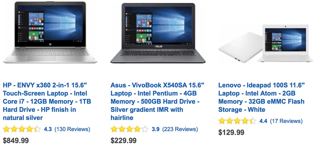
Product Details and Options
Comprehensive details both excite and reassure users, allowing them to quickly understand purchase options. Users appreciate it when app or site shows all available product information: stock availability, sizes, color choices, product description, photos, reviews, and more.
Product Detail Are Clear and Intuitive
Product description should be easy to skim (get a general overview) and scan (find a specific info). In the left example below user can be frustrated by incomplete product details:
- Size: it’s not clear whether certain sizes are even available or just currently unavailable; not clear what is size ‘XL’ in actual measurements.
- Color: no visual representation for the color options; microcopy doesn’t provide enough information about how the color looks like in a real life.
- Stock availability: no information about stock availability and delivery options.
- No product details.
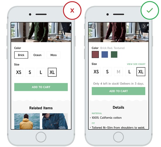
Incomplete product details may lead to user frustration. Image credit: thinkwithgoogle
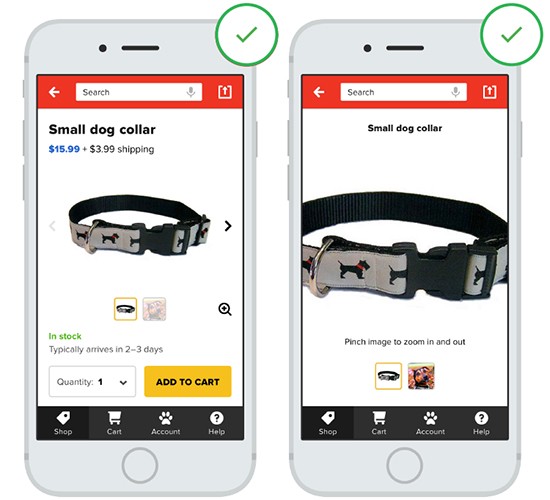
It’s true that compacting all the information essential to a great product page into a format that works on a mobile screen is incredibly difficult. But some retailers show that it’s possible:
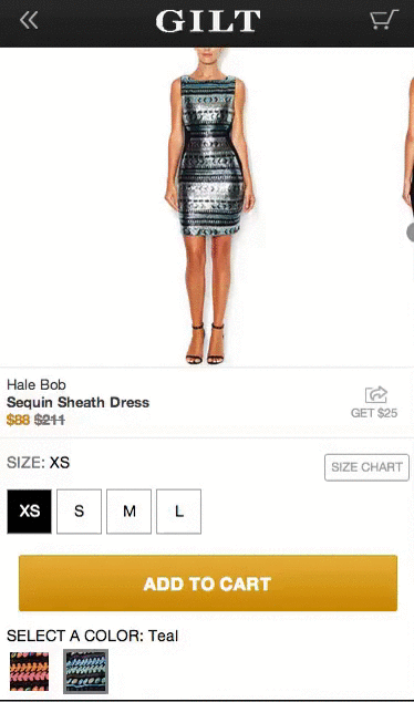
Image credit: ometria
##Minimize User Typing Effort
Majority of errors on mobile apps occur on input fields. Typing has high interaction cost; it is error prone and time consuming even with a full keyboard (and even more so on a touch screen). Ideally, all input fields where users can enter a raw data (open for user error) on the product page should be elimintated. You should prevent users from making errors by resticting the number of options: use radio buttons and steppers so users can select only definitive options.
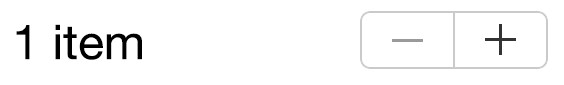
Stepper element in user interface
#Product Images
*The product image sells the item.* Regardless of your product, whether it be computers or t-shirts, it’s the most important element on the page. Good product image does two very important things — makes a great impression and provides information.
##Use Big and Quality Images
For the image to be effective it needs to be both big and high quality. This is especially important for clothing stores where consumers are more concerned with detail. The image below illustrates how this rule applies to apparel product page.

Notice that zoom controls are large enough to capture the attention of the user. Image credit: ctshirts
Make sure the assets don’t appear pixelated. Not only original image should be good but the zoomed-in images also need to maintain high quality. So make sure that your images implementation fetches a higher-resolution version of the product image when users begins zooming.

Left: Degraded imagery. Right: Appropriately sized imager.
Below is a clear example of zooming problem. While the zoom-in is supported at Overstock, the product images are of a very low image resolution and they are simply unusable due to their low quality.

##Let the User Control the Level of Zoom
The image is used to get a feel for the product in a way that a product description never can. Since users usually rely on the product image to assess *features* and *details*, they can become frustrated by apps or mobile sites that zoom in at a predetermined magnification level.
Zoom capability restricted to a specific location. Image credit: thinkwithgoogle
You should put users in control by allowing them to zoom in as they prefer.
Depth and area is controlled by the user. Image credit: thinkwithgoogle
##Required Number of Images
Generally speaking, the more product images you have within your product screen layout the better. But in practice, in order to optimize usage of the gallery photos try to use images associated with the product details highlighted in the product description.
Here are a few tips for image gallery:
- You may also show practical shots that show detail and features. For example, if you’re selling an AV receiver show the input ports at the back to help the user understand what it’s capable of.
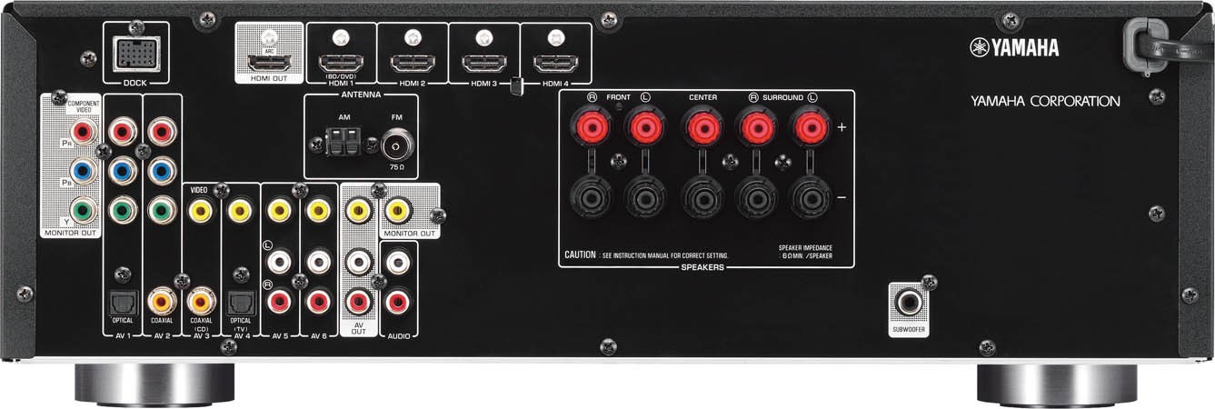
Use pictures to convey information. Image credit: Yamaha
- Contextual images can be also helpful for your users. For example, Harry’s uses images to tell the brand’s story in a mobile setting.
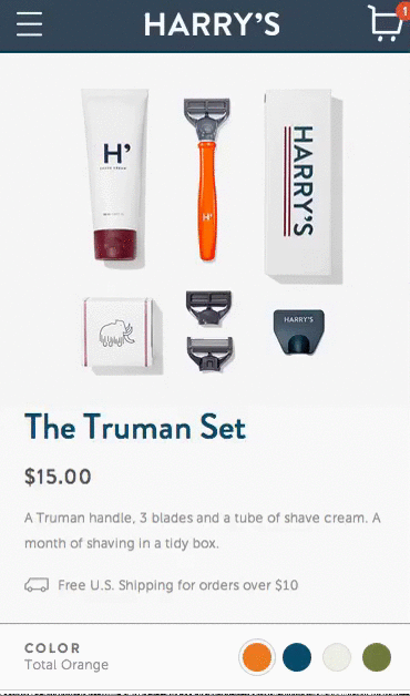
Image credit: ometria
##Design Your Image Gallery for Horizontal Swiping
*Side-swipeable images created for thumbs.* Users should be able to quickly swipe through product images horizontally, and not have to scroll down to view a series of images.
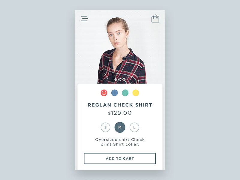
Image credit: Dribbble
##Support Pinch and Double-tap Gestures
Users often try to use gestures such as pinch, double-tap to try zooming images on mobile product pages. However, not all sites that support zoom gestures inform their users that they support pinching and tapping. When sites indicate support for image gestures it actually help users to take advantage of this feature.

Image credit: baymard
#Product Price
*Price is a very rational thing* and you should take some time to get your product pricing strategy right. There are two different ways to approach price and place it in the right spot on the page:
-
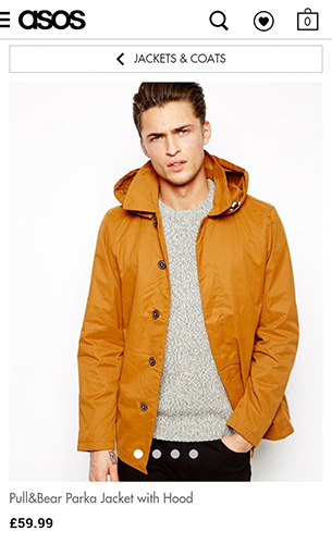
If you are competing on price, that is you are selling the same product as many other vendors, then make more of the price. As a rule of thumb, place the price front (right after the image and product name) if you are confident your prices are undercutting competitors (just like Asos does):
-
If you are competing in other ways (e.g. you are selling a unique product), then you want to reduce the display emphasis on price. You may place the price after the list of benefits and features of the product.
Product Availability and Delivery Options
One of the biggest reasons for product page abandonment is that many product pages don’t list the delivery options and costs. Lack of shipping information forces users to search for it on other pages, distracting them from the main intent.
Show In-store Availability
In-store availability is key for users who want to buy or pick up their items at a physical location. Always try to detect user’s location automatically in order to show local availability, but allow users to select a preferred store easily. A common mistake is defaulting to the user’s location without providing an easy way to override it.
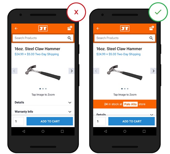
In-store availability should be presented on the product page. Image credit: thinkwithgoogle
##Shipping Costs and Delivery Dates
Users expect shipping costs and delivery timing to be clear and surface as soon as possible, because when users are purchasing an item, they often weigh the cost of shipping versus the speed with which they can receive it.

Image credit: thinkwithgoogle
Ideally, you should offer a free delivery and a premium just-in-time option. Be sure to list available delivery options with associated costs within the design of your product page.
#Helpful Product Reviews
Online shopping is about trust and people tend to trust the opinion of others. Customer reviews are used in two different ways by users:
- Reviews help to assess the quality of the product and the level of your service. Users want to be reassured that all what you say on the product page is true.
- Reviews help users find answers to questions about details that might not be found on the item page. Buyers consider this information just as good, if not better, than talking to an in-store sales representative.
If you can build up a good set of reviews, they will add credibility to your product page and help sell the product.
Allow User Reviews to Be Filtered
Allow users to sort and filter so they can get the “true” information about an item.
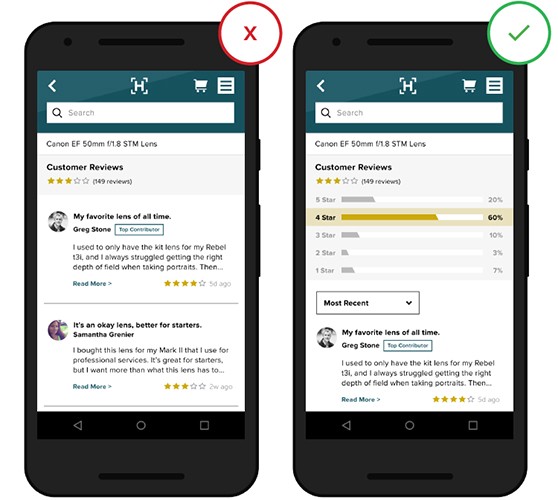
Image credit: thinkwithgoogle
##Don’t Hide Any Negative Reviews and Show Total Number of Votes
If all the reviews are overly positive it leads users to question their validity.
And when you display products, make sure of showing the number of votes done to make the rating more meaningful.
#Decreasing Bounce Rate
Keep users engaged with the site or in app for as long as possible by offering additional content: provide an information about related items and most popular products. When users are thinking about replacement or add-on products, they appreciate relevant product recommendations on product pages. Try to use eye-catching product recommendations at the bottom of the page.

Related recommendations provided during browsing can aid a user’s purchase decision
#Conclusion
30 per cent of mobile shoppers abandon a transaction if the experience isn’t optimised for mobile. Designing a mobile shopping experience that matches desktop in terms of conversion rates should be a top priority task for each eCommerce app or site, especially when it comes to product pages. Product pages should drive shoppers to convert, because the easier it is for a user to buy a product the likelier they are to buy it.
Thank you!