Icons as Part of an Awesome User Experience
Due to the limited screen space, we usually replace text labels with icons wherever possible. Icons take less space, they don’t have to be translated, and people are familiar with them after all, right?
That’s not always true. Let’s see what does it take to make an icon user-friendly.
Benefits of Icons
The are a lot of benefits of using icons in design including:
- Icons make good targets. They are typically sized large enough to be easily touched in a finger-friendly UI.
- They save screen estate. Icons can be compact enough to allow display more content on a relatively small space.
- Icons are fast to recognize at a glance. This is particularly true for standard icons that people have seen and used before.
- Usually no need to translate icons for international users. Good example is an envilope. It looks the same in various countries.
- Icons enhance the aesthetic appeal of a design. Because they bring visual delight to the user experience.
And, last but not least, most apps use icons. It’s a design pattern which is familiar for the users.
Despite these potential advantages, icons often cause usability problems when they are designed without consideration for their many potential downsides.
Types of Icons
Let’s focus on types of icons and their impact on the user experience.
Universal icons
Icons are, by definition, a visual representation of an object, action, or idea. There are a few icons that enjoy mostly universal recognition from users. The icons for home, print, and the shopping cart are such instances.
Confusing and Conflicting Icons
The trouble comes in when you’re implementing commonly-used pictogram that have contradictory meanings.
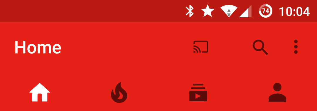
The “hamburger” icon is an excellent example of an icon that is striving to become universally known.
Other icons frequently misunderstood by users include the heart and the star. Imagine you see this icon below an image in an app. What does this mean? What happens if you tap it?

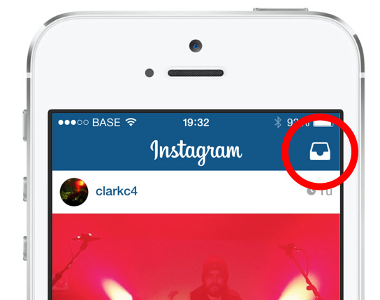
A lot of designers try, and a lot of designers fail. They hide functionality behind icons that are actually pretty hard to recognize. Would you guess, for example, that you can send direct messages behind this icon in Instagram?
When Google decided to hide other apps behind an unclear icon in the Gmail, they apparently got a stream of support requests, like “Where is my Google Calendar?”

No matter how much sense an icon makes once you know what it’s supposed to represent, it can be a completely different experience for first-time users. And it’s a common mistake to assume that your users are either familiar with abstract pictograms or they’re willing to spend extra time exploring and learning them.
Labels and Usability
As Bruce Tognazzini once said, “a word is worth a thousand pictures.” This may come as a disappointment to those who say a picture is worth a thousand words but labels dramatically increase the usability of icons.
It’s a common misconception that users (especially mobile users) will play with all the different icons until they discover what each icon does. In reality, users are often intimidated by unfamiliar interfaces. Users want a clear idea of what will happen before they take an action in an unfamiliar product. So your icons need to set clear expectations for users before they click or tap on them.

UserTesting study found that:
- For icons with labels, users were able to correctly predict what would happen when they tapped the icon 88% of the time.
- For icons without labels, this number dropped to 60%. And for unlabeled icons that are unique to the app, users correctly predicted what would happen when they tapped the icon only 34% of the time.
Tutorials and Onboarding
Some designers find that labels clutter up their interface. To avoid using labels, they’ll include instructions for using icons in onboarding, hoping to train users on how to interact with the icons. While this can be a great way to introduce unique or uncommon icons, usually it’s a bad idea. Because many users will skip your intro; they just want to get started with the app. Onboarding should be a tool, not a crutch.
Takeaway and Tips
Your icons should help your users do what they need to do without requiring effort. Don’t use an icon if its meaning isn’t a 100% clear to user. When in doubt, skip the icon. Reside to simple copy. If you want to keep the graphical advantages of icons, you can of course combine the icon with copy.
If you use icons in your app, strive to make them easy to recognize and memorize by following these guidelines:
- Avoid icons with conflicting meaning. Icons must first and foremost communicate meaning.
- Keep the icons simple and schematic. Reduce the amount of graphic details by focusing on the basic characteristics of the object rather than creating a highly realistic image.
- Use labels whenever it would help the user. This is especially true for complex features.
- ABC (Always be Testing). Watching a real first-time user interact with your interface will help you determine whether your icons are good enough. Test the icons both for recognizability and memorability. Ask a repeat set of users if they can remember the icon’s meaning after being told what it represented a couple weeks earlier.
Conclusion
Any icon in your interface should serve a purpose, whether you’re designing a website or an app. When done correctly, icons can help you guide users intuitively through a workflow.
Thank you!