UX in Email Design

You spend months creating an awesome product with an amazing UX. You’ve put a lot of effort into creating something really cool. And there comes a time when you need to present the product to the audience. But have you thought about the emails you’re going to send, user experience of the email?
Most of us solving this task using 3-simple actions - we figure out our target audience, create a proper copy and send it to the audience at the right time. But even if you hire a copywriter to write the perfect copy and send it to the right people at the right time, content alone does not make a good user experience. In order to achieve this goal you should find a right balance between business goals and context, user needs and your content.
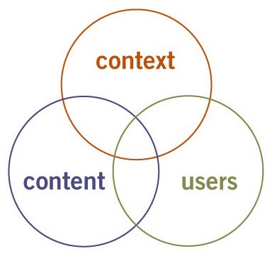
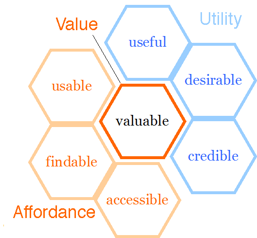
Facets of the User Experience
Peter Morville’s created a user experience honeycomb which can be applied to email as well as anything else on the web:
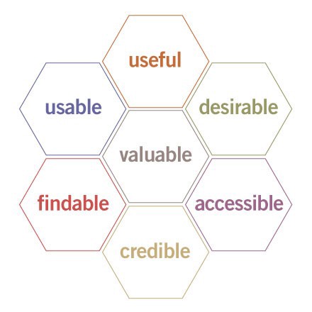
Desirable
How many of messages do you get every day? How many do you scan over or ignore entirely? We’re all experts at ignoring messages that aren’t meant specifically for us. There’s a fine line between optimized, helpful message, and the one that feels like a spam. That's why you should only send your users an information they would want to receive.
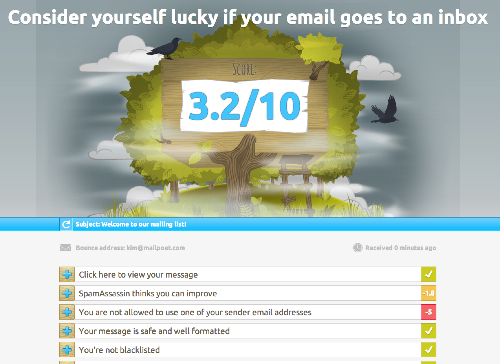
Findable
“Findable” should be an equivalent of “not ending up in the spam folder”. Spam filters analyze your content. There are no magic keywords to enhance deliverability, but limiting the use of risky words (such as free, buy, promo) reduces the likelihood of your emails ended up into spam folder. Check your email content using special tools like Mail-Tester to be sure that it doesn’t look like a spam for filters.
Accessible
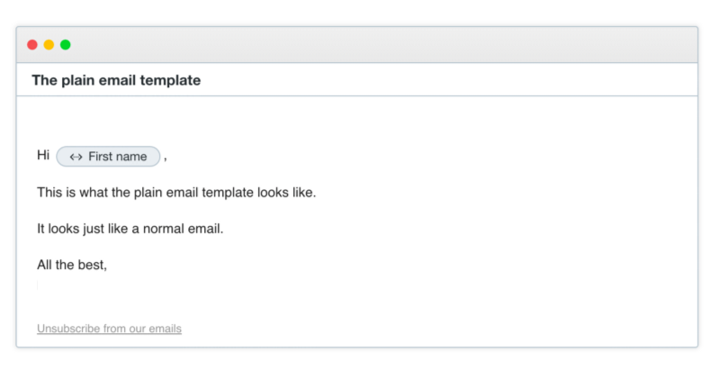
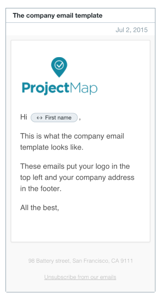
Accessibility can be a greatly overlooked area of email design. Hopefully there are simple things you can do to improve accessibility for a large number of users. One simple thing is to create a plain-text version of your email. And this plain styled email should be designed to look 100% manual and handwritten:
Credible
Credibility in email is a very important facet. Users should trust and believe what you tell them. Credible emails is the one which:
- Doesn’t look like a spam (See Findable facet).
- From a trusted sender (Use clear, trustworthy From field names. Avoid obscure From field names, such as: “42352345@domain.com”, “noreply@domain.com”).
- Have a clear subject (Answer on the question ”What’s the context?”).
- Makes it clear where links will lead (Do not use url shorteners).
Valuable
Your emails must deliver value to your clients. “Valuable” is the most important facet of user experience design. You should answer on the question: “Who is the audience?” You can drill into your customers base to identify the exact groups of users to talk to. You message should make more sense to more people, so you’ll see better feedback.
Tips for Designing Effective Emails
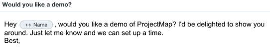
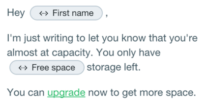
Make Email Sound Personal
The content is rarely as important as a direct note from someone. Each email should look like it was written by you, just for that particular customer. This is a better experience for everyone, because it brings more engagement than something that looks like it was sent to the masses.
There are three simple ways to accomplish this:
- Use a personal looking message. A simple thing like address your customers by their first name makes good first impression.
- Speak like a human. Don't use a robot language or business jargon. You just want to sound friendly, natural, and personal).
- Personalize your message using customer’s details. Use custom attributes in a message, which are specific for each user.
Optimize for Mobile Devices
One of the most important things you can do is optimize email for mobile screens. We read a ton of emails on our phones. No, actually we scan a ton of emails on our phones:
- 48% of emails are opened on mobile devices
- 69% of mobile users delete emails that aren’t optimized for mobile
- 89% of email marketers are losing leads and opportunities because they’re not optimizing their emails
It’s simply essential to design your email to be mobile-friendly (or mobile-first). If your email is mobile-friendly, then that means it’s less likely to get trashed before they’ve opened it on their regular computer to take action.
Here are some quick tricks to help you start doing so right away:
- Reduce image file sizes. Images still going to load more slowly on mobile devices than on desktops. Every 1 second delay in loading time results in an average 7% drop in conversions. You can optimize your emails by using smaller image files. Use services like TinyPNG for that.
- Resize images by proportion of screen. Make sure your images fit whatever screen size your device is). You shouldn’t have something like this in your email:
- Increase the size of links and click-to-call buttons. Make sure you don’t let mobile device users experience a case of the bad touch. Use at least 57x57 pixel square proportions for each CTA button.

- Use responsive email templates. Create a responsive grid system). A good example for a plain email:
Conclusion
Just because email happens outside of your product doesn’t mean you can ignore the user’s experience with it. Yes, sending better messages isn't easy thing. But often email is the first introduction of your product to the clients. And you must make sure they’ll have an awesome experience.
Thank you!