Designing a User-Friendly Homepage Carousel

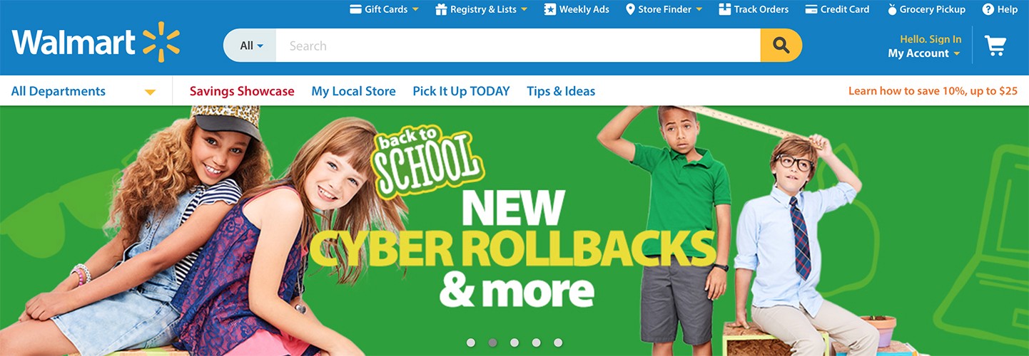
Carousels, image rotators, sliders, featured content modules, whatever you want to call them — they’re everywhere on the web. Carousels are hugely popular on e-commerce sites, especially on the homepage. Most of e-commerce sites have a carousel on the homepage of their desktop site:
Ask anyone this question and they’ll tell you that carousels are an anti-pattern. There have been a few contributors to carousels’ bad reputation. Research by Erik Runyon revealed that only 1% of site visitors clicked on the carousel feature — and 84% of those were clicks on the first slide. On his site Should I use a carousel?, Jared Smith states that, given the choice, you should not use a carousel. Perhaps, the best statement at Jared’s site comes from Lee Duddell who summed up a common carousel problem:
“Carousels are effective at being able to tell people in Marketing/Senior Management that their latest idea is on the Home Page. Use them to put content that users will ignore on your Home Page. Or, if you prefer, don’t use them. Ever.”
Actually, homepage carousels can work well and be helpful to users if they adhere to a few key implementation details. In this article we’ll go over effective carousel implementation details and outline how to design a good carousel.
What is a Carousel
Carousels are a method of displaying marketing information on a homepage. Designers use carousels to maximize the information density without forcing the user to scroll further down the page. Carousels come in many shapes and sizes, but usually a carousel (as discussed in this article) possesses the following traits:
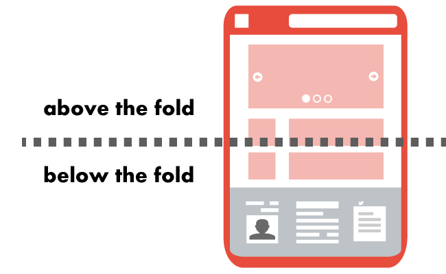
- It appears toward the top of the homepage and occupies a substantial section of the “above the fold” area.
- More than one piece of content appears in the same place, though only one actually displays at a time; each piece contains images and a small amount of text.
- It offers some indication that there is more than one piece of featured content within the carousel.
- Don’t use a carousel if the content isn’t interesting or useful for your visitors (e.g. promotional information they don’t care about). Such carousels only distract people most of time rather than guiding them to a single clear call to action.
- Content in your carousel should’t look like an ad (formatted in the same way as advertisement). If the content is ad-looking, most users will simply ignore it due to banner blindness. That’s why it’s essential to choose the typeface and images to match those used in the rest of the site, so the slide appears to be part of the site content rather than a pushy advertisement.
- The slide sequence should be chosen carefully. Keep in mind that the initial slides will get vastly more exposure the than later ones. Thus, the first slide should always show the most important piece of content and has to sell the next slide to the user. Next slides should all be ordered by importance.
- The carousel slides should never be the only way to access site features and content. It’s a good idea to put any important information that appears in a carousel also somewhere else in the page, so the visitors who interact with the site have a good chance of seeing it.
- Don’t use a carousel if you need the user to see all of the content. Even if your carousel is effective, remember that most visitors aren’t going to see every slide.
Limit the Number of Slides
Include five or fewer slides within the carousel, as it’s unlikely users will engage with more than that. Limiting the number also helps with discovering the content, and finding the content in the carousel again later.
Provide a Progress Indicator
Indicate how many slides are present, and where the user is within the “progression.” This helps people feel in control.

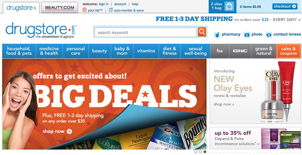
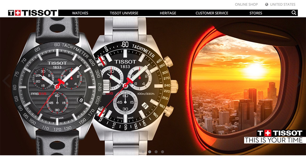
- Ensure that navigation controls exist and appear inside the carousel, not below it or separated by a fold. This avoids issues on both large and small displays. Below there are two examples for desktop sites:

- Make links and buttons clearly distinguishable and large enough to decipher and click. Buttons (next / previous and slide selectors) that are tiny, close together, or on top of a busy background are not easy to see or click.
- Support swipe gestures for mobile devices. This doesn’t mean traditional carousel controls such as next / previous buttons can’t be implemented, but they should be provided in addition to supporting swipe gestures.

- Never use auto-rotation for mobile sites. Users can accidentally open wrong slides when the carousel auto-rotates just as they tap their screen.
- Make sure slides don’t rotate too quickly. Sometimes carousels move too quickly, and users can’t read the information, which is frustrating for them. Of course auto-rotating too slowly will have the opposite problem — users will be bored by slides. You should test for the right timing, or at least estimate how long it might take the average user to read the text and process the images. Consider the possibility of unique rotation times for each slide if information on them require different time to comprehend. If you aren’t sure you can get the timing correct— don’t auto-rotate the carousel.
- Keep users in control (control creates trust). Pause auto-rotation on hover to avoid changing slides the user is likely to be reading or are about to click. Permanently stop auto-rotation after any active user interaction (i.e. click on carousel controls), because a click is an active user request and is a strong indicator of the user’s interests and intent.
- Don’t stop at the last slide. Continue cycling through the slides and displaying which slide is currently selected.
The Best Alternative To Carousel
A common problem with homepage carousel is lack of context: visitors usually has little idea of what the next slide will show or why they should care. As a result, they won’t likely want to flip through them. In an attempt to solve this problem you might consider using a hero image instead of a carousel. Сompared to a carousel, hero image has the following advantages:
- Visitors can focus on the one image rather than dividing their attention among several. And a static hero image may be less likely to distract visitors than a rotating element.
- If designers know they had to choose just one image and a sentiment for it, they may be more likely to choose something that’s better represent a service or products.
You can prioritize your content effectively, eliminate the carousel, and put an effective and useful hero image together with call to action where the carousel was. For example, the following screenshot shows the homepage at Amazon on which designers use a hero image to highlight the top product — Kindle Paperwhite. This hero is attention-grabbing and communicative.