Even though registration is so common thing, it’s also one of the trickiest parts to design. Make sure that your sign up page isn’t an obstacle to your users by following these tips for designing a better registration process.
1. Don’t Use ‘Sign In’ and ‘Sign Up’ Together
How fast can you spot the difference between ‘sign up’ and ‘sign in’ on image below?

Bad: ‘Sign in’ and ‘Sign up’ are used together
The problem is that ‘Sign In’ and ‘Sign Up’ are quite close. When buttons looks too similar and both use the same verb in their labels it’s pretty easy for users to get confused. Users might click one instead of the other, and usually this problem frustrates the users who try to log in because they make the mistake the most. This happens because users scan the screen quickly and assume that the first call to action that catches their attention is the correct one. Even if users didn’t make the mistake, they’ll spend extra time to distinguish the two buttons.
Users shouldn’t have to pause and and think what button should they click. If you want to provide a good user experience in login, avoid using ‘sign up’ and ‘sign in’ together. Instead, make the button distinct from each other by using different verbs in labels:

Good: ‘Login’ and ‘Register’ are more clear to users.
and *different visual appearance for buttons* (colors and styles) to make the difference more evident:

Image credit: ThinkWithGoogle
#2. Eliminate as Many Fields as Possible
When registering a new user, ask the minimum you need to get you started. The fewer form fields you can get away with in your registration process, the less likely users’ll abandon it. Consider what information you *absolutely* must gather:
- One of the things any registration form can do better is to remove the double entry password and email field. There are other solutions for capturing typos (see section 4).
- From a UX perspective, it’s better to have no optional fields, assuming that if a piece of information is not required there’s no point in wasting a user’s time. You can always ask further information down the line. But if there are still optional fields in your registration form, make sure to clearly highlight them with label Optional:
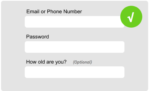
‘How old are you’ is marked as Optional
#3. Differentiate Login From Registration
Many sites and apps use almost the same number of input fields (email/user name and password) for login and registration forms and showing the two side by side:

Bad: two forms are side by side
However, it’s very important to clearly differentiate the registration from login, and to minimize the chance of users accidentally attempting to log in via the registration form. For example, Twitter’s login and registration forms not just look different, but they also have different color for CTA buttons and proper help text (‘New to Twitter? Sign up”).
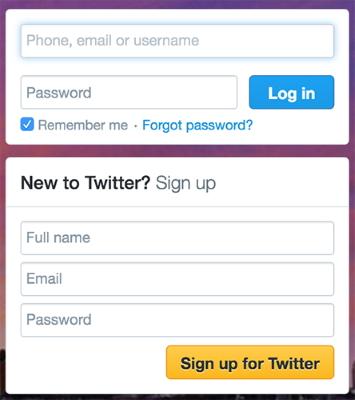
Good: Twitter login and signup forms
#4. Let Users See Their Password
A common problem during login and registration is *mistyping a password*. And this is fairly easy to do it because the password field is usually masked (of course because of security reasons). People aren’t perfect typists and they often mistype their password, especially on mobile devices.
Many sign up forms try to prevent mistyping errors by using the confirm password field when creating a password:
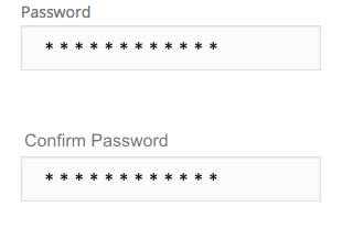
Bad: Two input fields for user password
While the confirm password field seems sensible, using it doesn’t completely solve the problem. Users make more errors when they can’t see what they’re typing while filling in a form. And they feel less confident, because they can make a same error twice (for both fields).
Don’t make the user fill in the same field twice! Implementing a ‘show password’ option is a proper way to prevent mistyping errors. You can place a checkbox near the password field. When users click it, it’ll display their input unmasked.
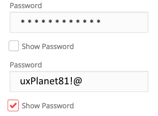
Good: ‘Show Password’ as a checkbox
Alternatively you can use an icon button. When user click on the icon, display the eye icon with a slash over it to represent masking.

Good: ‘Show Password’ as icon button
#5. Provide Guidance
You should clearly identify and explain form field errors. If a field isn’t completed correctly, don’t just tell users they made a mistake. *Show* them in which field the error occurred, and *explain* the correct way to fill out the field.
User-friendly and Descriptive Error Messages
“For security reasons your password must be longer than 6 and shorter than 10 characters, contain at least one capital letter, a number and a symbol.” This is a typical password requirement, but demanding users to consider all of the field requirements isn’t a proper way of explaining the problem. Take a cue from Mailchimp and indicate user progress with a “password strength” visual.
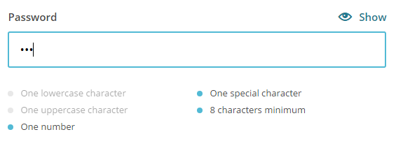
Current password requires ‘one special character’, ‘one number’ and it should be 8 characters.
##Real-time Data Validation
Real-time validation immediately informs users about the correctness of provided data. This approach allows users to correct the errors they make faster without having to wait until they press the submit button to see the errors. However, form validation shouldn’t only tell users what they did wrong, it *should also tell them what they’re doing right*. This gives users more confidence to move through the registration form.

Image credits: form-ux-tips
Real-time validation works especially good for less obvious answers, such as picking a unique username or a strong password. Twitter is an obvious example here. On the screen below you can see that the form informs me that this email is already in use and offer me some options (either to login or recover my password).

#6. Use Email or Phone Number, Rather Than Username
If you ask users to create a username during registration, most probably you’re dealing with following difficulties:
- Since usernames have to be unique, users might need to spend a few minute before they end up with a proper name, because preferred usernames have already been taken by other users.
- Users end up registering with a brand new username that they are hardly remember after a while.

You site or app should allow users to login with their email address or phone number:
Good: Phone or email can be used for username during registration
#7. Allow User to Log in Via Facebook, Twitter or Google+
Why force users to create another set of login details when you can let them login via an external account, such as Facebook, Google or Twitter? This feature can alleviate registration headaches.

Comparing to the standard registration with email, it has both pros and cons:
- Pros: Users don’t have to fill out registration form, to create another pairs of username/password and to verify emails, hence can sign up in like 10 seconds instead of 10 minutes. And most important, users don’t have to remember a new usernames/passwords.
- Cons: Since the information about the user is loaded automatically it raises a huge privacy concern and not everyone is likely to be happy to share their profile data. For such cases you should have traditional login system running in parallel.
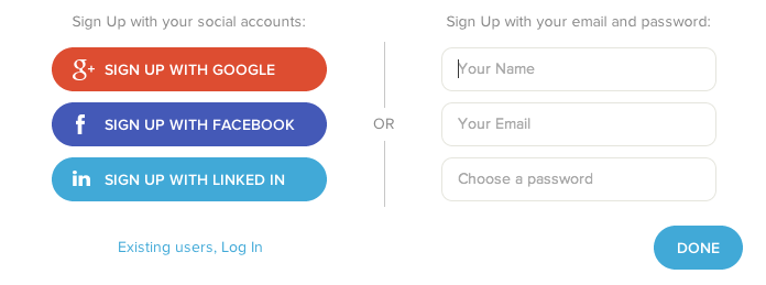
Good: Login via Facebook/Google+/Twitter or use a traditional sign up
#8. Keep Users Signed In When They Register
Common issue with registration is *requiring users to log in immediately after registration*. This extra step usually frustrates the user.

Bad: Ask user to log in after account activation
You should design the app so that new users stay signed in immediately after registration (unless of course security is a real issues, such as banking apps and websites).
9. Make Password Recovery Painless
It’s very important that if users do forget their password (and they will) that this is well handled by the login process.
Make it easy for users to reset their password so they don’t abandon your service. As a starter always have a clear ‘Forgotten your password?’ link for your login form and this link should be visible all the time (not just after the incorrectly entered password).
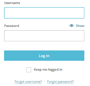
Good: Mailchimp login form has ‘Forgot password?’ link
#Bonus. Follow a ‘Try Before You Buy’ Strategy
Users will abandon an app/online service that asks them to provide personal information upfront unless there’s some form of immediate payoff (e.g. ordering a taxi). In particular, services with low brand recognition must clear a higher hurdle when they ask users to register at the start of the experience, because forcing registration too early can cause [more than 85%](http://janrain.com/blog/infographic-how-to-solve-the-online-registration-challenge/) of users to abandon the product.

Required upfront registration is a huge barrier to use. Before users are offered up this kind of request they want to see what the service is offering/how the app works. Image credit: ThinkWithGoogle
It is better to deliver a limited set of features immediately than nothing at all. Thus, follow a ‘try before you buy’ strategy. *Try before you buy* strategy is about giving new users the ability to experience your product so that they’ll personally interested in signup. People are more likely to sign up and provide real personal information if they just knew what sort of product and experience they receive.

A try before you buy pattern doesn’t mean you can’t ask a user to create an account. It just means you ask for that *after delivering value for the user*. For example, YouTube lets new users browse as much content as they’d like, prompting them only to sign up when they try to reply or create their own video content.

Conclusion
When you strip every barrier away from signing up, what you get is lots of sign-ups. And lots of sign-ups doesn’t translate automatically to the lots of customers. Customers are the result of a series of events. And creating an efficient registration process is just a first step in this direction.
Thank you!